Diller Scofidio + Renfro’s EXIT investigates human migration

“It’s almost as though the sky, and the clouds in it and the pollution of it, were making their entry into history. Not the history of the seasons, summer, autumn, winter, but of population flows, of zones now uninhabitable for reasons that aren’t just to do with desertification, but with disappearance, with submersion of land. This is the future.”
– Paul Virilio on EXIT, 2009
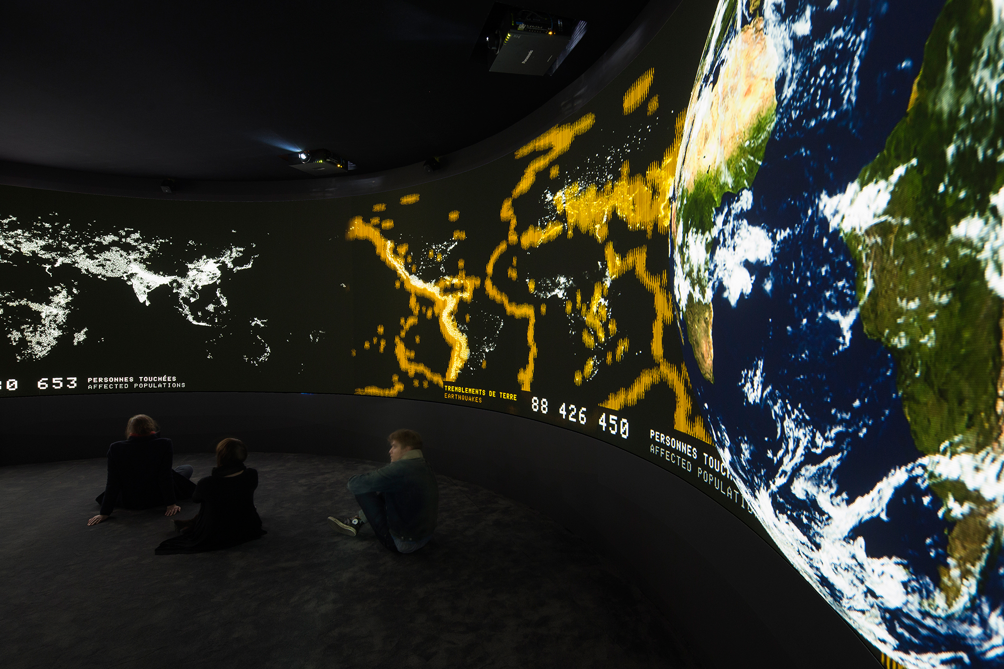
Based on a prompt by French philosopher and urbanist Paul Virilio, EXIT (2008–15) is an experimental 360-degree installation created by New York-based artists and architects Diller Scofidio + Renfro with architect–artist Laura Kurgan and statistician–artist Mark Hansen, alongside a core team of scientists and geographers. The data-driven artwork – which aims to investigate human migration and its leading causes around the world, including the impacts of climate change – was originally commissioned in 2008 by the Fondation Cartier pour l’art contemporain in Paris for its exhibition Native Land, Stop Eject, and is now a part of its collection.
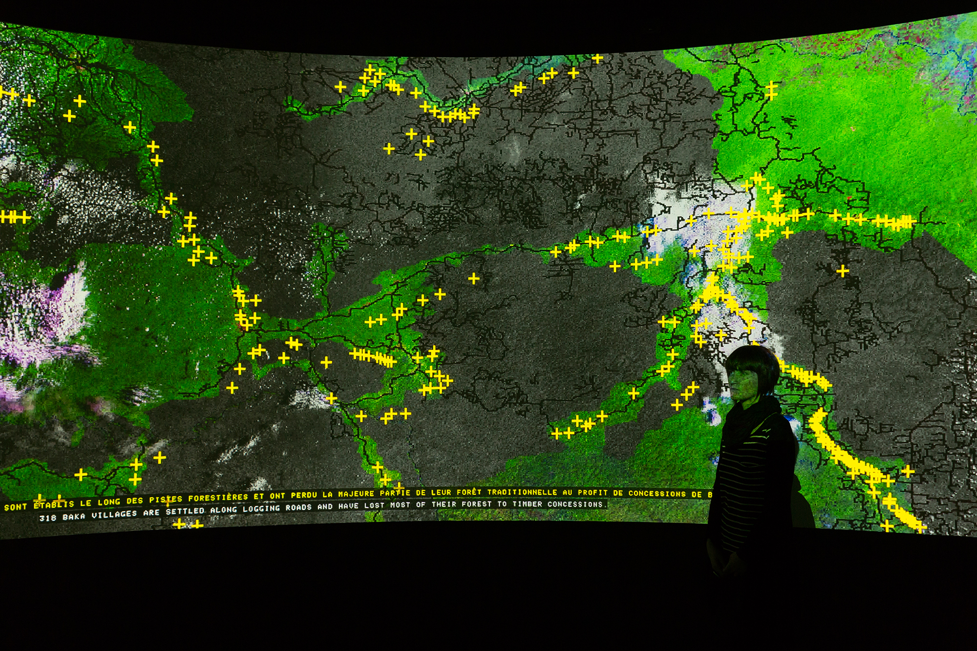
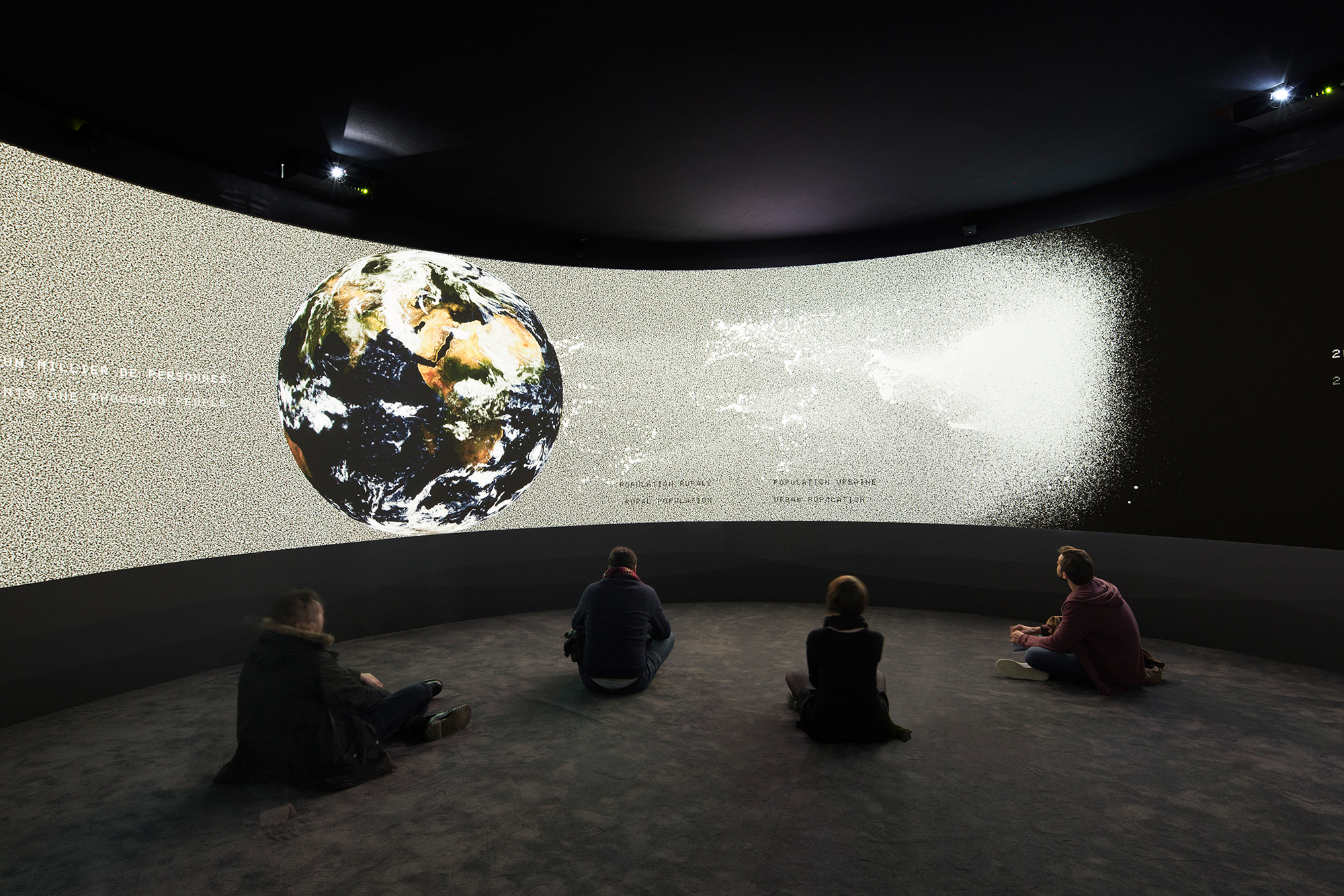
In November 2015, it was updated for inclusion in United Nations Climate Change Conference (COP21). Updating the information was no simple undertaking, with EXIT comprising geocoded data from over 100 sources (ranging from international organisations to NGOs and research centres, including UNESCO and the World Bank), visually represented in a series of six animated, panoramic maps reflecting on the movement of people across the globe. Forced displacement caused by wars, persecution and violence are all represented in EXIT, alongside movement attributable to urbanisation, large-scale deforestation and natural disasters. Also included is a map of ‘remittances’, tracking the money sent by migrants around the world to their countries of origin.
It’s a provocative and ambitious artwork that since its inception has travelled to Alhóndiga Bilbao (now Azkuna Zentroa) in Spain and more recently across oceans to the UNSW Galleries for Sydney Festival 2017. From 19 April until 16 July 2017, EXIT will show at the Ian Potter Museum of Art at the University of Melbourne as part of ART+CLIMATE=CHANGE 2017. I caught up with Fondation Cartier curator Thomas Delamarre to talk about EXIT about working at the intersection of art and data, and about the role of cultural institutions in effecting change.

Sara Savage: Quite some time has passed between the first showing of Exit in 2008 and the current exhibition, which debuted in 2015. Can you talk about making the decision to update the data and what was involved in doing so?
Thomas Delamarre: It’s a rare challenge for an art collection to have something like EXIT. Because of course you can say, ‘Okay, we can freeze it,’ and present a picture of the subject in 2008, but it doesn’t really stay relevant for long. Updating EXIT was a huge process: we had to gather the whole team again, and the team [that was] put together by Diller and Scofidio were scattered around the world. The occasion of COP21 in Paris really gave us the motivation to do it – we thought it would be a huge mistake not to use the occasion in this way.
Of course, the updates led to very dark conclusions – in every area of the data collected, things have worsened since 2008. So it’s added a completely new face to this work. You can see more political refugees, the rising of temperatures has worsened, and so on.
SS: Do you think the response has been different this time around?
TD: Yes, we have felt an incredible difference. In 2008, we had strong attendance in terms of visitors but I don’t think the effects were as large. The political atmosphere is so different now.

SS: In her essay ‘Museums and the Public Good’, director of the Ian Potter Museum of Art, Kelly Gellatly, argues that 21st-century museums and galleries shouldn’t be afraid to be political or present agenda-fuelled exhibitions. She says, “The museum has not and has never been a neutral or objective space, and to effectively hide behind this sense of neutrality in order to avoid having and communicating an opinion is disingenuous.” Do you think cultural institutions like the Fondation Cartier have a certain responsibility to foster conversation on issues like climate change?
TD: That’s a difficult question. We do feel we should have a commitment to include these questions in our exhibition programs – and actually, we do – but it’s always a very thin line between art and pedagogy. Of course we always want to stay on the side of creating artworks, not tools for understanding, but at Fondation Cartier we believe, and [general director] Hervé Chandès believes, that an arts centre, an exhibition space, should be a place where you can learn things, and that this can be achieved through artworks. I think this is the case with EXIT .
Our recent exhibition The Great Animal Orchestra (2016–17) was an art exhibit but with an underlying motivation to raise issues about biodiversity and the mass extinction of species. We spent many months trying to figure out how to include these ideas in the exhibition relying only on the artworks, but in a way that didn’t mask or cover the aesthetics. I think it’s a difficult balance to find, but it’s an exciting challenge for an exhibition space. The fact that [Fondation Cartier] mostly works on commissions helps, because we can spend a lot of time with the artist, thinking together about the right steps to take. And we like to gather not only artists but also thinkers, researchers and scientists and foster a dialogue between these very different people. That’s how we worked on The Great Animal Orchestra and that’s how we worked on EXIT.
SS: EXIT wasn’t the first time you’ve collaborated with Diller Scofidio + Renfro. What has it been like to work with them?
TD: Before making buildings, Elizabeth [Diller] and Ricardo [Scofidio] worked a lot on temporary installations and also outdoor installations. When they do this, and when they work with us inside the museum, they’re always operating as architects. In a way they’re always practicing architecture. Every time they are questioned on their different practices, they’ll say it’s all architecture. Because for them, they’re thinking about space all the time, reflecting on what is contemporary space, how we live in it and how our bodies and minds react to it. It’s all architecture. And I think this is really the case with EXIT. In creating animated maps, they’re showing abstract representations of people moving around them – it’s really a way for [Diller and Scofidio] to reflect on space. Every time they’ve worked with us, that’s the motivation they’ve had.
SS: It’s also not the first time Fondation Cartier has curated an exhibition based around statistics and mathematics – you also presented Mathematics, A Beautiful Elsewhere in 2011–12. Is it a conscious decision to work at the intersection of art and data?
TD: Not really. I would say it’s almost by chance that we did this show on mathematics two years after Native Land, Stop Eject – they’re two very different projects. With Mathematics, A Beautiful Elsewhere, the aesthetics created by the mathematicians and the artists are pretty different from EXIT. The movies [in Mathematics] were mostly created by David Lynch and they relate to the mathematical figures in a very poetic and dramatic way, breathing a lot of emotion into the figures. So that exhibition wasn’t really about data visualisation.
For EXIT, it was really the subject matter that brought us to this kind of data visualisation. It’s the first time in history that our lives rely so much on data, and with EXIT we wanted to be able to make the data speak, and to reveal any truths that might otherwise be concealed.
SS: I heard Ricardo Scofidio speaking about EXIT, where he said that he and Liz Diller tried to let the data drive the visual side of things, but it was the sonic elements that allowed their emotions to shine through.
TD: It really was the data that created the visuals in EXIT, especially because they only used data that could be geocoded. But data is an extremely dry material and not very emotional, and it’s true there is a lot brought to EXIT by the sound. That’s another reason why it really has to be experienced in person – because you are really immersed in the sound, and that changes everything. There is a kind of narrative brought by the sound that gives the piece its poetic aspect.
This article originally appeared in ‘In/formation‘, the seventh print issue of Assemble Papers. Thanks to Thomas Delamarre for taking the time to share his thoughts with us over Skype, and to Climarte for facilitating the interview. Catch EXIT while it’s in Melbourne – find more info via the Ian Potter Museum of Art website.

Photo: EXIT (2008–15). View of the installation EXIT. Collection Fondation Cartier pour l’art contemporain, Paris. © Diller Scofidio + Renfro, Mark Hansen, Laura Kurgan and Ben Rubin, in collaboration with Robert Gerard Pietrusko and Stewart Smith. Photo © Luc Boegly.
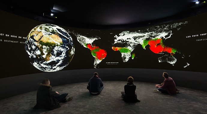
Photo: EXIT (2008–15). View of the installation EXIT. Collection Fondation Cartier pour l’art contemporain, Paris. © Diller Scofidio + Renfro, Mark Hansen, Laura Kurgan and Ben Rubin, in collaboration with Robert Gerard Pietrusko and Stewart Smith. Photo © Luc Boegly.
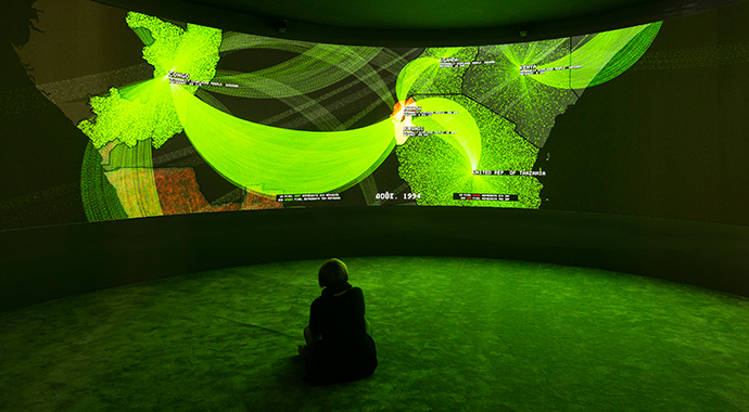
Photo: EXIT (2008–15). View of the installation EXIT. Collection Fondation Cartier pour l’art contemporain, Paris. © Diller Scofidio + Renfro, Mark Hansen, Laura Kurgan and Ben Rubin, in collaboration with Robert Gerard Pietrusko and Stewart Smith. Photo © Luc Boegly.
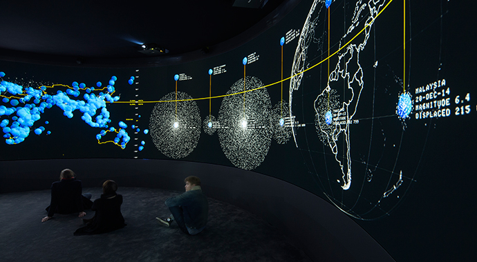
Photo: EXIT (2008–15). View of the installation EXIT. Collection Fondation Cartier pour l’art contemporain, Paris. © Diller Scofidio + Renfro, Mark Hansen, Laura Kurgan and Ben Rubin, in collaboration with Robert Gerard Pietrusko and Stewart Smith. Photo © Luc Boegly.
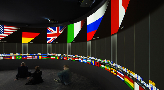
Photo: EXIT (2008–15). View of the installation EXIT. Collection Fondation Cartier pour l’art contemporain, Paris. © Diller Scofidio + Renfro, Mark Hansen, Laura Kurgan and Ben Rubin, in collaboration with Robert Gerard Pietrusko and Stewart Smith. Photo © Luc Boegly.