The changing signs of Melbourne’s industrial skyline
The historical rooftop signs that dot the horizon lines of our cities are often symbols of a bygone industrial era, memories clinging to facades. As emerging technology transforms advertising techniques, and awareness of our consumption habits in relation to issues such as climate crisis develops, what will become of the humble rooftop sign? Writer Samuel Holleran and photographer Tom Ross take us on a stroll down memory lane and through previously industrial suburbs of Melbourne in search of an answer.
A visitor to Los Angeles in 1923 would have noted the soaring palm trees and huge studio lots. The 12-metre-tall letters going up on Mount Lee’s scrubby peak might have made an impression, but only for its brash commercialism. LA was in a building boom and loud retail signage was abundant. The letters advertised ‘Hollywoodland’, a new housing development, and were meant to stay up for the leasing period only. Of course, the sign (the word ‘land’ was removed in 1949) came to symbolise LA and the motion picture industry. In the first decades of the 20th century, cities in virtually every industrialising country were saturated with oversized signage. Mounted on rooftops, propped up on hillsides, clamped to facades and even attached to flying blimps, they aimed to push new consumer goods. Seen by many as blemishes on otherwise ‘pure’ buildings, they were, over time, regulated. Today, as the few remaining examples of signs from this era age and decay, they have gone from despised to beloved.
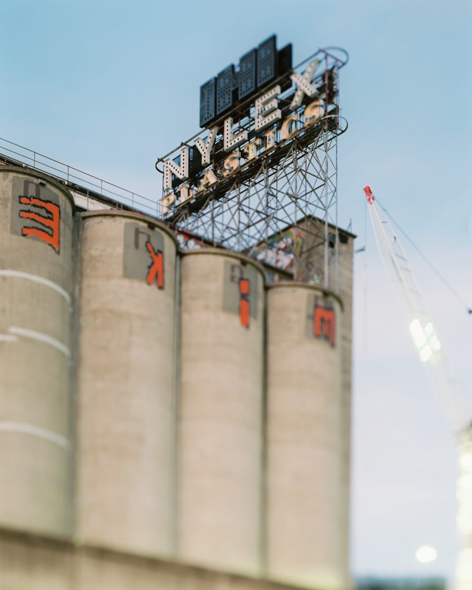
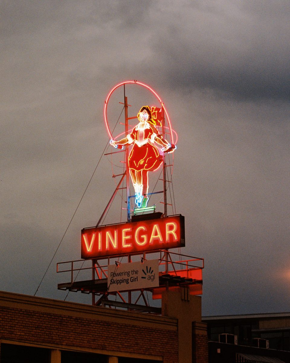
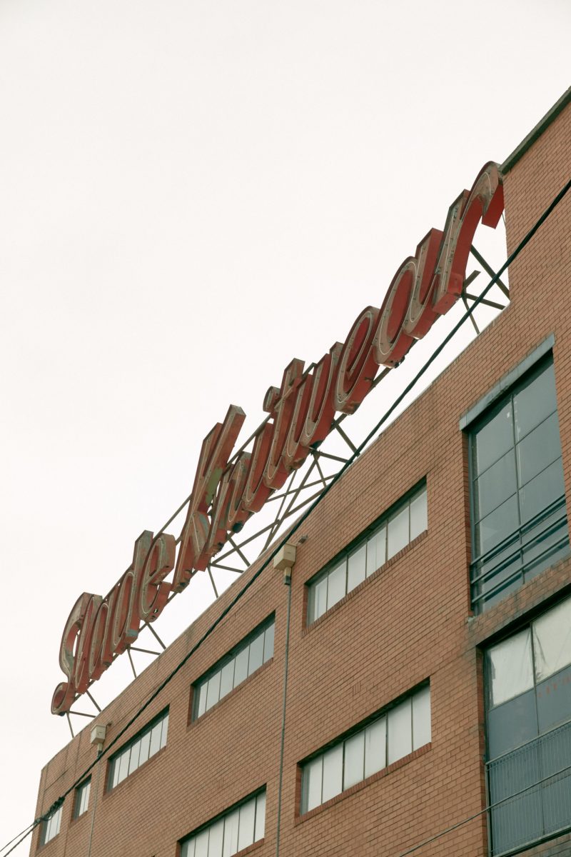
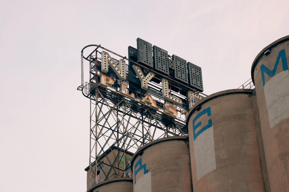
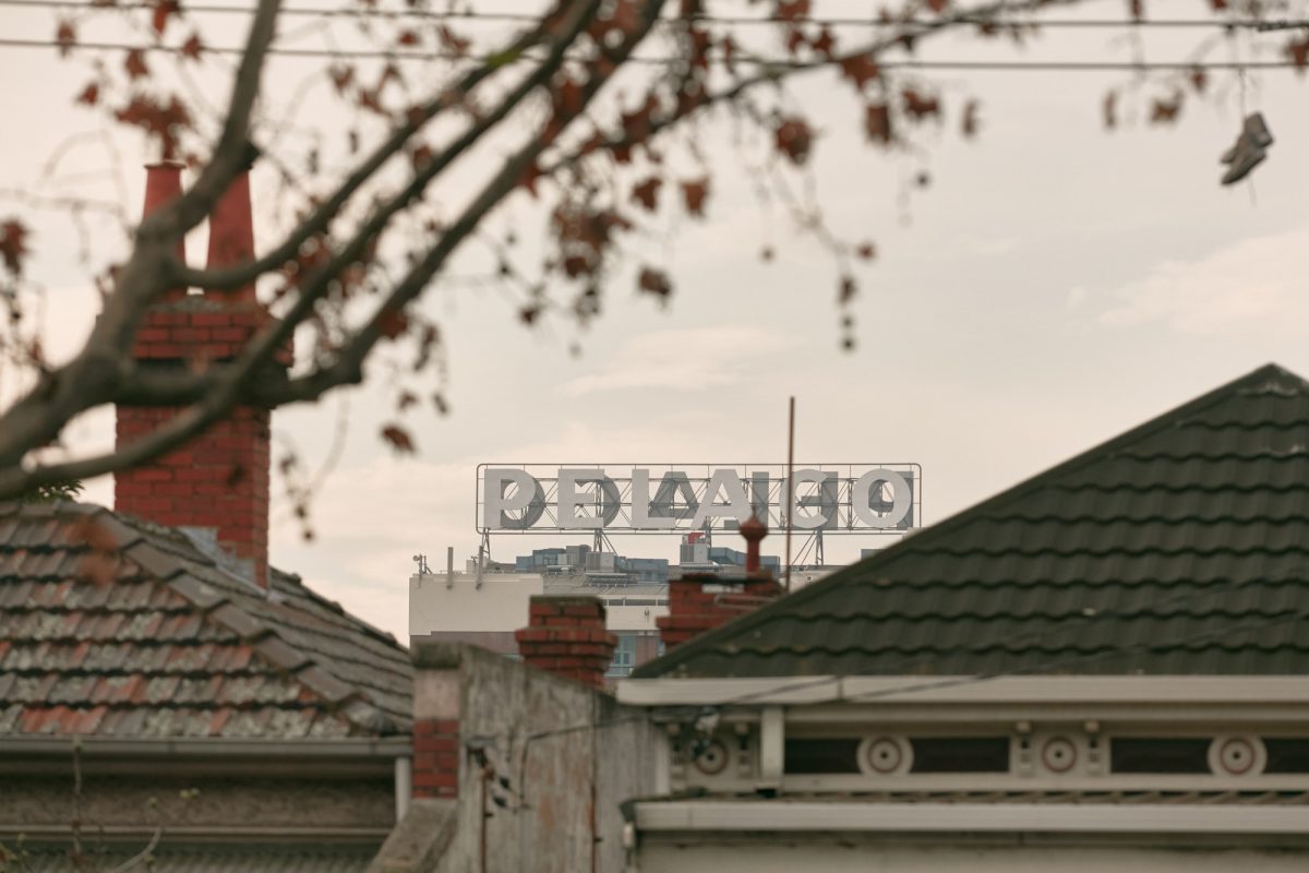
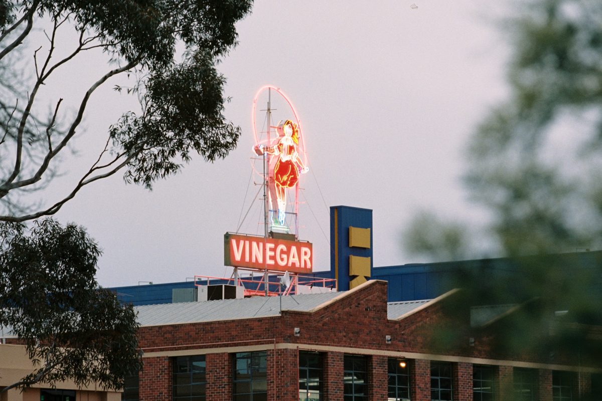
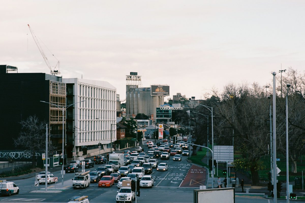
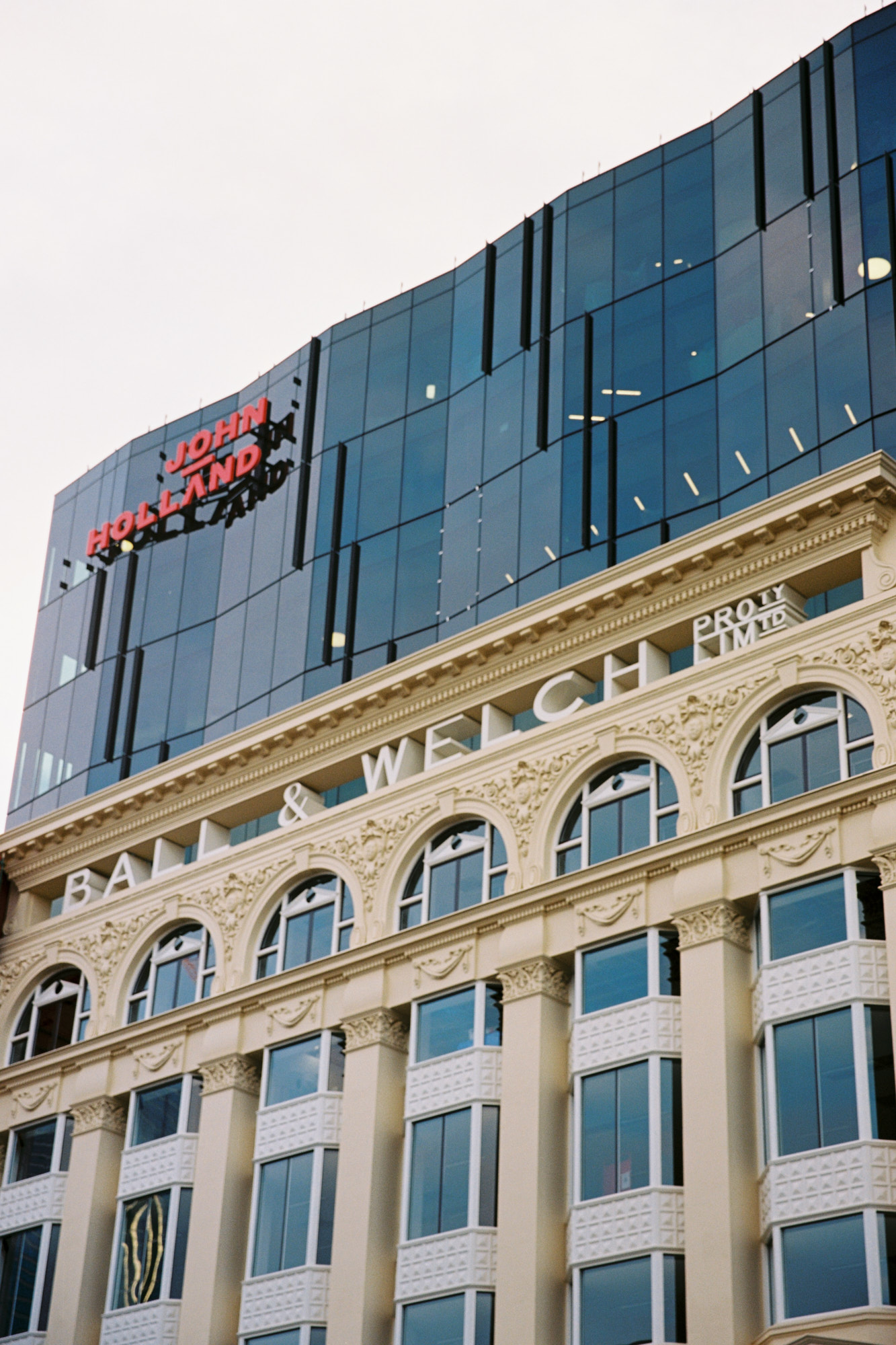
While no one sign is fundamentally associated with Melbourne, the industrial corridor of Richmond and Cremorne is full of well-known once-illuminated rooftop signs: Skipping Girl Vinegar, Slade Knitwear, Nylex Plastics and Pelaco. The products they advertise are mostly forgotten, but their presence adds depth, texture and history to the city. The 1962 Nylex Plastics sign is perhaps the best known and serves as an informal entryway into Melbourne’s CBD. Once known as ‘Derham’s Folly’ because of its huge cost, its digital clock face links technological eras as it tells time above buzzing neon tubes. Over the years it has become a marker of civic pride and the developers building on the site below, redubbed the Malt District, seem to recognise the cultural capital it brings. The Malt District will preserve and restore the sign, and what went up as an ad for plastic garden hoses and kitchen canisters will now serve as a beacon for a rooftop bar in a mixed-use “lifestyle destination” that trades heavily on its industrial chic prehistory.
The embrace of the Nylex Plastics sign is just the latest shift of taste culture in which elements of the built environment, previously seen as unsophisticated, are now treasured. Some signs survive by taking on new meanings. The Hollywood sign – constructed during a boom in speculative property schemes – managed to associate itself not with the cheap and segregated homes it advertised, but with the golden age of film. Others have come to be linked with sport: the Nylex Plastics sign hovers over the Essendon grandstand in Melbourne, and Boston’s Citgo sign (beloved in a left-leaning city despite its clear connection to a petrochemical company) is an integral part of the Red Sox baseball lure. In order to stay standing, many signs had to get new patrons. The Hollywood sign went through a period of neglect and lay half-felled and rotting when, in 1978, Hugh Hefner and other LA impresarios started a charity to rebuild it.
Architect Robin Boyd’s The Australian Ugliness, published 60 years ago, bemoaned the visual clutter of roadside signage and warned of the dangers maximalist advertising posed to the legibility of the city. This concern wasn’t new; it had cropped up as early as the 1890s, when the satirists at London’s Punch magazine composed a poem on a future in which unchecked advertisements would blot out “the sun-disc as it flames at noon… [and] daub the praise of Pickles o’er the moon”. Boyd maintained that the expansion of car culture had accelerated vulgar commercialism and was to blame for an increase in obnoxious ads. “Australians,” he maintained, will “allow anyone with something to sell to take control of the appearance of their country.”
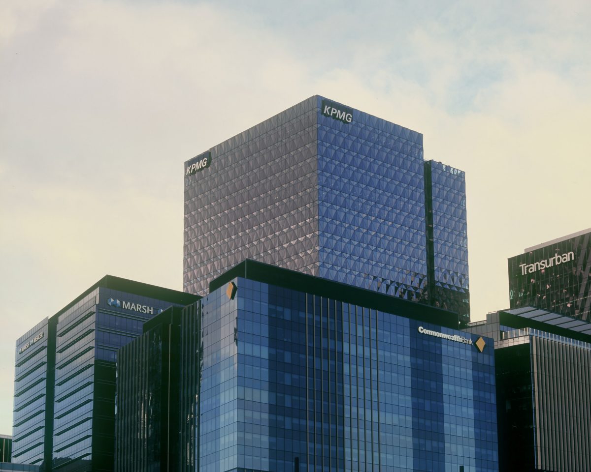
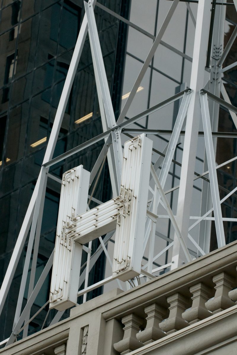
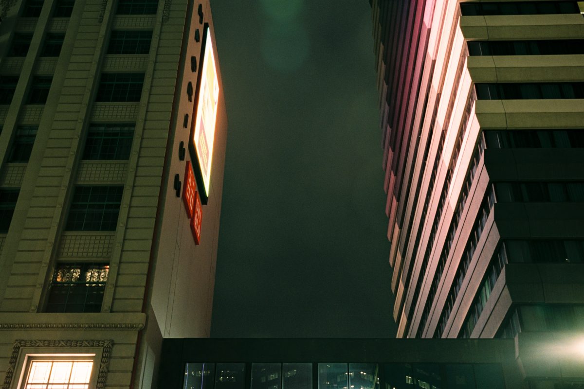
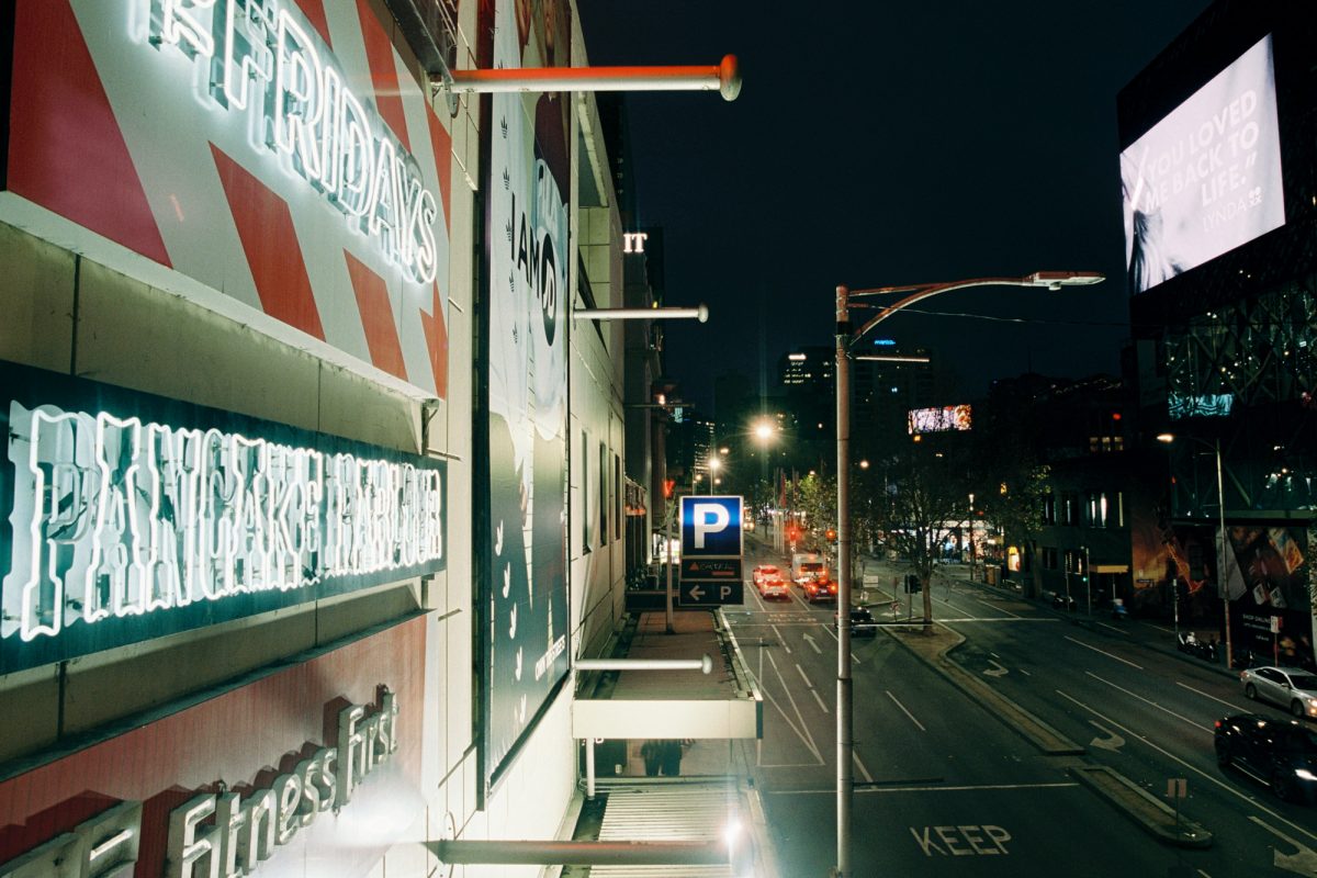
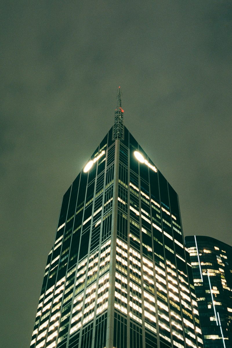
It’s only when you stroll past the Nylex Plastics sign, travelling westward down the Yarra River, that old-timey signage – the ruins of a past industrial period – butts up against the backlit logos that sit atop the CBD’s skyscrapers. The former are ‘sky signs’ (hollow letters bolted on a rooftop metal superstructure) that reference discrete products, while the latter are corporate trademarks rendered in Plexiglas. These logos are often mounted at the top right of office towers like giant lapel pins, but so high up that they are irrelevant to pedestrians below. They are largely unnoticed and unloved.

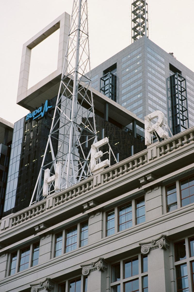
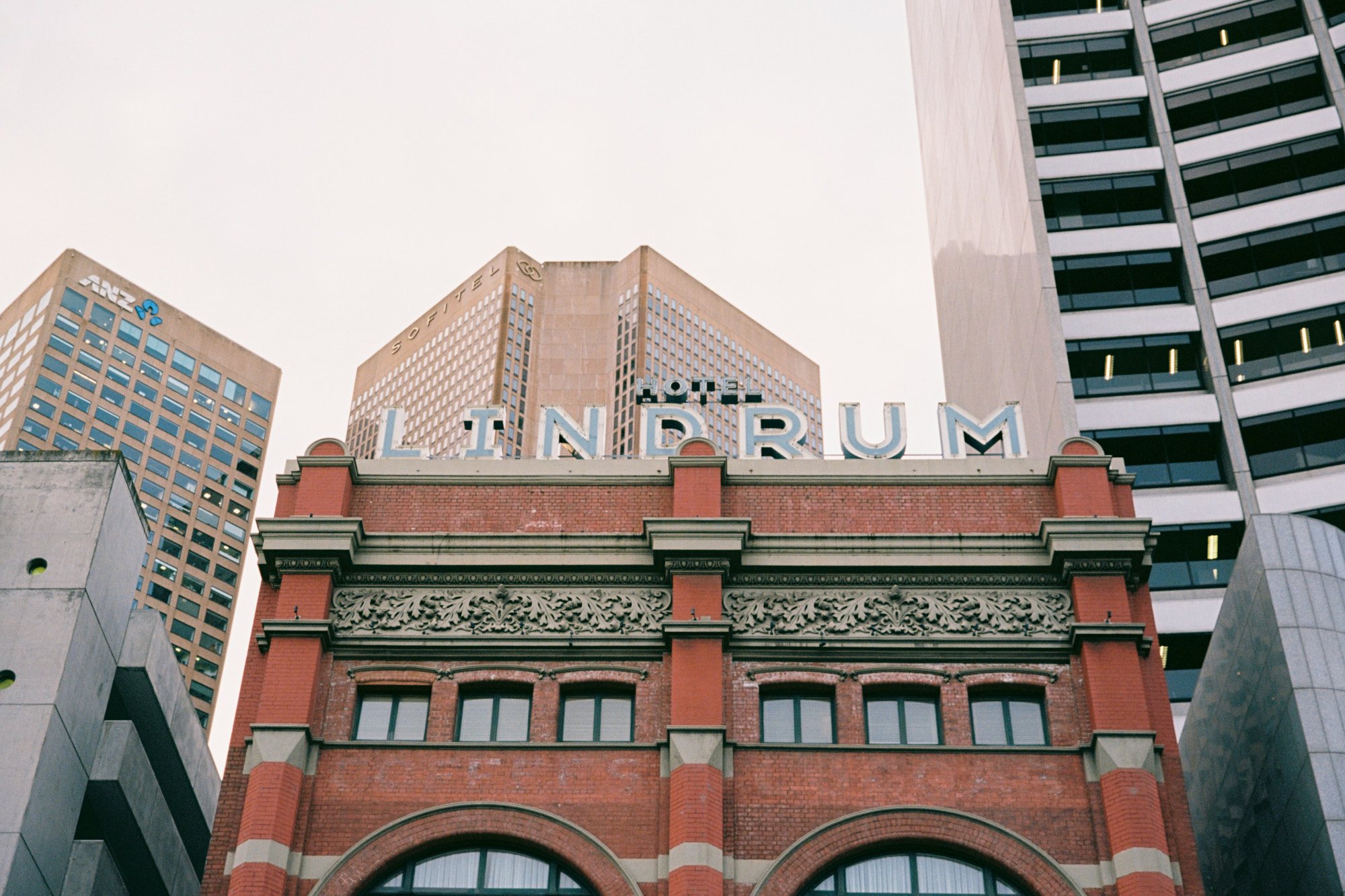
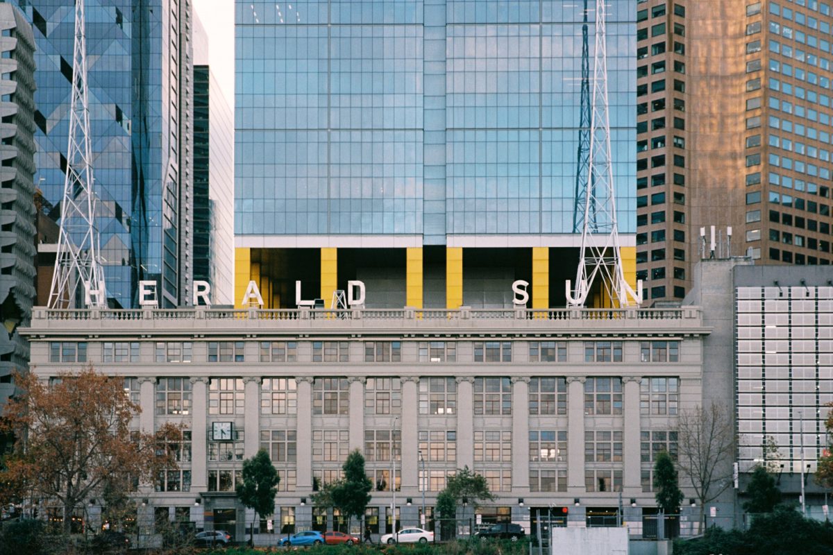
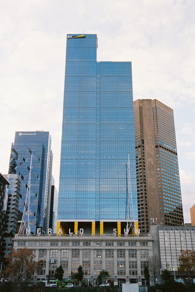
On Flinders Street, the Herald Sun sign, dating from the 1930s, still commands the view from Batman Avenue Bridge. It was preserved when the 40-storey Ernst & Young skyscraper grew out of the newspaper’s heritage building in 2005. High above street level, Ernst & Young’s ‘cheese wedge’ logo tops off the building, but it’s only really visible from across the Yarra River, 500 metres away. The materiality of the Herald Sun sign is also different; the handwrought letters staggered across the building’s facade imply a site specificity and permanence that modern wordmarks for big organisations (often repeated on skylines across the world) can’t convey.
Is it simply the passage of time that makes signs grow more favourable to us? Despite being large and striking, signs are also one of the most disposable elements of the built environment. They are ripped off and swapped out every couple of years. When one lasts even a dozen years, we start to admire its staying power, as if the letters themselves should be commended for their resilience. If they manage to stick around for several decades, they are thought of fondly, worthy of respect and a continued presence as guardians of the city.
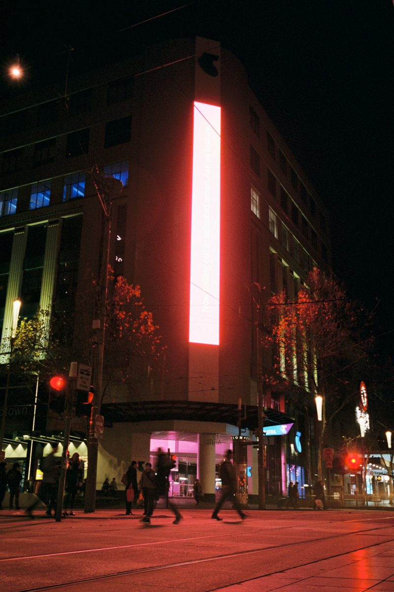
When thinking of the future of signage, we should consider the shifting conception of ads and the technology used to deliver them. Some people are objectively more susceptible to the adverse effects of a flickering and bright illumination (notably those with epilepsy). Sensitivity to visual stimuli changes with age and other life factors, and it is also linked to cultural norms and political positions. Anti-sign sentiment is often a stand-in for much deeper societal fears. The battle against billboards in the 60’s went well beyond taste and was wrapped up in dissatisfaction with car culture and the environmental crisis. Likewise, critics of the overstimulated streetscape of the 21st century – blinking LEDs, backlit logos, and Smart City screens – are reacting not just to a visual shift but to the notion that the public sphere is increasingly obstructed and ‘infobese’. To many, the overlapping visual and information overload that characterises our mobile screens seems to have jumped scale, ending up smeared across the surfaces of the city. The few examples of digital facades that exist in Melbourne (for example, Federation Square) have been celebrated, but what happens when they become many? The integration of digital signage with buildings blurs the line between the technological and physical world in ways that could prove uncomfortable.
Anxiety around overbearing advertisements is exemplified by the cyberpunk genre. Ridley Scott’s Blade Runner, made in 1982, was one of the first popular films to create a vision of hyper-frenzied dystopic nightscapes. Recently, the dystopian imaginary of cyberpunk cities has, in some ways, conceded to a more nuanced ‘mixtopia’ – a vision for future cityscapes that rejects a dystopia/utopia binary and accepts a kind of layering. It seems possible to regulate the city’s visual density in the same way that we monitor construction noise and sidewalk cafes, weighing the amenity versus the disturbance it creates. Cities of the near future can potentially accommodate a variety of agents – rusting sky signs, giant logos, unsanctioned graffiti, public art and official messaging – to make room for a diverse visual life.