De-obfuscating architecture’s mandate at the Venice Biennale
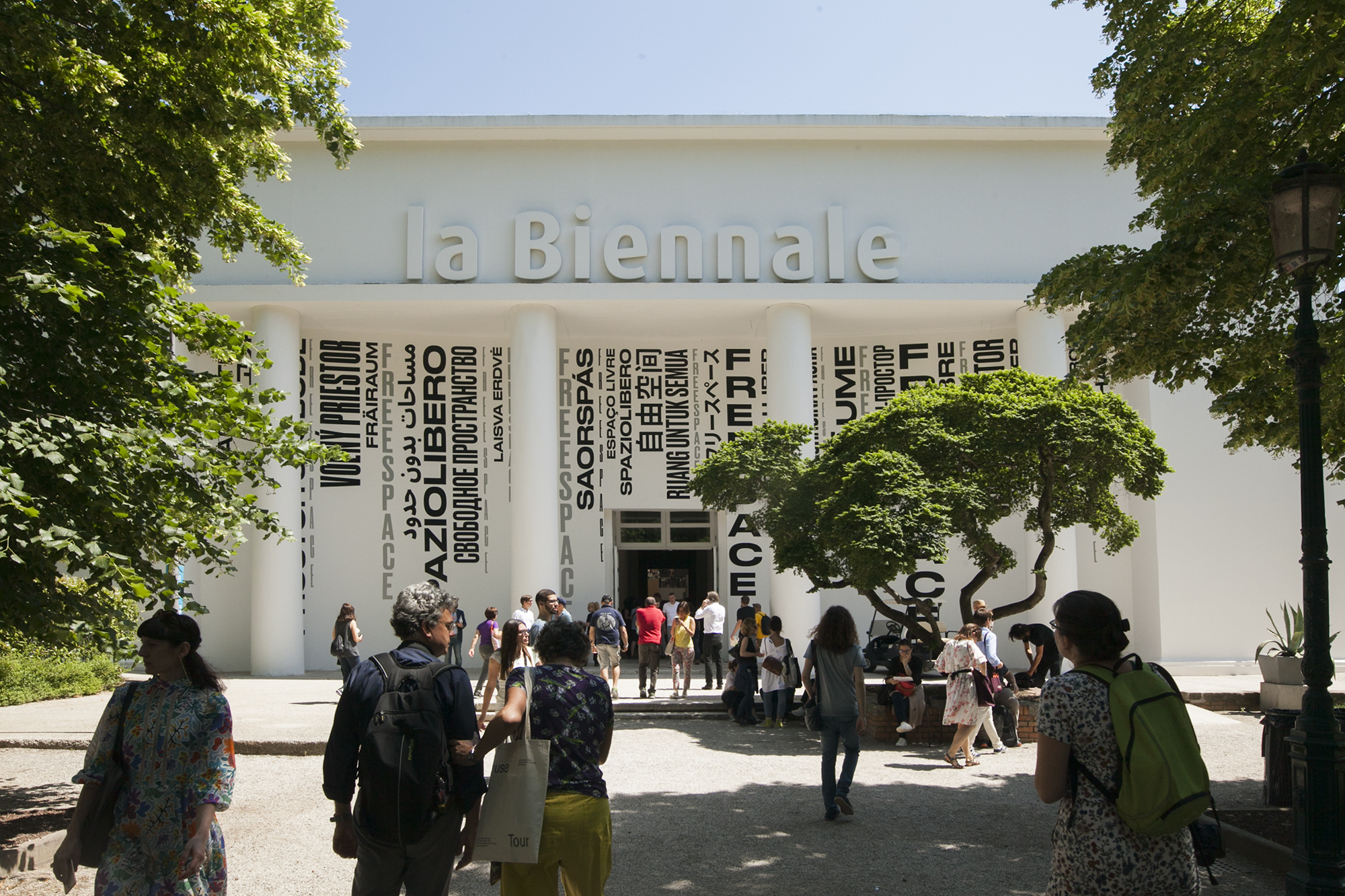
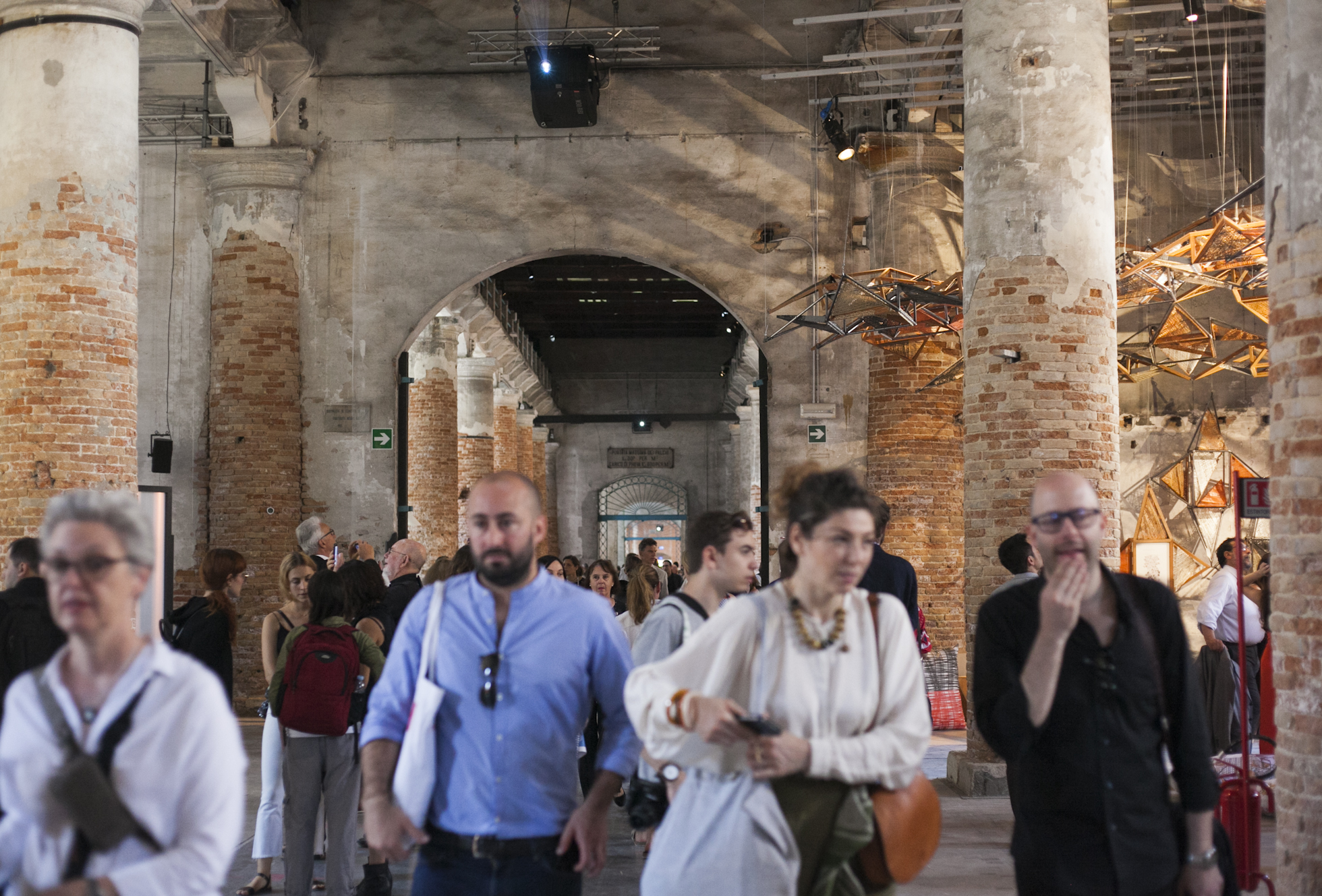
Amelyn Ng: This was my first time to the Venice Architecture Biennale (and indeed, to Venice) – and what a saturating experience it has been over the last few days! It was fascinating to experience the ‘bubble’ of architectural culture compressed into three days. Since 1980, this public exposition (which alternates annually with the Venice Art Biennale) has come to connote both national prestige and pageantry, and is greeted each time with renewed fanfare. Now in its 16th iteration, the Biennale showcase continues to be a highlight of the international architectural calendar. We visited the Biennale’s two main sites: the Giardini (a garden hosting 29 pavilions of foreign countries, many designed by storied architects such as Alvar Aalto and Gerrit Rietveld) and the the Arsenale (a repurposed industrial ship-building complex with 23 national participations).
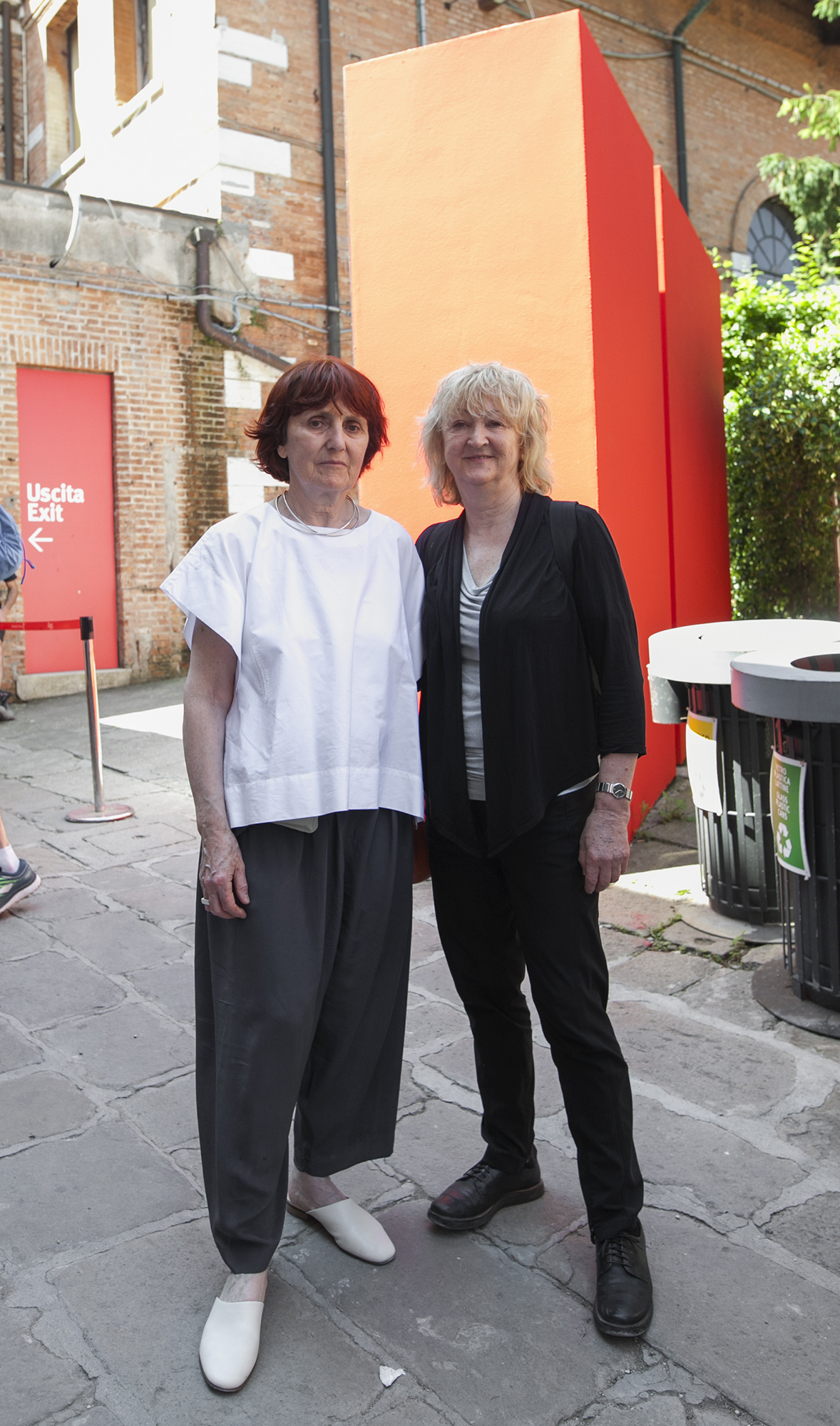
This year’s Biennale is loosely themed FREESPACE by Irish curators Yvonne Farrell and Shelley McNamara of Grafton Architects. As an Asian-Australian architect entering this spectacular ‘arena’ for the first time, my first impression was at once of wonderment: at the extent of national effort, information density and programmatic variety; and also of dismay: that many non-Western nations do not have their own pavilion, or aren’t represented at all, not least because of the Giardini’s spatial limitations and fixity at the time of its conception. A quick headcount of the Giardini pavilions reveals only two East Asian representatives (Japan and South Korea); many others – Indonesia and Singapore, for example – are instead found off-site in the Arsenale hall… In a way, the Biennale is a historical-political register of international powers at its moment of inception. Content-wise, I found it overwhelming to try and digest everything presented or read the event as a coherent thematic whole – and I’m usually a pretty meticulous exhibition visitor!
Jana Perković: As someone who has been coming to the Biennale for 15 years (and used to live around the corner from Giardini in my undergrad days!), I have long stopped worrying about seeing everything and catching everyone. Yes, the Biennale is a kind of architectural equivalent of the Cannes Film Festival. However, it is good to remember that it is just the small cousin of the Art Biennale, which attracts vastly less general attention and engulfs the city for months. Unlike art, buildings can’t be brought in for the exhibition, and so there is always a fundamental confusion about what it is that is happening here. Is it about creating architectural installations, documenting architecture made elsewhere, or is it just about networking? I think the director of Biennale, Paolo Baratta, summed it up the best when he said that the purpose of the Biennale is ‘to create a desire for architecture’. At its best, the Venice Biennale is a festival of ideas and provocations, a contemplative window of time in which to reflect on questions that, as practitioners, we rarely have time for.
I think over the last years we’ve seen a shift away from pomp and concept, and towards an architecture of small gestures and good citizenship. Aravena’s previous Biennale, Reporting From The Front, was heavy on municipal utilities companies. This year, curators Yvonne Farrell and Shelley McNamara have built the program around a similarly-sounding call for ‘a generosity of spirit and a sense of humanity at the core of architecture’s agenda’, but their focus was not on politics and social movements – but on the quality of civic spaces that good architecture creates. The projects they selected are all distinguished by going above and beyond the brief, to create additional comfort, quality, open space, assets to both city and citizens. Many of them – Takaharu Tezuka’s Fuji Kindergarten, for example – have been featured in AP in previous years, which I would like to think speaks to more than just a shared sense of values between our magazine and Grafton Architects. I hope it is an indicator of the Zeitgeist favouring ethics over aesthetics. That spirit of spatial generosity was also present in situ: there were so many comfortable benches to sit on! Normally, Biennale is a hard slog, with hot weather, much walking, a barrage of words and images. Not this time: Farrell and McNamara’s interest in materiality has extended to designing a welcoming, comfortable space to hold us all in.
AN: On one hand ‘freespace’ has really de-obfuscated architecture’s mandate, focusing on universal design modalities such as ‘generosity’ that are so all-encompassing that they can’t really be contested. To play the devil’s advocate, though, I did find it hard to swallow the manifesto’s truisms, for example the notion of architecture’s ‘free gifts’ seems to present a problematic view of architectural production without human and non-human labor and costs! I also noticed an overt vacuum in non-Western (and non-male) representation in Farrell and McNamara’s own Close Encounter: Meetings with Remarkable Buildings exhibition in the main Foundation Pavilion hall, where contemporary reinterpretations of subjectively selected buildings by architectural masters were to be “exhibited as living sources of inspiration.” It made me realise that the architecture of ‘freespace’ is really quite a misnomer: in fact it is also a conditional, negotiated space, and full of omissions… Let’s talk about the Australian Pavilion – what were your thoughts?
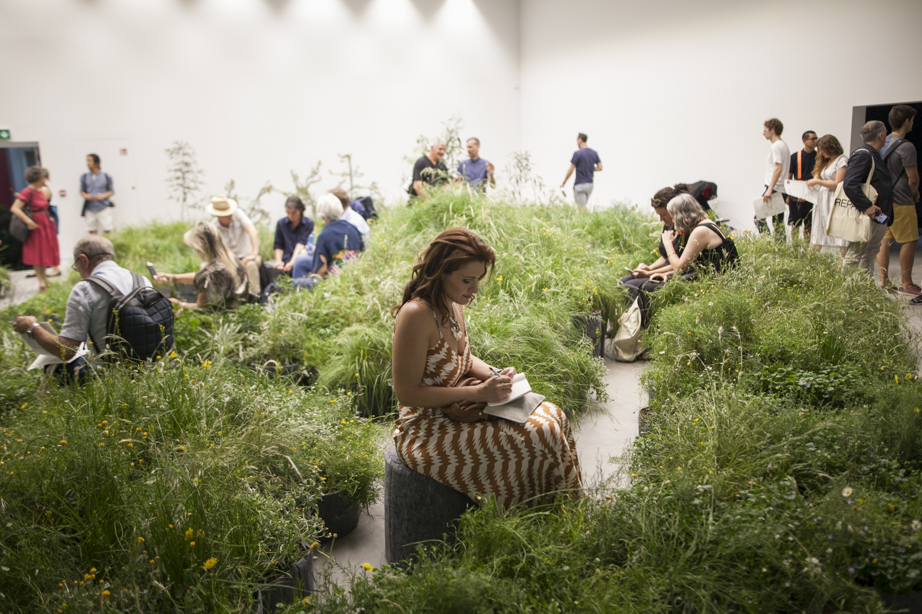

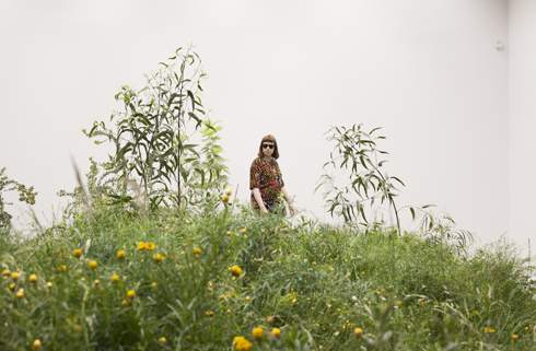
JP: The last two Australian exhibits, in the new pavilion by Denton Corker Marshall, have been displayed with enormous dignity yet informality, which I think is a remarkable achievement in any context. The former Australian pavilion was a corrugated iron shed by Philip Cox (built as a temporary structure in 1988, and never intended to last as long as it did): very Australian in its lightness and casualness, but thankless for designing exhibitions. The new one is a hermetically sealed black box, perhaps overcompensating for the shortcomings of Cox’s design. Paradoxically, though, because it is so sealed off from the outside, it feels even more like entering a garden shed. And I don’t mean it disparagingly: among the often overstuffed surrounding pavilions, the Australian exhibit was again an oasis of calm – plants, earth, sunlight, quiet.
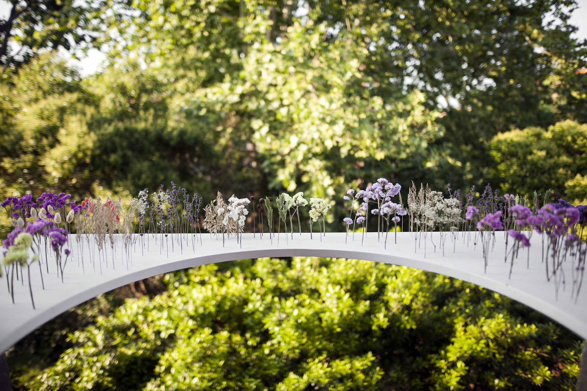
AN: Yes, I agree. I found it actually quite interesting to see where the pavilions are sited in the Giardini grounds and the anachronistic forms they took; Australia’s DCM-designed black-box pavilion was nestled literally out back, overlooking the canal with a fortress-like presence. Away from the bustle of the central Giardini, its exhibition I think at a very physical, sensory level provided much-needed respite from the fluxes of people and program that infuse the Giardini. It was perhaps the least showcase-like of the pavilions, attending instead to the theme of ‘repair’ writ large: from collecting the seeds of the threatened indigenous ecologies of Western Plains Grasslands and cultivating them in Italy (65 species to be exact!), to short two-channel ‘slow cinema’ works of 15 Australian projects that shifted away from architecture-as-object to architecture as an expanded temporal field of occupation.
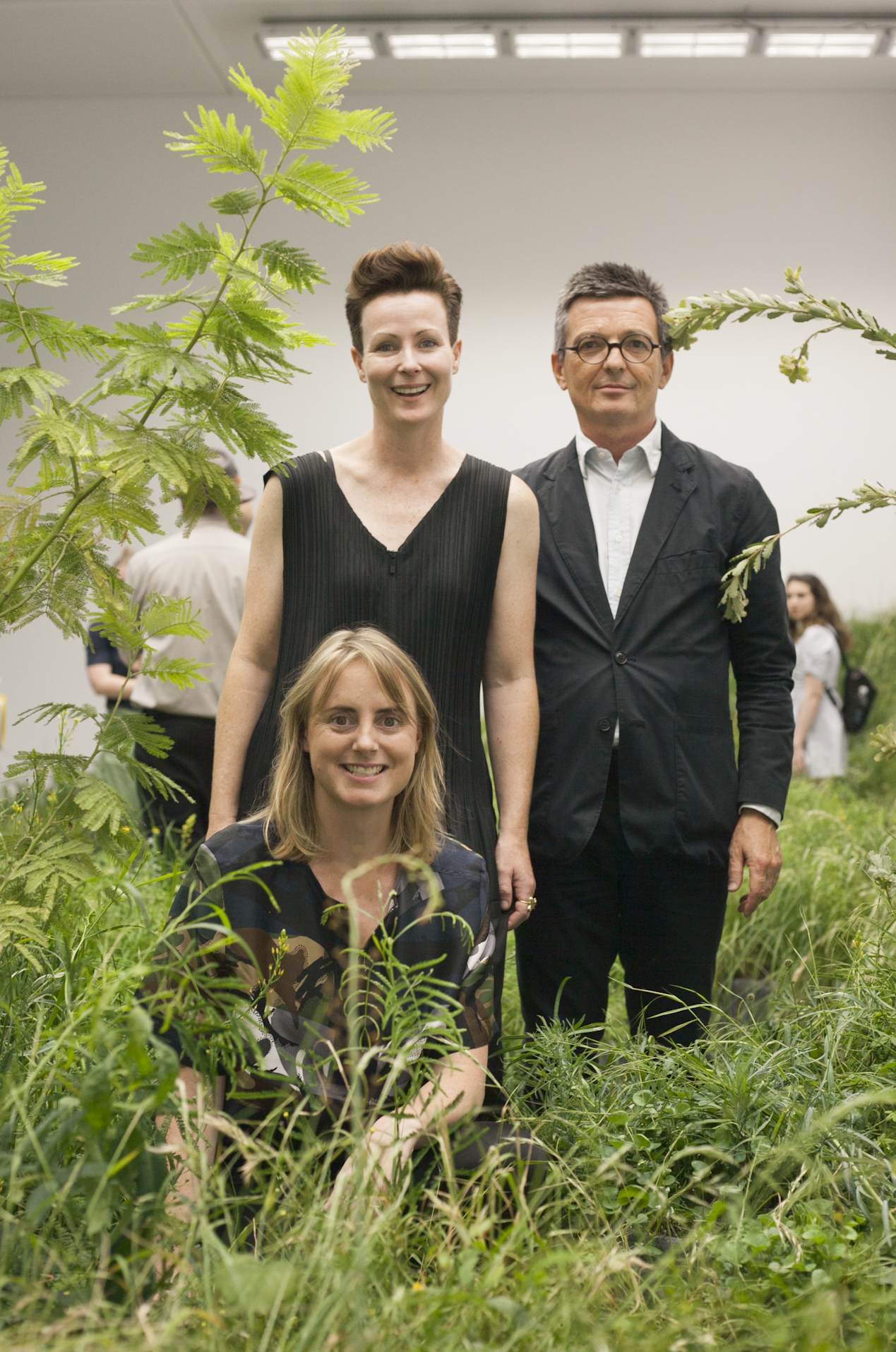
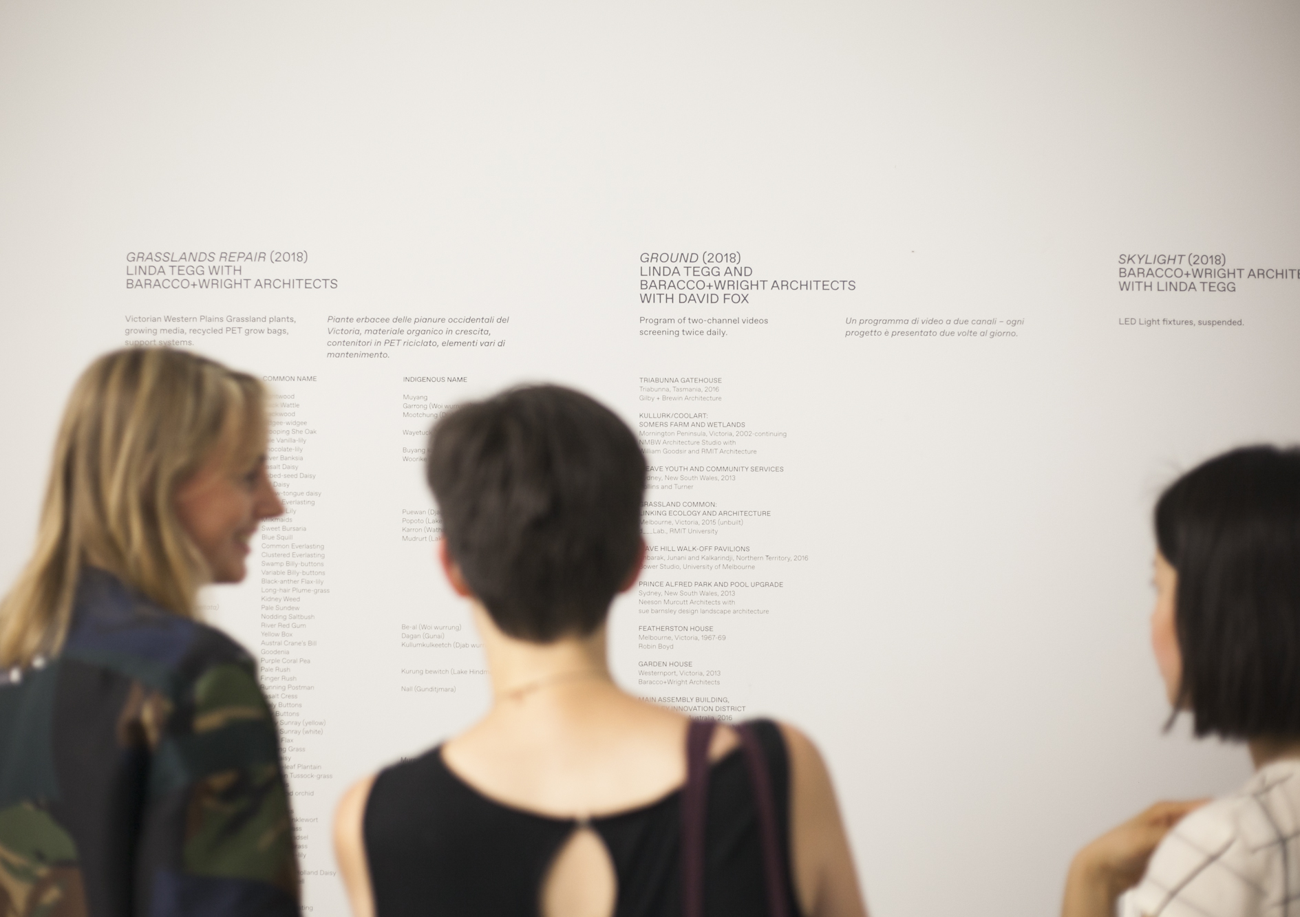
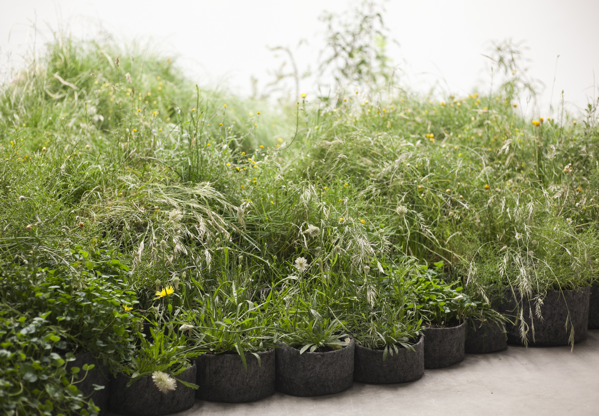
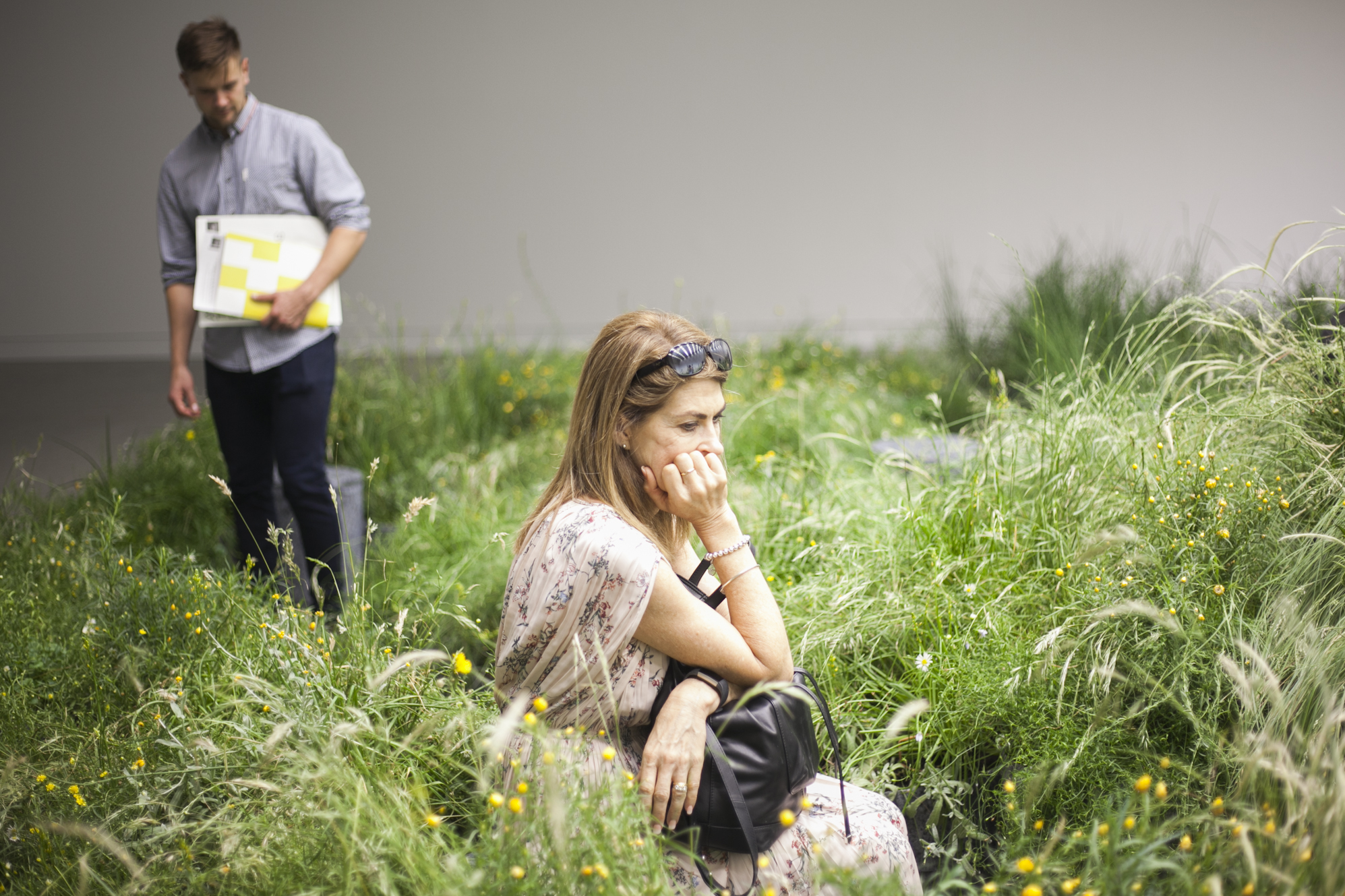
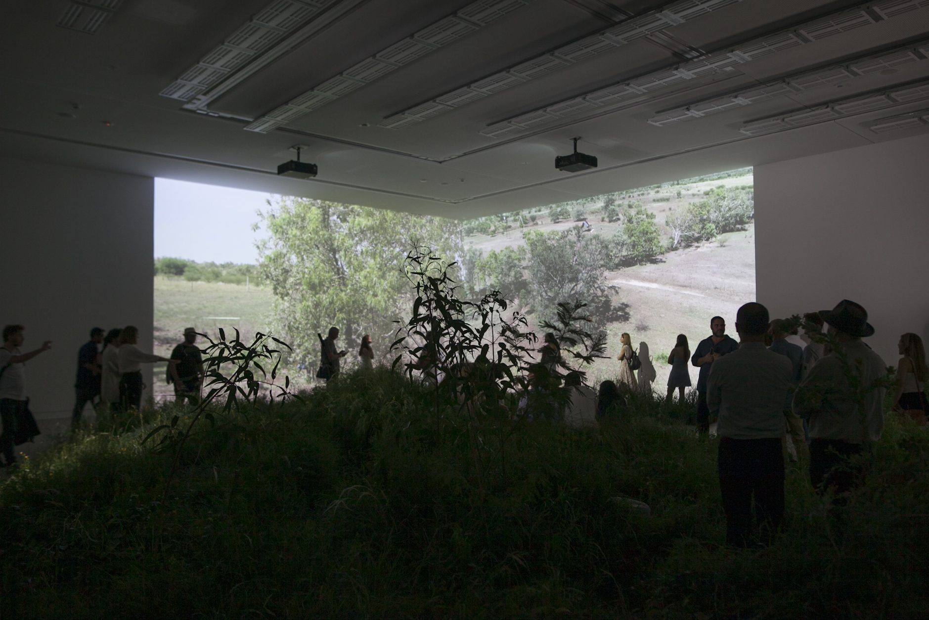
JP: And yet, and yet – this greenhouse-like recreation of elements indoors speaks to white Australia’s obsessive interest with the natural environment of the continent it has colonised, and the continuous sidelining of the First Nations’ people and their knowledge of the landscape, flora and fauna, and appropriate architecture. The political questions animating surrounding pavilions are of ownership, access, sharing, equity and generosity; Australia cannot join that conversation in earnest until the elephant in the room is named. Until then, we will keep sculpting a pastoral fantasia sawn off from context – perhaps unwittingly symbolised so well by DCM’s black box.
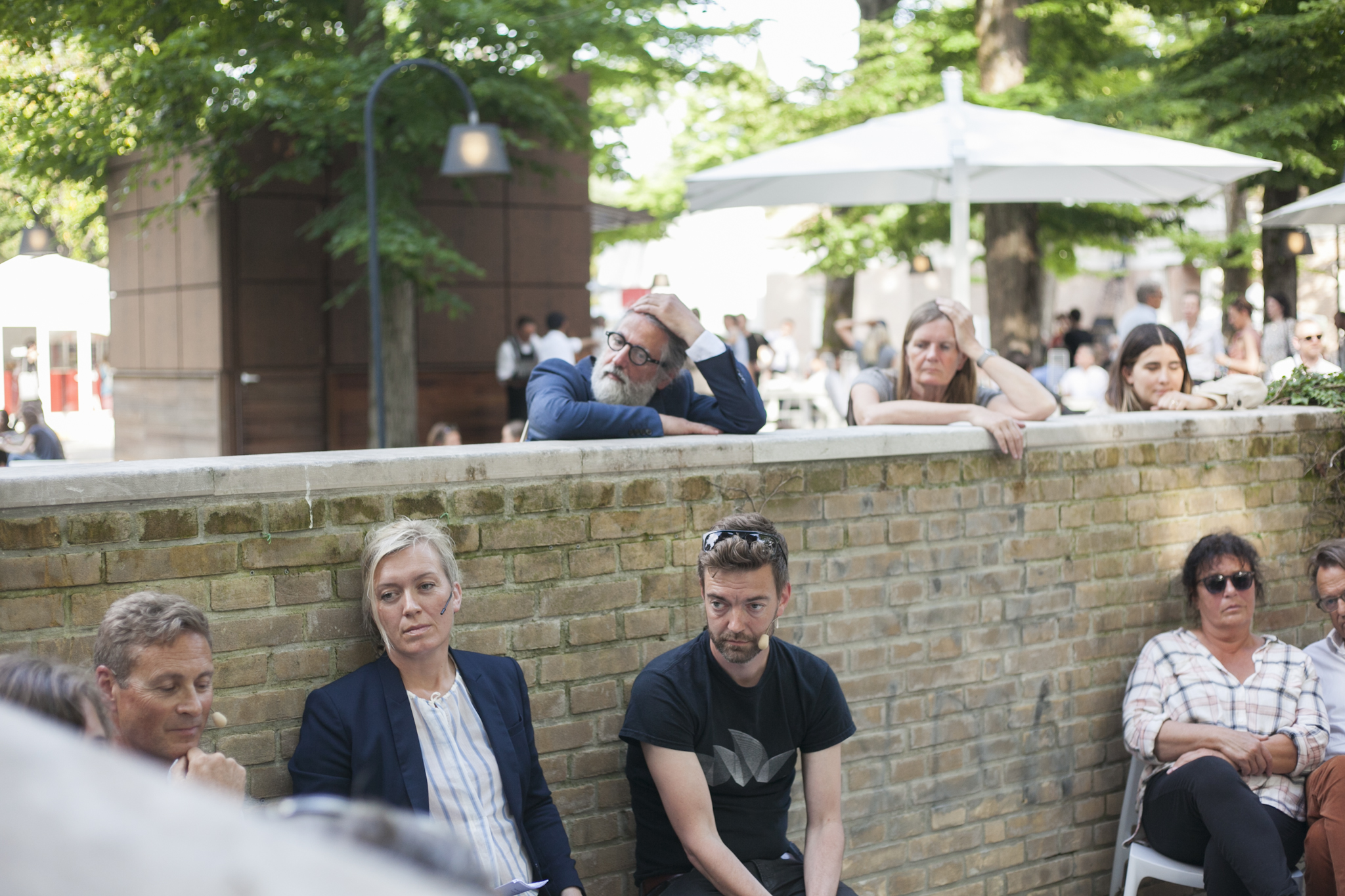
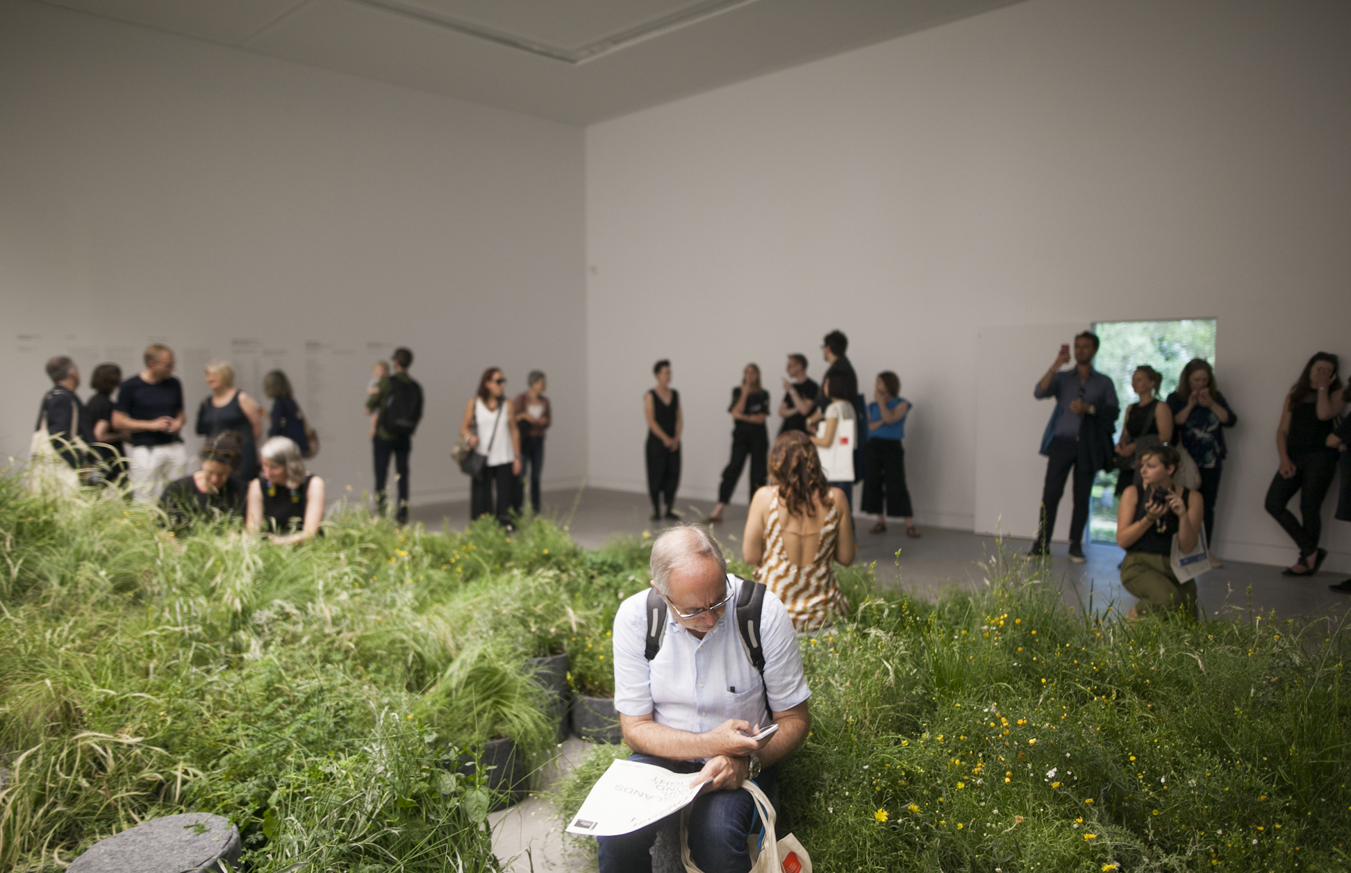
AN: I appreciated that Indigenous plant names were included on the wall next to the plants’ common and botanical names – a deliberate act to expose how many blanks exist, how many original names have been lost. Like everything else that deals with the concept of nationhood and representation, it also wasn’t without its moments of hesitation to name, as you say, the white elephant: such as the use of the terminology of ‘repair’ without necessarily discussing its extremely current sociopolitical counterpart definition of reconciliation with Australia’s First Nations peoples (which extends beyond ecological protections to citizenship rights and restorative justice). This would have opened up a curatorially thorny Pandora’s Box, but I think it’s still worth having those discussions and acknowledging their intrinsic and ongoing sensitivities in this international forum – and such a discussion we did have with curators Louise, Mauro and Linda.
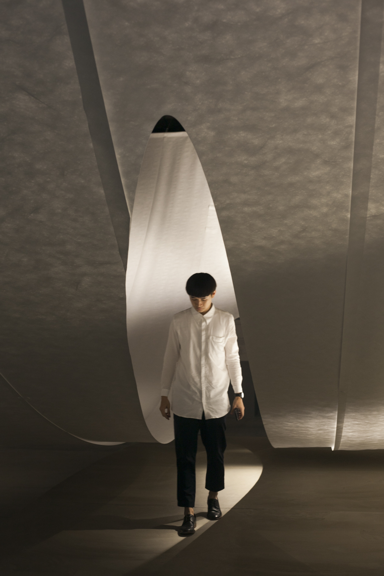
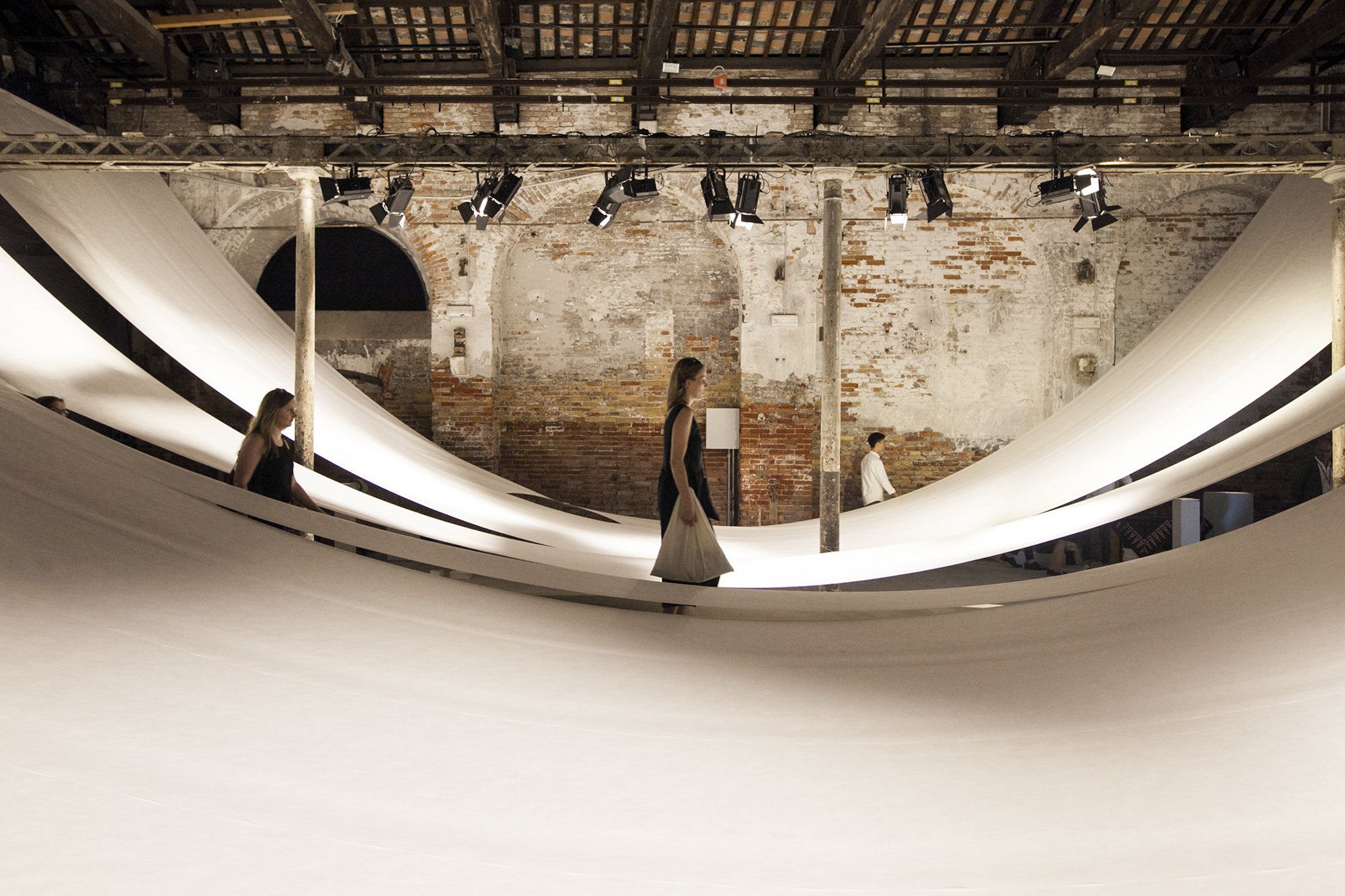
JP: One of the finest exhibits I saw was Indonesia’s Sunyata: The Poetics of Emptiness, which interprets the theme of ‘freespace’ through the Buddhist lens of ‘emptiness’ or ‘void’. Lead curator Ary Indrajanto described it as “the longest roll of toilet paper”. It is actually a continuous expanse of the same material used for astronauts’ suits, which slices the long space of the Arsenale diagonally and creates an experience of floating on a white wave; a remarkable, simple transformation.
Overall, while Giardini is dominated by delegations from Western European current and former mega-powers, I regularly find Arsenale to be a more welcoming space. The distribution of spaces at the Biennale is profoundly shaped by historical political forces, and the small space of Arsenale, where everyone shares one continuous corridor, seems to have ended up dedicated to the former Non-Aligned movement: the Balkans, Middle East, and South-East Asia. Bahrain’s exploration of the Friday prayer (‘what would the Friday sermon in praise of good design sound like?’), Lebanon’s mapping of density and sprawl, Ireland’s ‘townie’ concept – I felt I was taken on a trip around the world’s most exciting places, as opposed to endlessly waiting for culture ministers to finish their speeches.
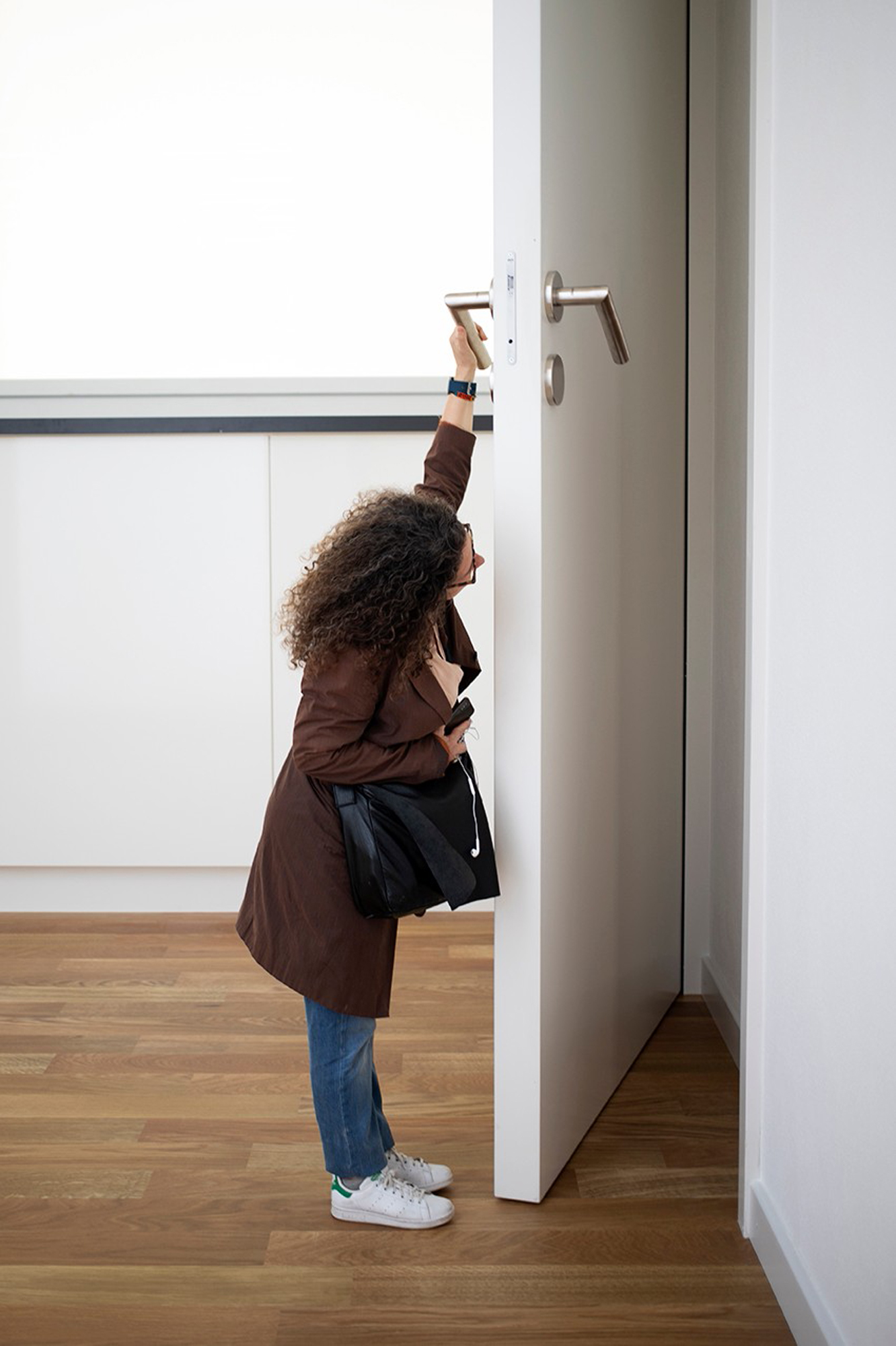
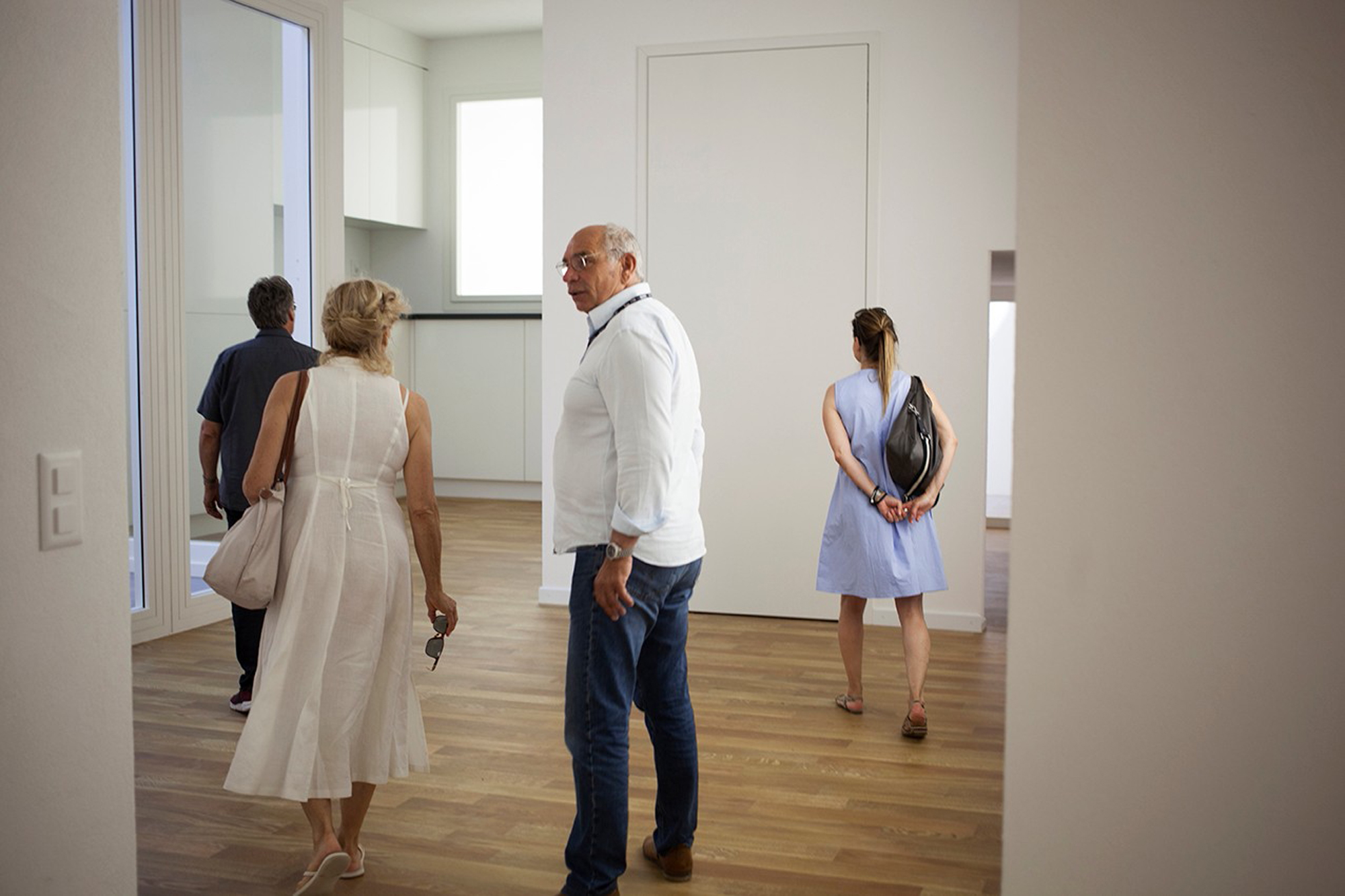
AN: On the notion of excitement: let’s add exhibitions which addressed the other end of the spectrum, the most banal, dull and homogenous aspects of universalising spaces. Namely, the generic apartment interior. The Golden-Lion winning Swiss Pavilion presented an Alice-in-Wonderland-like circuit of white-walled, parquet-floored apartments so reminiscent of real estate renders across the globe. It drew me in with its utter familiarity, only to surprise me with its distorted scales and warped perspectives. It challenged not only the human body in space but also questioned the putative neutrality of real estate. For me this went hand-in-hand with the display of the Star Apartment complex for Los Angeles’ homeless (located in the main Foundation Pavilion), which subverted otherwise blank-canvas scale interior models of apartment units that one might find in a display show-room, by populating them with colourful miniatures of the actual residents’ belongings. Furniture, clothes, kitchen utensils, wall posters and other human cues of a lived-in space … To me, these subtle but pointed interrogations of the ordinary and familiar, and the way architects typically represent them, also successfully present a specific politics of dwelling within the ambiguous, anything-goes frame of ‘freespace’.
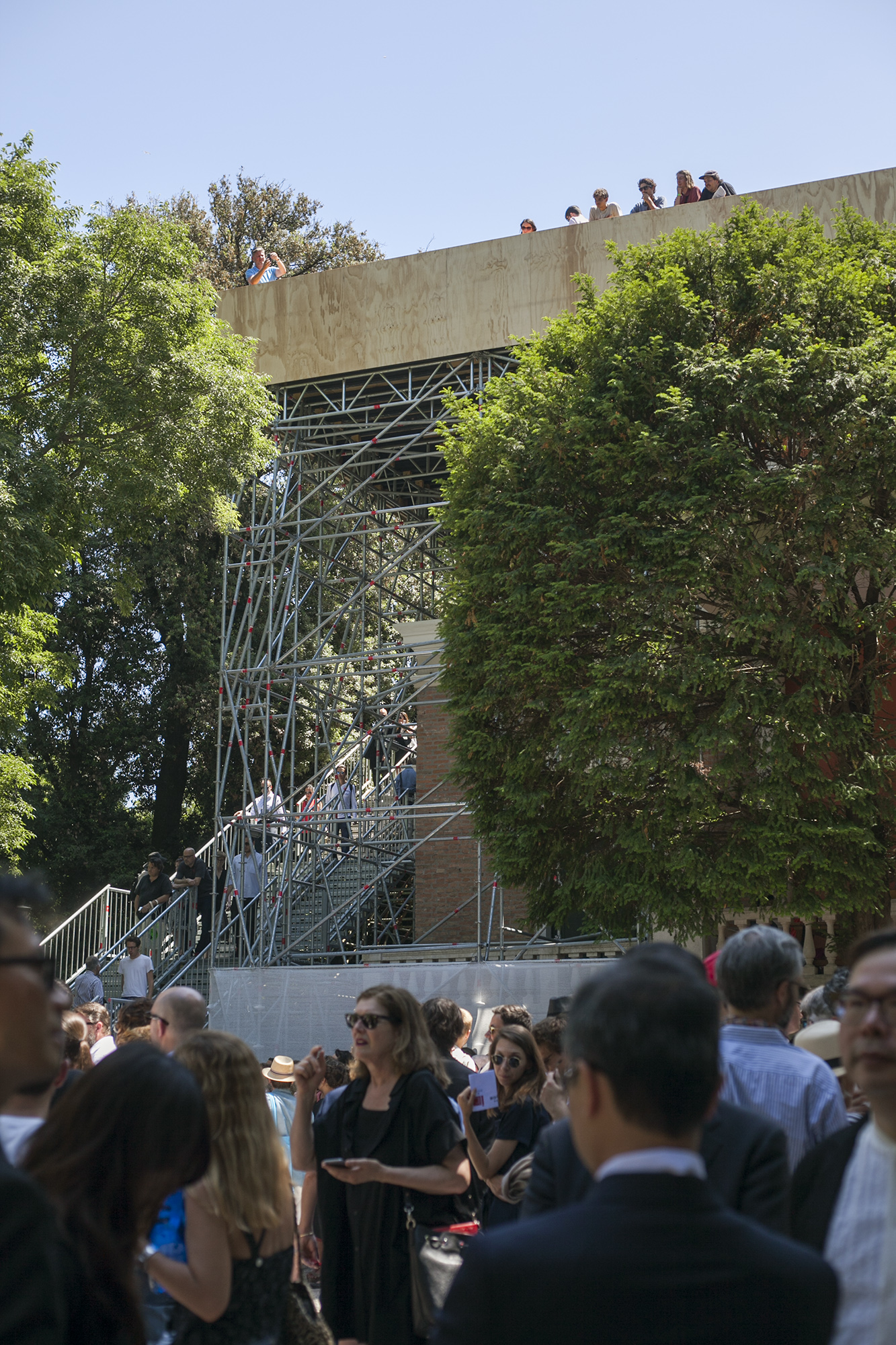
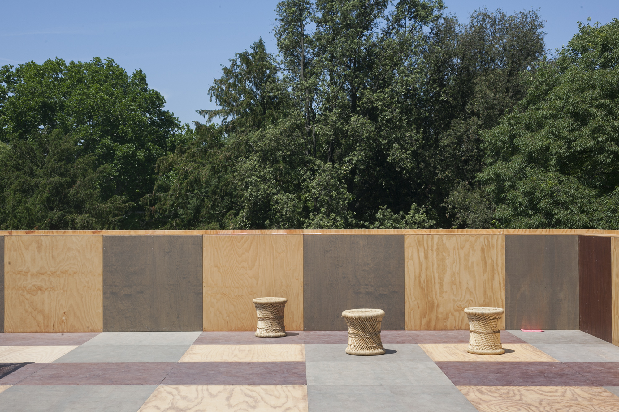
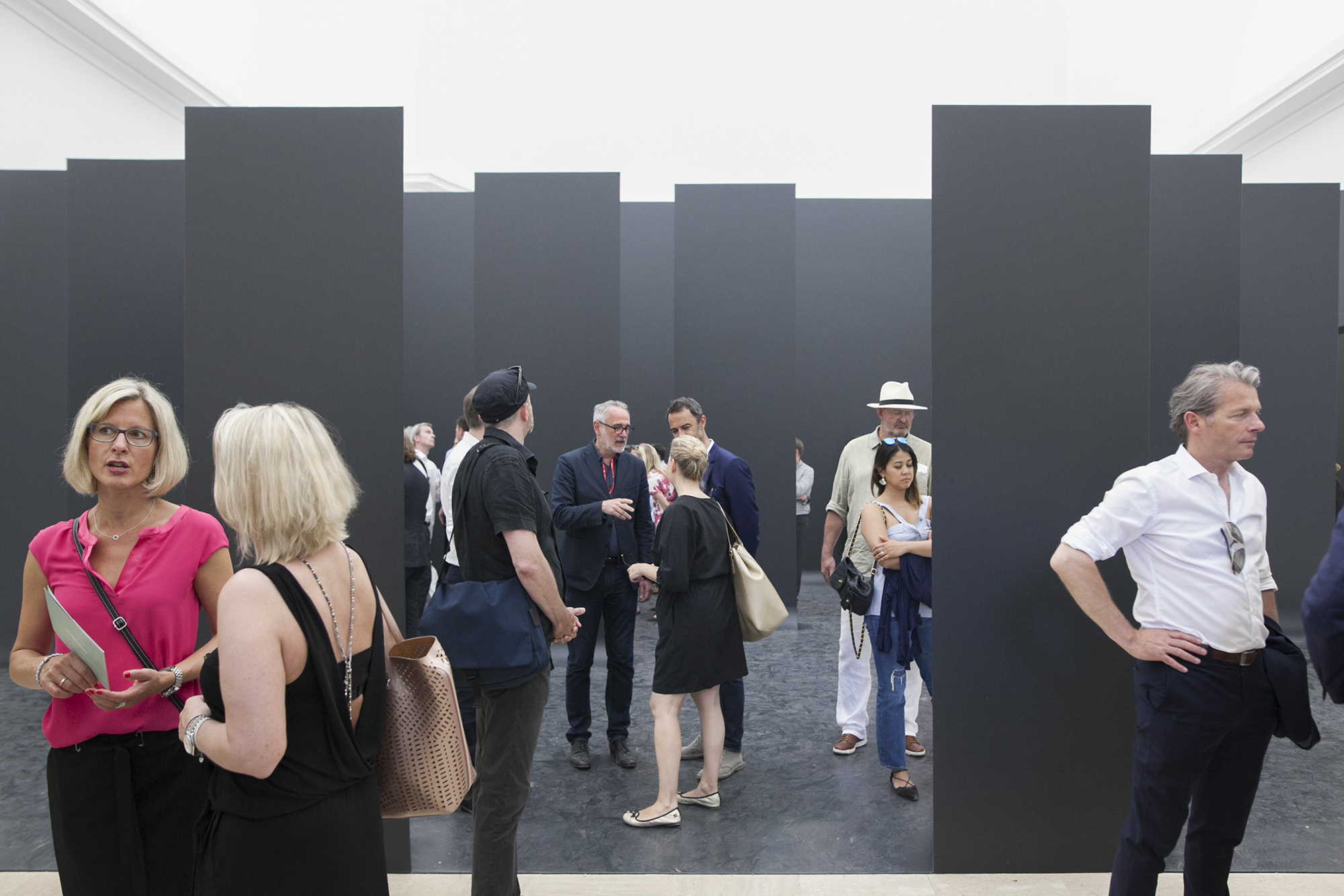
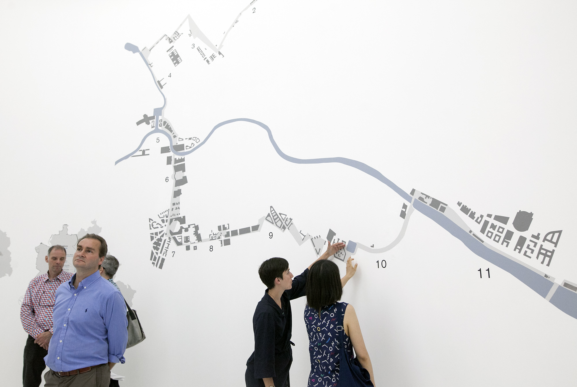
JP: Yes – though it was not an overtly political Biennale, politics did find its way in. Walls featured left, right and centre: the US Pavilion (unsurprisingly) looked at erecting walls, while the German Pavilion was entirely dedicated to the slow process of restitching Berlin after the fall of the Wall. Perhaps less intentionally declarative was the British pavilion, which was nonetheless read in the context of Brexit: an empty pavilion, no design interventions of any kind, visitors looking at scuffmarks on the floor from last year’s exhibition and trying to read meaning into it… And a scaffolded plywood square erected on the roof, from which to observe the Giardini like we have never seen before; detached, at a remove; and 4 o’clock tea parties every day. Title: Island. Is it a gesture of resignation? A metaphor for doomsday? I don’t know, but there is something remarkable about the total silent emptiness of the curatorial concept. It reminded me of the maxim about a good haiku being like a finger pointing at the moon: one sees the moon better if there is no jewelry on the finger. The Irish exhibit –dedicated entirely to depopulated small towns – was also read entirely in its political context. The same weekend of the Biennale opening, Irish people from around the world (Ireland has one of the largest diasporas of any world nation) flew back to vote in the referendum to repeal what was until then one of the strictest abortion laws in the developed world. The exhibit was absolutely read in the key of that event: small-p politics, and a remarkable display of solidarity that cut across socio-economic divides.
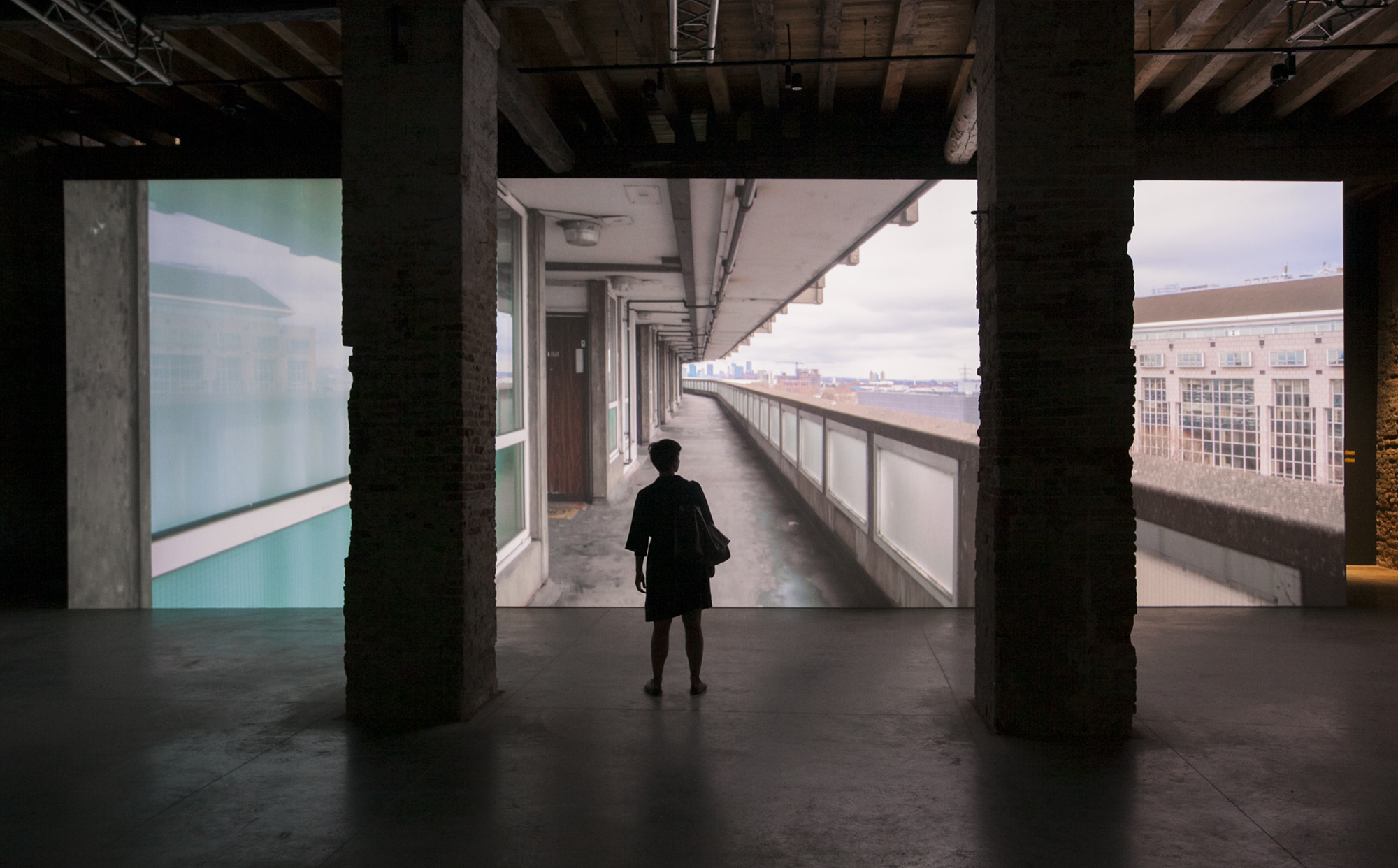
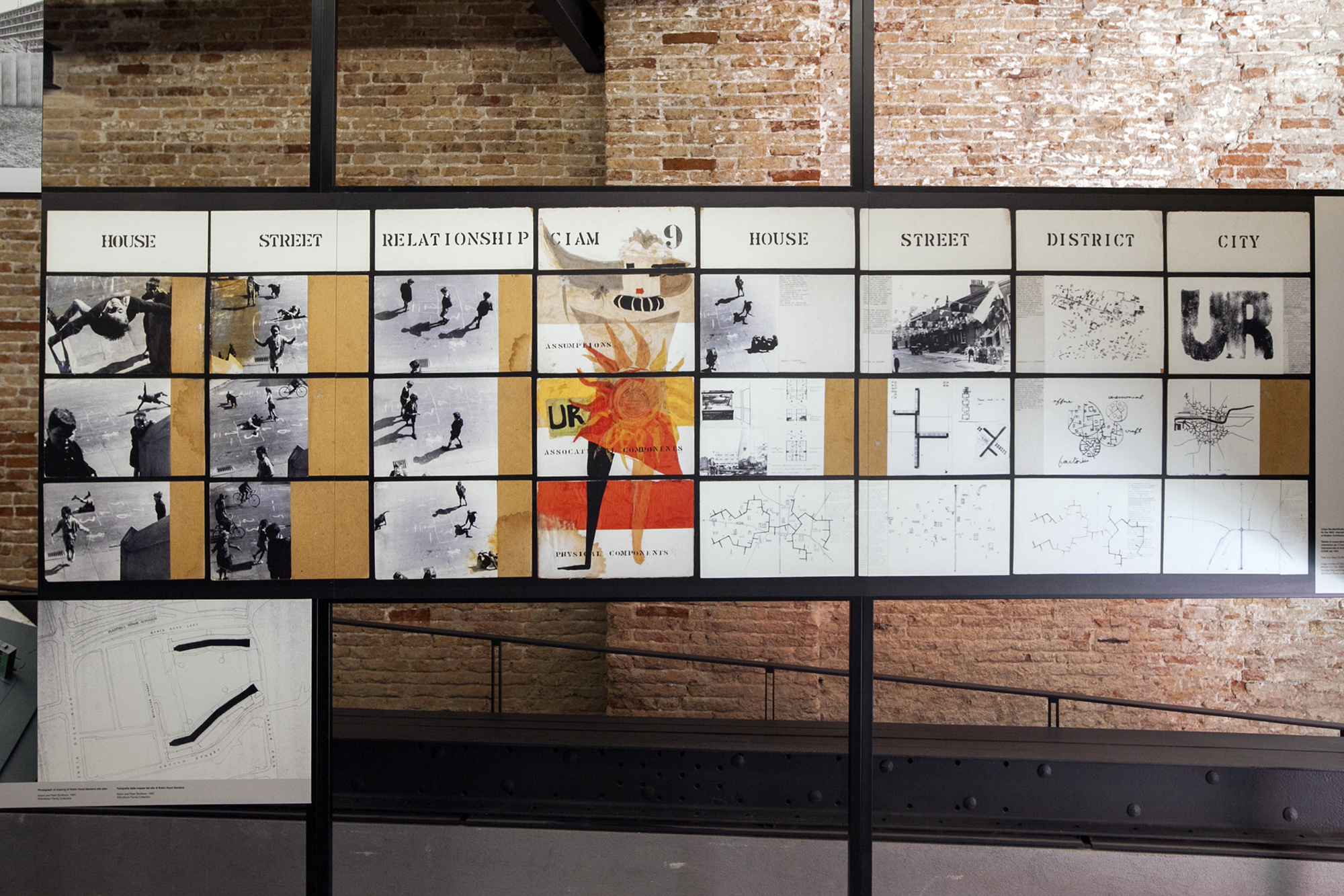
Social housing was another big theme. It seems like we are at a pivotal moment in deciding whether affordable housing should be left to the market or reinvented as a social service. The Grenfell Tower inquiry resumes this week in the UK, looking to assign responsibility for the fire that took 72 lives almost exactly a year ago, due to funding cuts to the public housing sector. Meanwhile, the demolition of Robin Hood Gardens, Alison and Peter Smithson’s biggest built project and one of Brutalism’s most significant works, begun at the end of last year, to be replaced with a mix of social and market dwellings. Last month, V&A Museum announced it was acquiring a fragment of Robin Hood Gardens, and its pavilion in Venice this week was entirely dedicated to the building: its construction in the 1960s, its first exhibition in Venice (the Smithsons showcased it here in 1976), its occupancy, and its demolition.
While we should train our eyes to see the merit in (admittedly bleak) estates such as Robin Hood Gardens, I must admit that I found much more uplifting the exhibition by Unfolding Pavilion, which occupied one whole apartment in the still-standing public housing complex in Venice, designed in 1982 by Gino Valle. The complex combines spatious, light-filled triplexes, duplexes and single-story rowhouses, connected with campos and elevated porticos in an extremely fine, Postmodernist reinterpretation of Venetian urbanism. (It would be hard to find an apartment of such quality to buy anywhere in Melbourne, no matter the price.) Curators Daniel Tudor Munteanu, Davide Tommaso Ferrando, Sara Favargiotti have struck a deal with the Venetian housing authority that will see the apartment refurbished and leased to a family at the end of the exhibition, thus making a net contribution to the city’s unaffordable housing market.
Both projects make a point that public housing used to be a significant area of public investment, an opportunity for architecture to interrogate housing typologies, and a major source of employment: in the 1970s, 49% of British architects worked in the public sector; today it is 1%. But Unfolding Pavilion brought a celebration of good design to what is often a dour topic: the enthusiasm of the young architects on opening night was infectious. If that night is anything to go by, public housing may be making a comeback. I sure hope so.
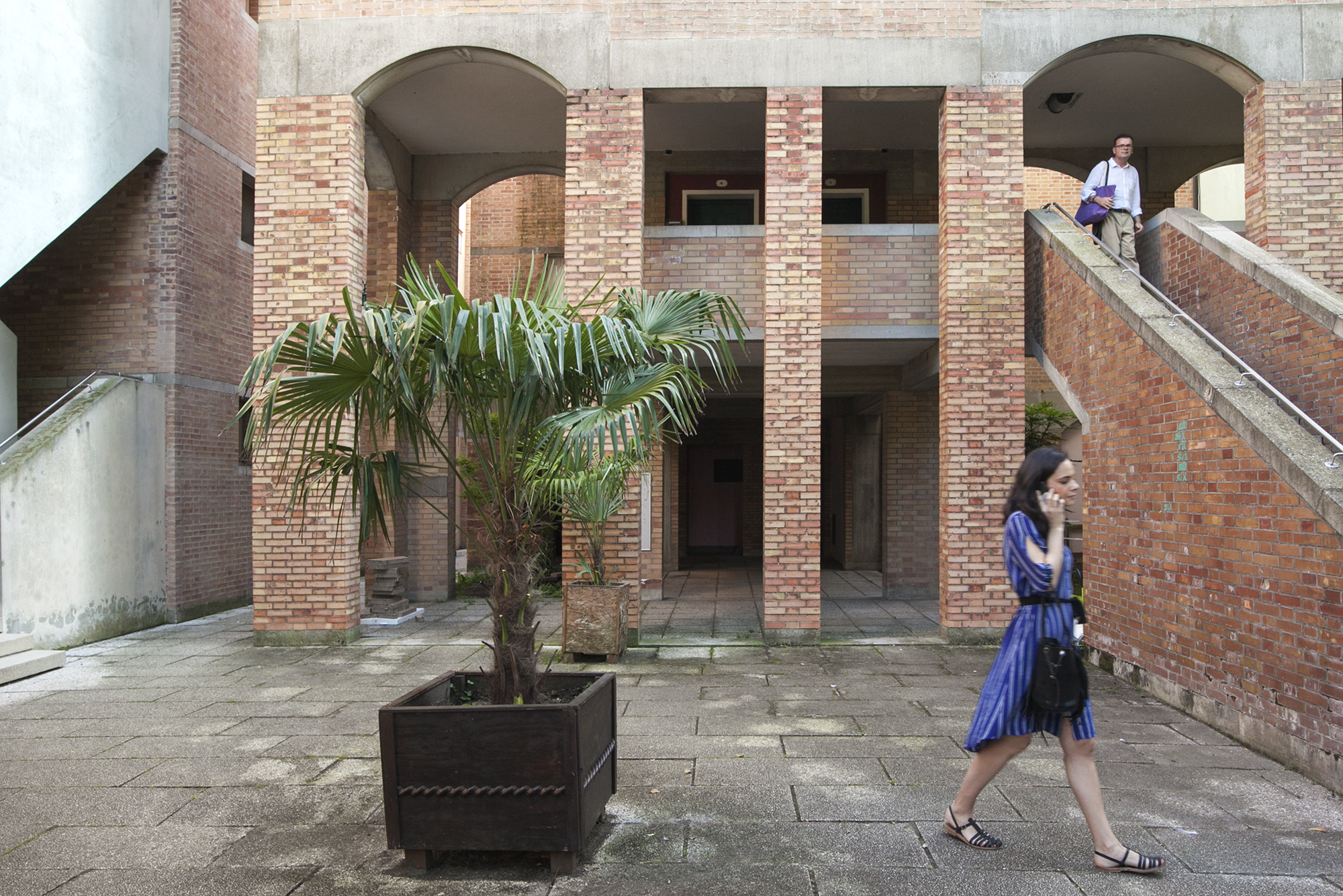
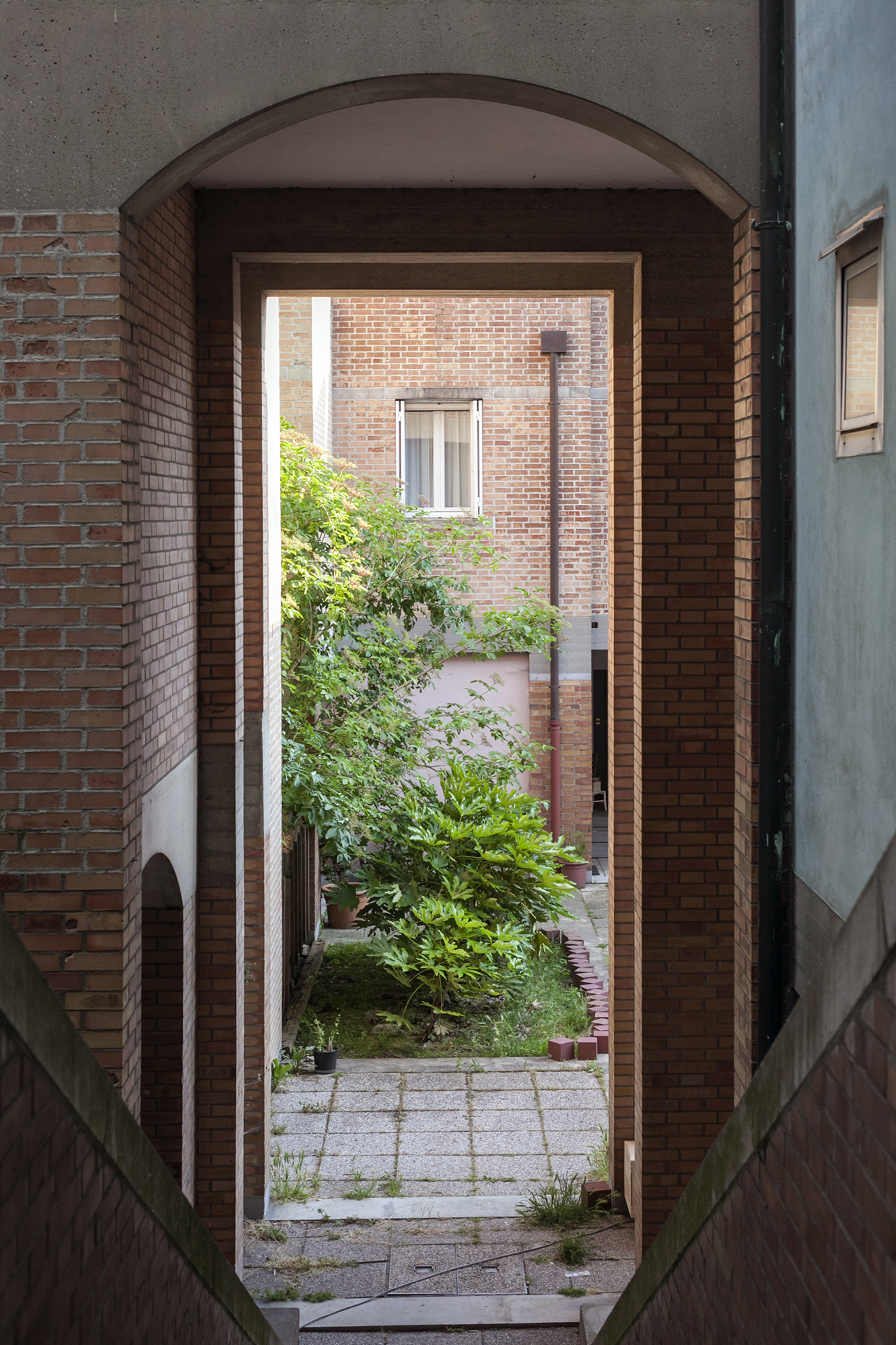
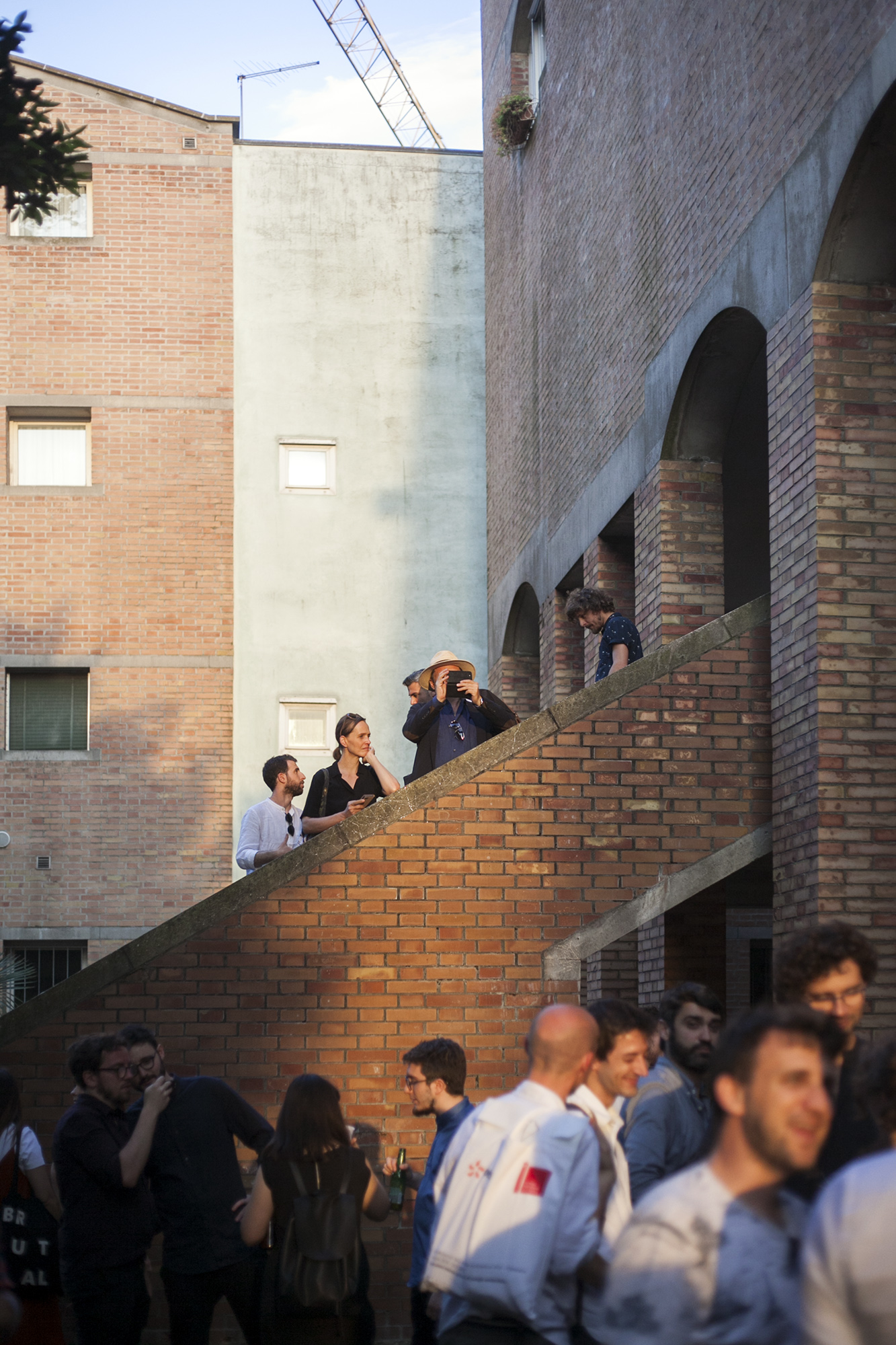
AN: Yes, it was really wonderful to see first-hand the spatial generosity of Valle’s housing complex – for example, the cascading of apartment heights such that each unit gets a view of the lagoon – and the modest interventions that the architect-curators are making to bring a vacant social housing apartment up to code and thus fit for occupancy, such as repainting the interiors themselves. This deep investment and care in reviving social housing stock is probably one of the most genuine responses to Farrell and McNamara’s curatorial call for “a generosity of spirit and a sense of humanity at the core of architecture’s agenda”, again raising another dismal irony: the Unfolding Pavilion was actually not a part of the Biennale’s line-up of collateral events as it would have cost €15,000 in admission fees to formally register with the Biennale Foundation. The business of the Biennale in many ways works against rather than for these smaller projects that genuinely aim to ‘free’ spaces for equitable use.
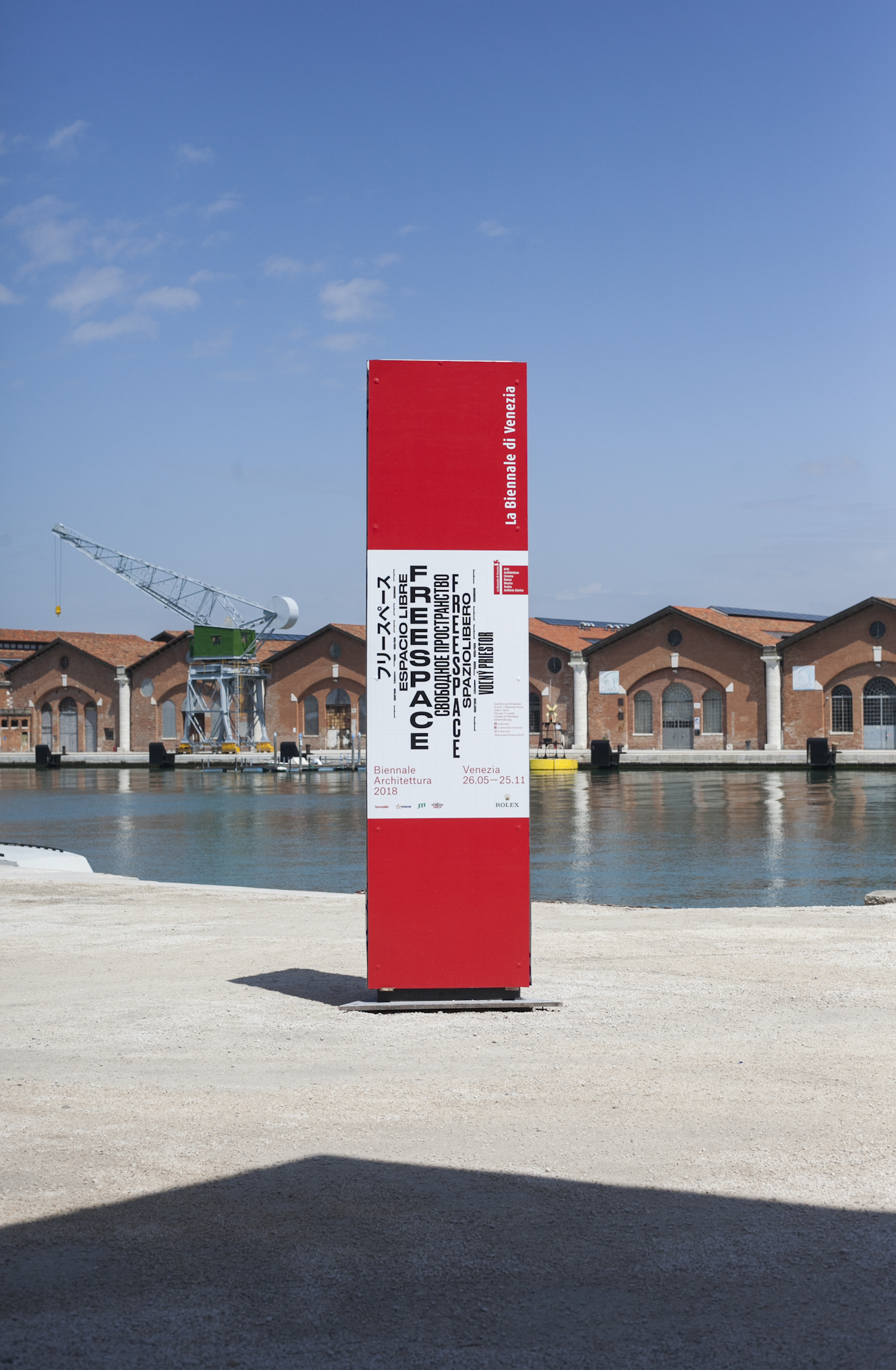
The 16th Venice Architecture Biennale opens to the public on 26 May 2018 and continues until 25 November. Tickets and news on the website.