Blood & Thunder
What first drew you to the Risograph and stencil printing process?
I had finished studying at Köln International School of Design in Cologne and got a job in Amsterdam designing The Green Pepper, a European Union-funded cultural and political magazine with limited production budget. I wanted to do a whole lot of things that I didn’t have the budget for and that was very frustrating. Then I was introduced to Ian McIntyre who was from Melbourne, but on holiday in Holland at the time. Ian had been making zines for a long time (the influential Woozy and How to make trouble and influence people) and he introduced me to Knust and Extrapool. Extrapool was founded in 1991, but the stencil workshop Knust (co-founder of Extrapool) began in a squatted social centre and has been around since the mid 80s. Knust recognized the advantages of stencil printing machines: it’s easy to work with spot colors, inexpensive and quick to do reasonable sized print runs. Coming from a web design background where I had been running a web design studio, if the programmers didn’t do things the way I wanted, I could fix the coding myself. I was approaching print the same way, which was very exciting.


What is Risograph printing?
Riso is a brand of stencil print machine. Stencil printing [a high-speed digital printing system designed mainly for high-volume spot colour photocopying and printing] is the type of printing. A number of different manufacturers make stencil printers: Riso, Duplo, Ricoh to name the largest.
What does the Heidelberg press do?
The Heidelberg Platen 10×15 grey model is a platen letterpress printer. I bought this because I wanted to achieve a more architectural print result for clients who need a sharp, clean and contemporary aesthetic. Letterpress is often associated with a bit of a folksy ‘twee’ aesthetic, but this isn’t what interests me in these machines. They can achieve much cleaner lines than I can with the stencil printing and I can use very bold spot colours that I mix myself whereas the Riso has a very limited colour selection. The Heidelberg also handles coated and very heavy stocks which the Riso does not.


Tell us about how Blood & Thunder started…
After living and working in Holland and then Barcelona for seven years, I came back to Australia and I wanted to make some small publications, but I couldn’t find a stencil printer in Sydney. A group of us got together and bought one and started the collective the Rizzeria. Coincidentally, this was around the time of the GFC and the distributer of Riso machines let me know that they were liquidating assets… there was a showroom model available at a hugely discounted price. So we (Mickie Quick, Leigh Rigozzi and I) all got out our credit cards and started working out of a space called Sydney where Jimmy’s (Jimmy Singline of Good God Small Club) Record Stand was. After around 6 months, we needed to move and had to work out how the machine was going to pay for itself. Blood & Thunder was originally going to be a comic book venture but it was too challenging to run a business from just designing and printing comics, so I brought in more design work. As we got more and more into design, I decided to buy the other guys out to make a full service design company that can provide everything from printing to designing and developing complex websites.


You are also a “publishing concern”: a graphic design studio specialising in creative concepts, strategy, research, web and print production: tell us about the kind of people and projects you work on and with. How do pixels and print come together in your process?
It’s 80% design work and 20% production; all of the design is informed by an intimate understanding of the production processes for both print and online. The first job I ever did was in 1998, while I was still at high school, designing the Mambo website. Initially my friend Georgia Blake got me a job counting labels. One day, the website guy totally disappeared, so I very shyly went up to the art director and told him that I could do the web work and they took me on. I took their shop online with a team of programmers – that was the time leading into the Sydney Olympics – Mambo’s heyday. The internet in those day was very much “do it yourself”, it wasn’t DIY in the punk sense, it was just that if you needed to achieve something, it was generally just as easy to learn how to do it yourself. That is very much what informs Blood & Thunder. People come to us with a certain budget and want to get as much with it as they can. Generally asking bigger print houses for three spot colours often means you need a seven or eight colour printing process which costs more than it needs to. Instead, we have machines that allow us to do it a lot better, so it’s really an approach for us.

What’s a typical week in the studio?
On Mondays I teach design and printmaking at the School of Architecture at Sydney University. The rest of the week, I am working with clients which means moving between arts organisations, clients in the fashion industry, the music industry, artists and photographers. Often there will be print press checks on bigger print jobs, for example the latest Performance Space catalogue; this sometimes means going out to larger printers at 2am in the morning to fine tune the colours, placements, ink levels. The week also involves a lot of emailing, meetings, presentations, checking on website and programming jobs and print production.


Can you tell us about your favourite projects?
Minto the typeface, designed and produced during a residency with Campbelltown Arts Centre and Sydney Festival in 2011 for Minto: Live, curated by Rosie Denis. Working with Good God (one of Sydney’s most exciting independent music venue and bars) has been an ongoing relationship. Blood & Thunder started in the living room with Good God’s Jimmy Singline and Hana Shimada so we have a very close working relationship. University of Western Sydney’s Transit Labour Digests with Professors Ned Rossiter and Bret Nielson. This series of publications has been going on for 3 – 4 years and is now rolling into a line of research and design in the area of global logistics. Designing and printing Performance Space’s Local Positioning Systems poster part of the relaunch of the MCA, a program put together by Performance Space for the relaunch. It was inspired by Ettore Sottsass and uses a type face by Karl Nawrot, a French graphic designer.


Would you say you have a defining style or aesthetic and if so, what? Or, what are the kinds of things you are drawn to?
It’s a style or really a culture and tradition that started at Tin Sheds (a hothouse of art, music, ideas and politics and at that time, one of the most radical and memorable ‘alternative art spaces’ in Australia) in the 60s and 70s. The anarchist poster collective Earthworks who produced some of the most left-of-centre, humorous, overtly political and cheeky posters of the decade. Also, Lucifoil and Redback Graphix who were screenprinting collectives that came out of Tin Sheds, as well as Icon Graphics linked to Phantom Graphics and Skull Graphics linked to Red Eye Records and Black Eye Records. Many of those artists went on to work with Mambo in the 80s and 90s. It was a tradition of printmaking and graphic work. Aesthetics informed by production and not settling for bad quality photocopied flyers. Australia has a tradition of amazing band posters with incredible compositions and fluoro colours. Many of which are now held in collections at the National Gallery of Australia, MCA and the Centre for the Study of Political Graphics in the USA.

Who are publishers, designers, printers, artists you admire, locally and globally?
Joyce and Jan-Dierk Knust of Extrapool. They are the godparents of the Riso movement. The publications they print, with the curated visiting artist programme, the nights they put on in their space and their printed wallpaper project. Le Dernier Cri, an incredible roster of artists, screen-printing and offset printing. Norakuro publications by Suiho Tagawa from the 1930s (pioneer of Japanese comics) they are the most beautiful comic works, stunningly printed objects, wild patterns. Aesthetic jumps from one style to another all by the one artist. Something I keep coming back to. There is no real literal translation the inspiration just manifests itself in different ways; colour separation etc. Dutch typographic designer and teacher Karel Martens (one of the most influential and enduring designers alive in the Netherlands today). Martens has tried to communicate visually, where things are stilted, it makes you stop and think. It makes you give it more consideration, which makes you more invested in it.


An exhibition catalogue by Ettore Sottsass is a good example of a grotesque approach… something that has really come back in with design these days. It has this ugly and jarring aesthetic, which makes you think. Factory Records: The Complete Graphic Album publication by Matthew Robertson. I studied at UWS under Matthew Robertson, he was obsessed with Factory Records and design being really specific to a time and place. As my tutor, he constantly asked us to consider: where we are? Where you have come from? What’s around you? How does the work reflect that? Blood & Thunder, Big Fag Press, Rizzeria collective are an easy answer to the questions Matthew asked – they’re a reflection of our times, a group of people coming together around specific print machines. Each machine has it’s own aesthetic and unique style which is world class, but definitely not an international style.

What’s in the crystal ball for Blood and Thunder?
Keep growing, working with our roster of long-term clients and also new ones. Coming up, we have Blood and Thunder Comic Anthology #2, launching on May 23rd at Kinokuniya by Glen Barkley, who started the zine fair at MCA. Continue the work and teaching that I do at the School of Architecture, Sydney University. Taking graphic design into the public domain and using design for place making through signage, wayfinding, and identities for buildings. I like it because it has a direct social outcome in that you are helping people, not just selling them things, by helping them relate to a place.
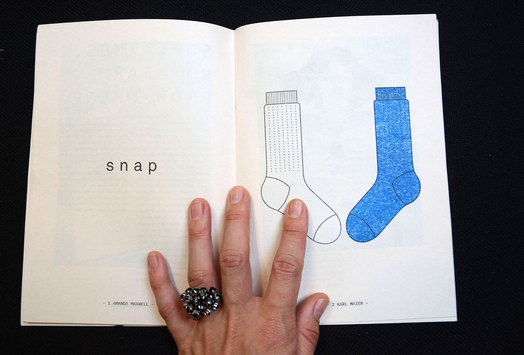
Feature image (top) is a spread from the DOUBLE GLAZED publication, Even Books. A Blood & Thunder Risograph publication, exhibition design and production. DOUBLE GLAZED was an exhibition of words and art curated by Even Books. Photo by Rafaela Pandolfini.