Takaharu Tezuka on social structures
“Architecture is consciously made to support those cultural activities and social structures that are unique to human beings… it may be described as the nexus for all human activities.” So says Takaharu Tezuka, true believer in the transformative potential of architecture. He speaks with Maitiú Ward about the enduring influence of Richard Rogers and the importance of the humble roof as a social structure in the work of Tezuka Architects.
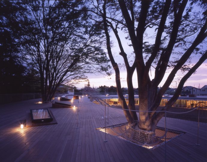
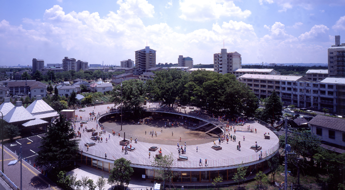
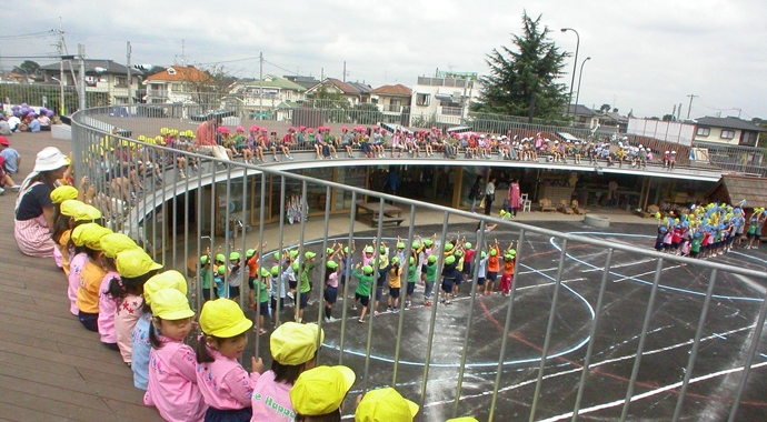
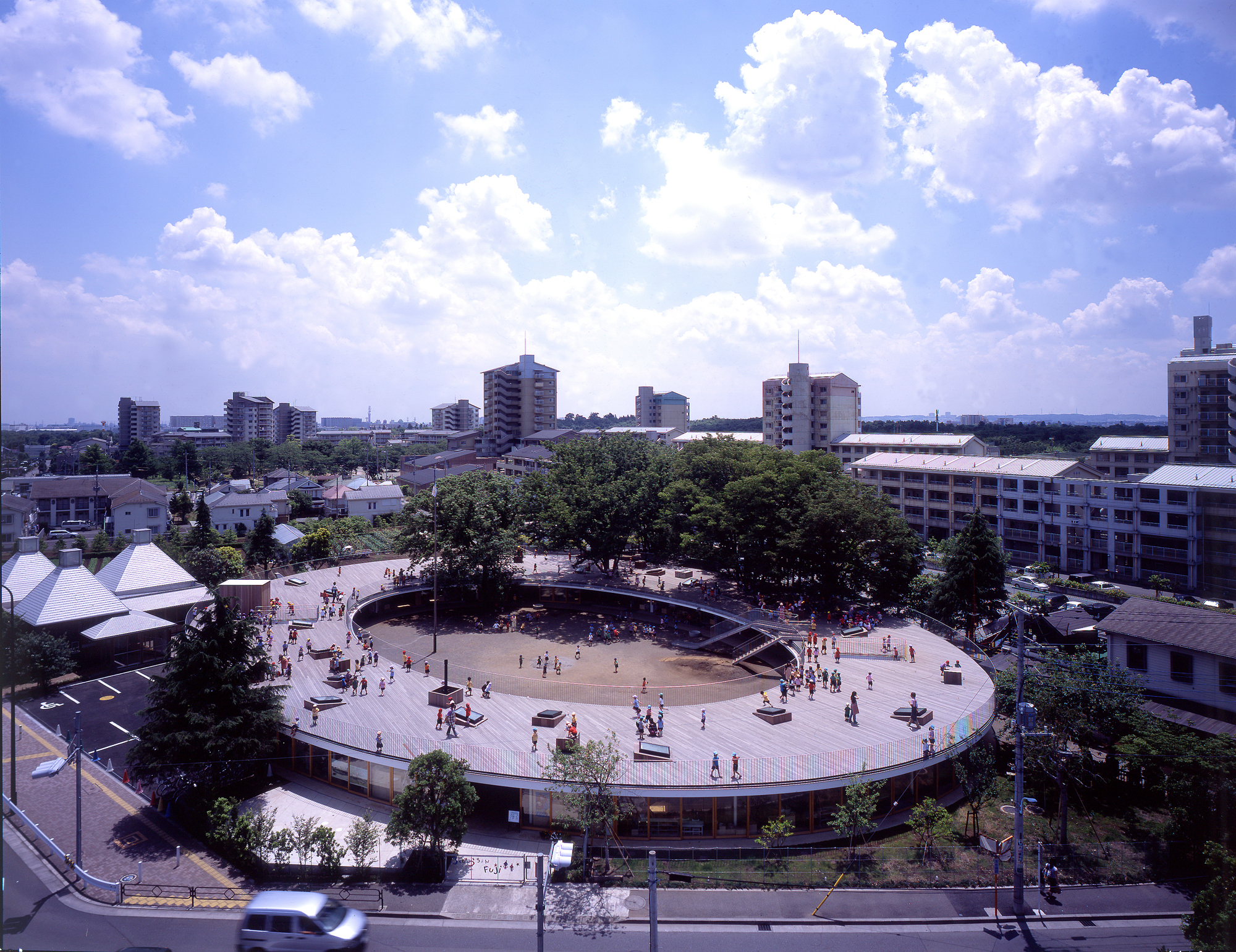
There’s an anecdote that Takaharu Tezuka likes to tell about his early attempts to publish his project Fuji Kindergarten in an architecture magazine. “I remember one editor told me, ‘If the roof was more wavy, I could give you more pages,’” he recalls. “That is what happened! And actually the project as published in that magazine, there’s no children. They wanted a picture without children…”. Tezuka recounts this incident to me across a half-eaten breakfast of poached eggs, the look of incredulity on his face sharpened by jetlag. He has flown into Melbourne for the Australasian Student Architecture Congress, where he is presenting, and will fly back that evening to Tokyo, where his practice is based. Designed with a deep sense of empathy for the building’s tiniest stakeholders, Fuji Kindergarten is a small and deceptively simple work, yet it is also the project that has brought Tezuka Architects, which Takaharu co-directs with his wife Yui, the most international notoriety. It was completed in 2007, on the cusp of the Global Financial Crisis, when the world of architecture and design was still deeply enamoured of the acrobatic forms produced by the so-called ‘starchitects’ – the Frank Gehrys, the Zaha Hadids – of the previous decade. At the time, no one was quite sure what to make of this kindergarten, which seemed to be more rooftop than building. With not much beyond a circular timber roofdeck wrapped around a dusty, well-trafficked courtyard and the odd tree, it certainly didn’t provide the glamorous eyeball-fodder the world had come to expect of its architecture.
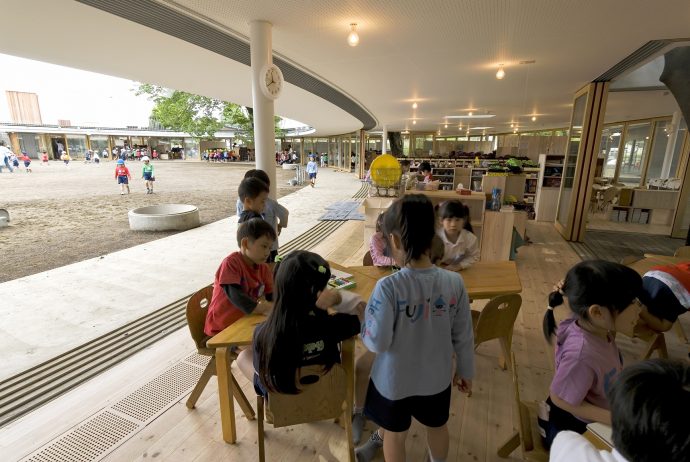
Things have changed a lot for Tezuka Architects since the completion of Fuji Kindergarten. After the Great Recession kicked in, tastes were sensitised to excess, perceived or real. And the exuberant shape-making popularised by the starchitects began to seem suspiciously wilful, egotistic; tainted, certainly, by the greed and ruinously opaque financial instruments that paid for these sculptural forms. In turn, Fuji Kindergarten, began to seem like starchitecture’s humble antithesis: by building as little as possible, it preserved as much of the existing play area as possible, and even went so far as to allow its roof to be subsumed under yet more play area. And so, in due course, came appreciation and attention – videos by Monocle, magazine features and TED talks.
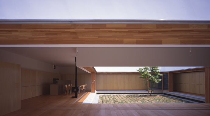
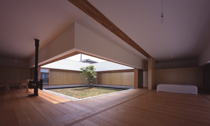
The Tezukas established their practice in 1994 and, like fledgling architecture studios the world over, spent most of their early years designing houses. Characterised by a precisely calibrated minimalism, natural timber finishes, and operable screens of varying transparency to draw in the world outside, it’s tempting to see these buildings as quintessentially Japanese. It’s a descriptor that Tezuka regards with bemusement, though. “I’m not trying to be Japanese, but I can’t get rid of my accent! It’s part of my genes,” says Tezuka. “It was an Italian photographer that first told me that my architecture is very Japanese, but I was trying to be international!”
In actuality, Tezuka’s biggest influence hails not from Japan, but an island nation on the other side of the world. In the early 1990s, Tezuka moved to London, where he went to work for Richard Rogers, one of the leading progenitors of British ‘high-tech’ architecture. “At that time, Richard Rogers had recently completed Lloyds of London. I went to see it and it was really shiny, impressive – I didn’t have words to describe it, it was overwhelming,” recalls Tezuka. “I didn’t have any other choice but to work for him.” At face value, Rogers’ shimmering, muscularly engineered mega-structures seem odd parents to Tezuka Architects’ grainy, humbly proportioned buildings, but their machined facades disguise a very particular understanding of architecture’s purpose that Tezuka shares. “At the beginning of my experience with Richard Rogers, I loved high-tech architecture – then one day I had a chance to visit his mother’s house,” he says. “I was so impressed, I started to like the house much more than Lloyds of London.”
It’s an over-used term, but in the history of residential design, the Rogers-designed 1969 Wimbledon House truly is iconic. A series of glazed, rectilinear volumes defined by an expressed steel structure painted in the day-glo, pop colours of the period, the project was radical for England at the time. “It’s timeless – everything was designed around the one concept: to look at the garden. The greenery comes into space, so there is no boundary between the outside and inside,” says Tezuka. “Still I think that is the best architecture I have ever seen. Richard Rogers never talks about details; he talks about human life. He tries to look at a much bigger picture.” It is this belief in a socially transformative architecture that is conceptually, rather than formally driven, that Tezuka shares with Rogers. It manifests in his designs as a focus on the plan or the program of a building; on how people make use of space, rather than how the building appears in space. This approach doesn’t always produce an outcome that is easily composed or digested as an image. Through these subtle tweaks to the spatial environment, though, Tezuka has discovered his buildings can have a profound effect on social activity.
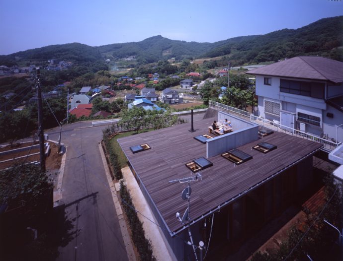
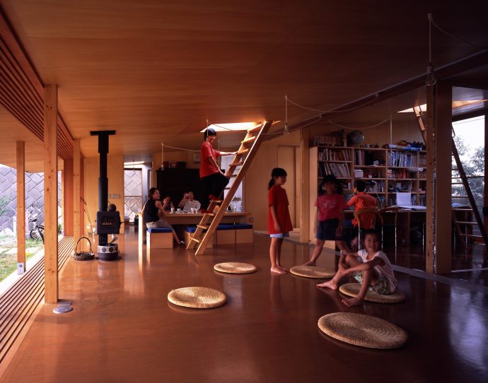
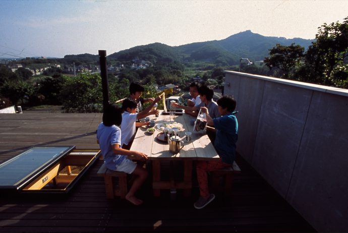
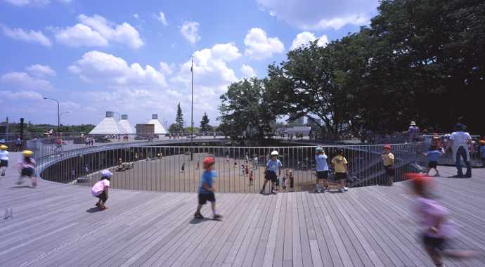
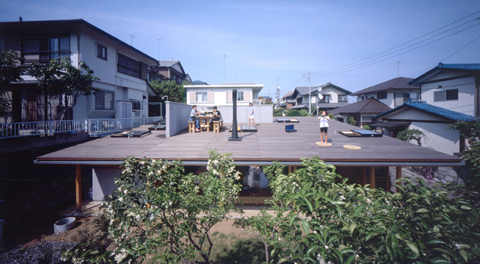
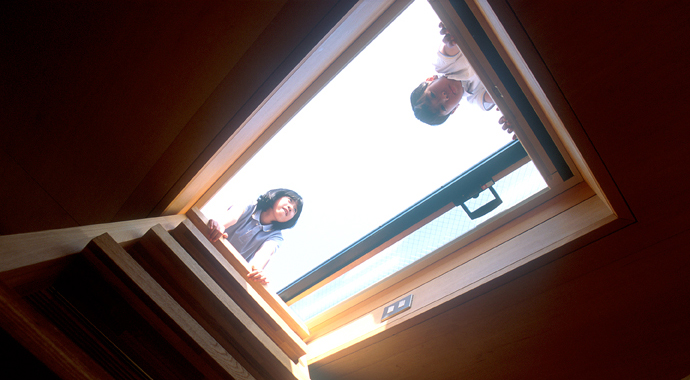
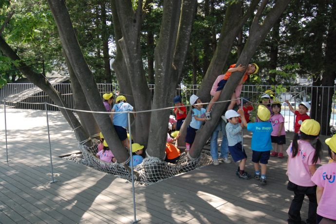
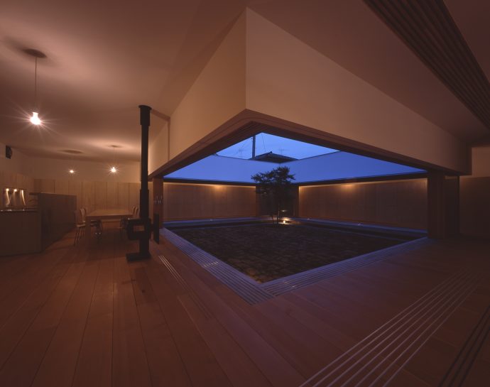
In Tezuka Architects’ Roof House of 2001, the roof of the dwelling was turned into an al fresco dining area. The success of this novel feature, as Tezuka recalls it, was at least in part determined by the roof’s slight monopitch, which made it both comfortable to sit on, and gently induced its family of occupants to scoot back from the edge to gather around the table in its centre. The practice employed a similar strategy in Fuji Kindergarten, where the ring-shaped roof funnels gently inwards towards the courtyard garden. Tezuka believes this subtle instability produces dynamism – not in the building, as such, but in its occupants. According to him, the kindergarten’s children hurtle around the faintly velodrome-like rooftop for distances of up to 6000 metres per day. It’s not easy to see this angled shift in photographs, but watch a video of the kindergarten when school’s in, and it’s clearly expressed through the non-stop galloping and giggling of its inhabitants.
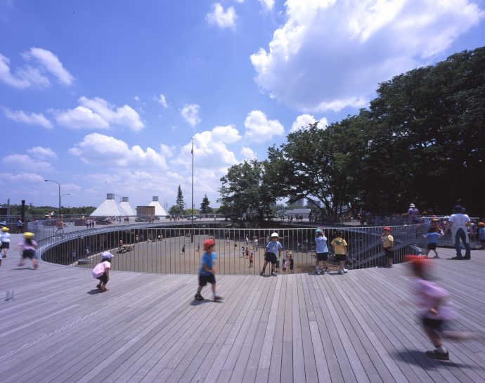
Tezuka’s belief in architecture’s transformative potential is total, a conviction that at times recalls the utopian idealism that inflected much of the architectural thinking of the 1960s – not to mention that of Rogers and his fellow high-tech brethren. Tezuka shares with me an essay he has written for an upcoming book. In it, he writes: “Architecture is consciously made to support those cultural activities and social structures that are unique to human beings. That is why human beings cannot avoid the need for architecture. Architecture may be described as the nexus for all human activities.”
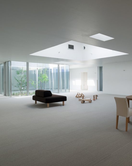
Recently, the practice completed a project called Chiba Chemo House, a cancer treatment centre for children that was close to a decade in the making. Much like Fuji Kindergarten, it effects a transformation in childcare through its focus on the plan and the program – what the building is used for and how it is used. It plays host to small family ‘houses’ around its perimeter, directly connected to the patients’ rooms, so that parents can stay in contact with their children for the duration of their treatment. The goal was to provide its sick occupants and their parents with an environment that is as close to a family home as possible, to minimise the disruption to family life and the additional trauma this brings with it. Chiba Chemo House, in this sense, actively strives to be quotidian – made from off-the-shelf materials donated by Japanese prefab builder, Sekisui House, there are no sculptural acrobatics or wavy forms to speak of. Unsurprisingly, I wasn’t able to find Chiba Chemo House profiled in any glossy design magazines, despite it being shortlisted for a 2014 Design of the Year award by the London Design Museum. I get the sense, though, that this is unlikely to faze the Tezukas too much.
Thanks to Elisha Deschamps at the Australian Institute of Architects for connecting us with Tezuka Architects. Many thanks to Tezuka-san for his time and insight during a very quick visit to Melbourne. And huge thanks also to Katsuhisa Kida/FOTOTECA for his images.
