What does it take to unbuild a wall?
What does it mean to unbuild a wall?
I turned this rudimentary question around in my mind while sitting quietly in the cool of the Giardini, in a folding garden chair before the German Pavilion, where the press conference that preceded the Pavilion’s formal opening was being conducted—entirely in German. Other members of the international press seated around me (presumably all German speakers) were poised for a good photographic moment but otherwise unusually quiet; at the conclusion of the conference there would be no questions from the crowd, only clapping and a flurry of camera shutters.
“Press conference” is perhaps a misnomer for such events, which are less an occasion for curatorial contestation or theoretical discussion and more of a celebration. This exhibition is, after all, a project of monumental national interest: one entirely dedicated to the Berlin Wall almost three decades on from the milestone reunification between East and West Germany. This is significant: as of February, the Berlin Wall has been gone for as long as it has stood. Of course, “gone” is also a misnomer—fragments of the wall live on: in physical memorial segments, in the collective and individual psyches of citizens, in neighbourhood character, in intergenerational stories. By contrast, Unbuilding Walls is only on show until November; its reassuringly solid form and commemorative function seeks to convey a sense of longevity through purely temporary means.
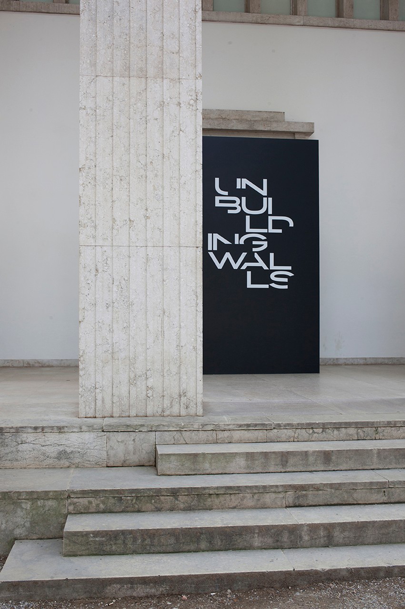
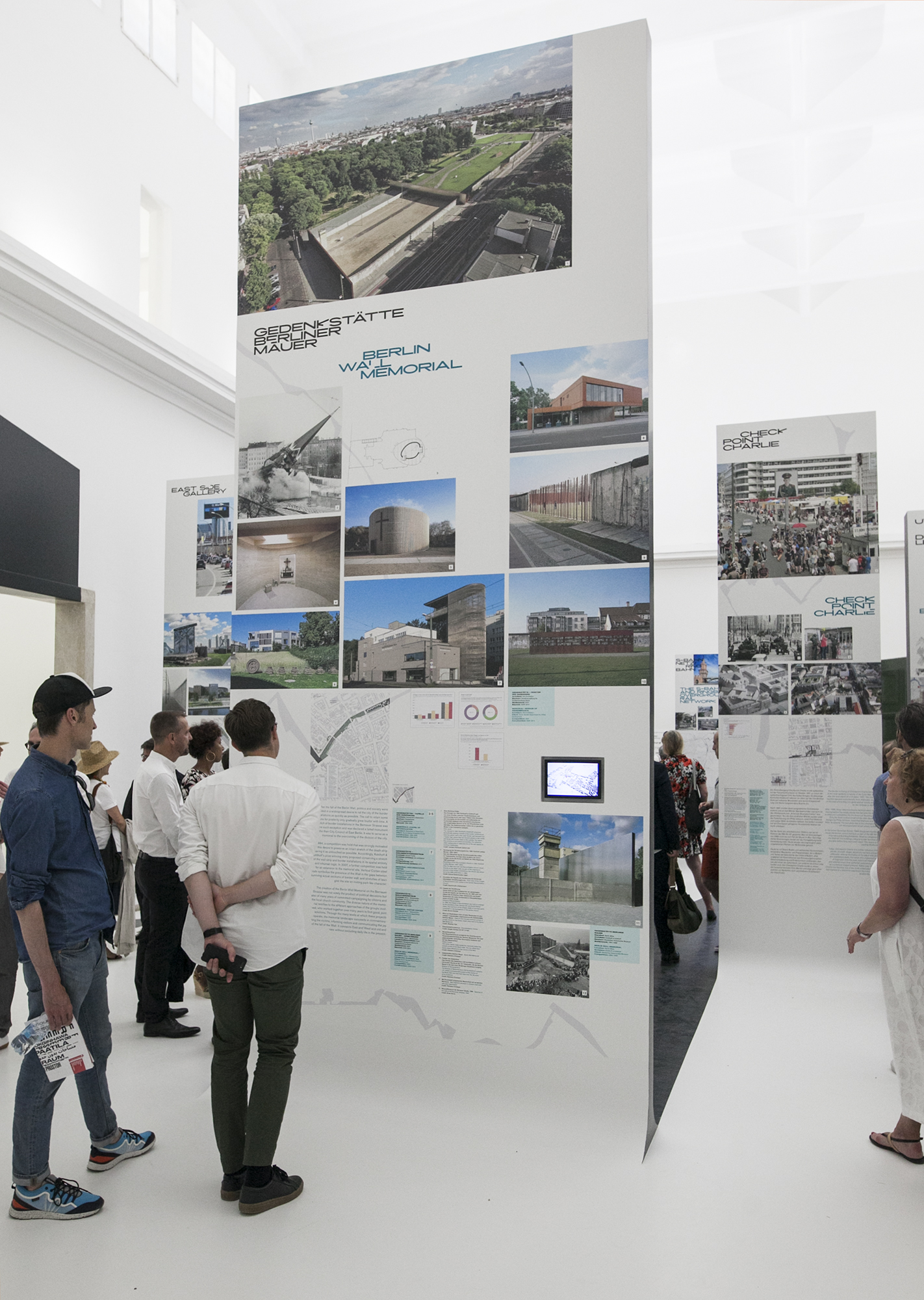
The bolded words of the project logo, displaced across multiple lines with square-shaped chunks cropped out to form a glyphic figure-ground of sorts, already allude to the Biennale theme of freespace as a verb: literally freeing up space by excising existing boundaries, whether in fonts or in buildings. The use of the traditional ‘figure-ground’ representation on typography itself prefigures what greets the visitor inside the pavilion: a series of 28 staggered vertical presentation boards whose height, width and thickness are immediately reminiscent of the concrete slabs that made up the Berlin Wall. These frontal elevations are uniformly finished in charcoal—diagrammatically suggesting an impregnable fortress.
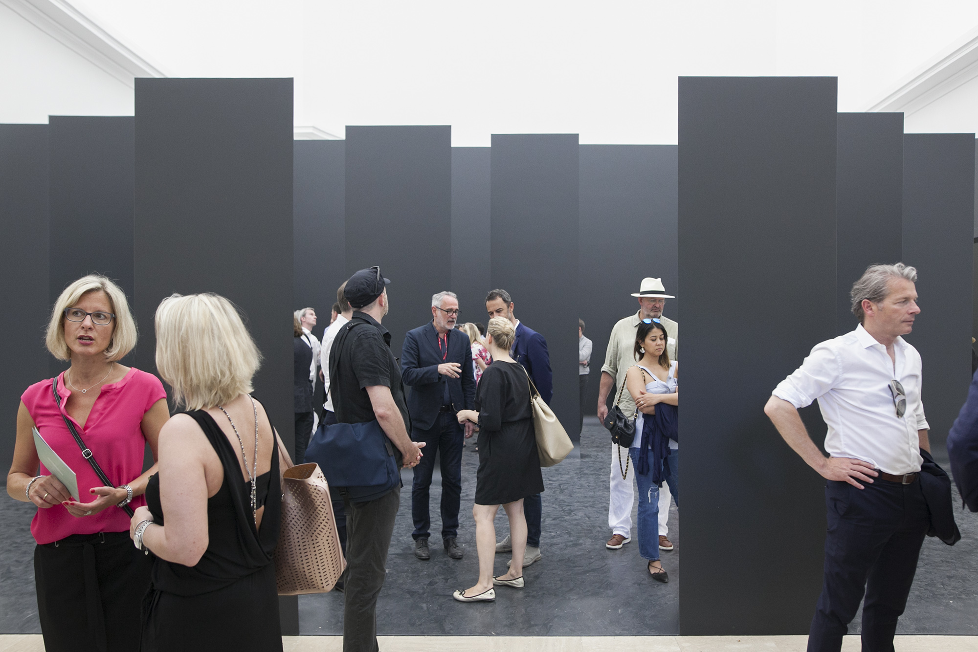
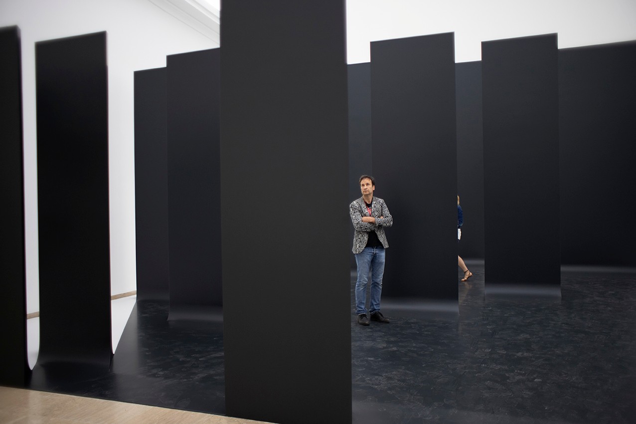
The repetitive charcoal slabs evoke the visual language of Peter Eisenman’s Memorial to the Murdered Jews of Europe, a major tourist attraction of 2,711 grey concrete blocks sited between East and West Berlin (which has incidentally attracted new controversy around a selfie-image-compositing project titled “Yolocaust”). Unlike the urban specificity of decentralized brass Stolpersteine memorials (literally a stone to “stumble upon”), which bear victim names and life dates and are embedded into roadways near their last known dwelling or workplace, Eisenman’s Memorial is anonymous, generic, undifferentiated mass.
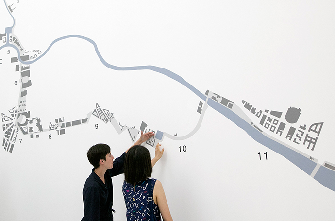
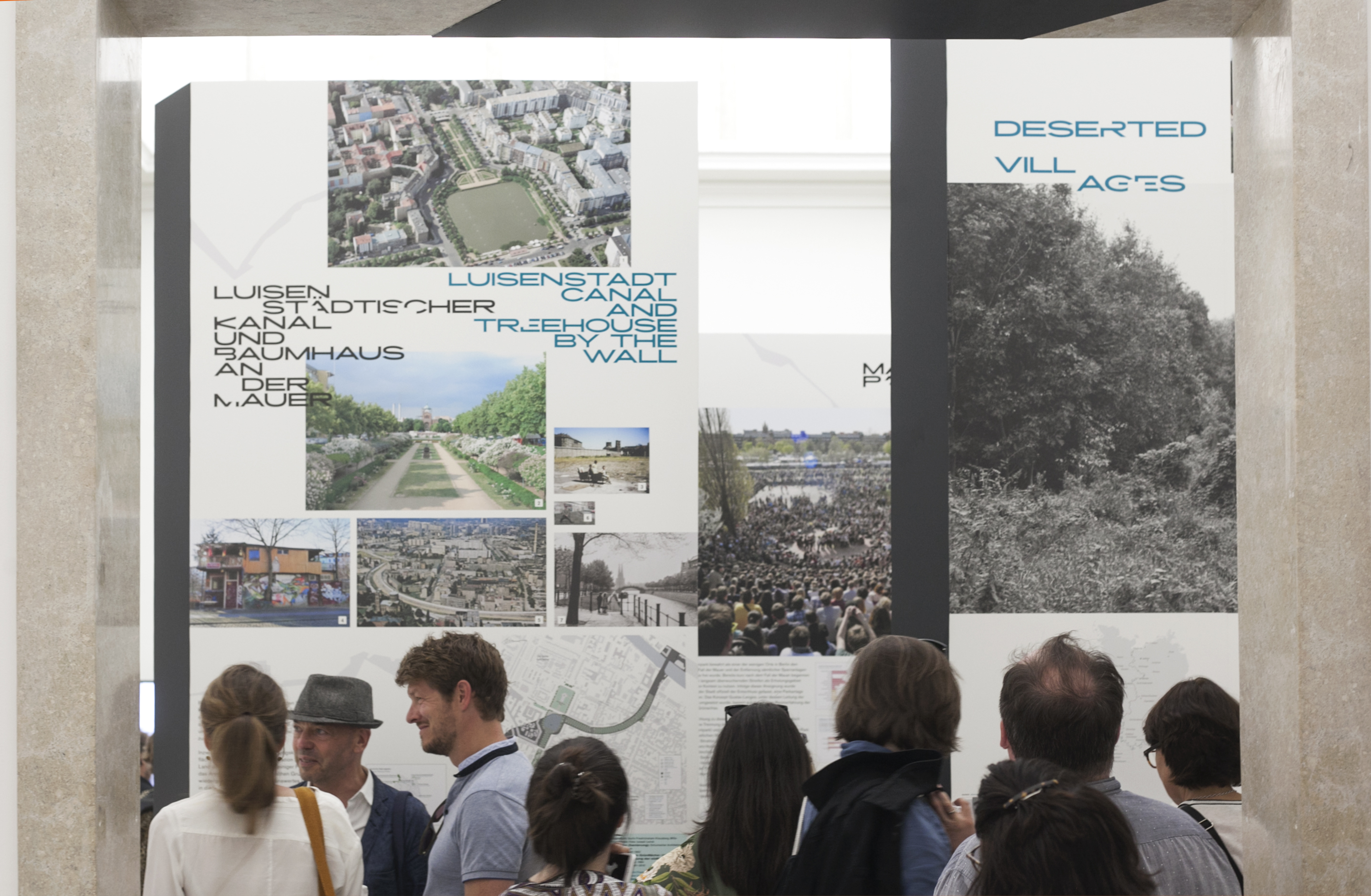
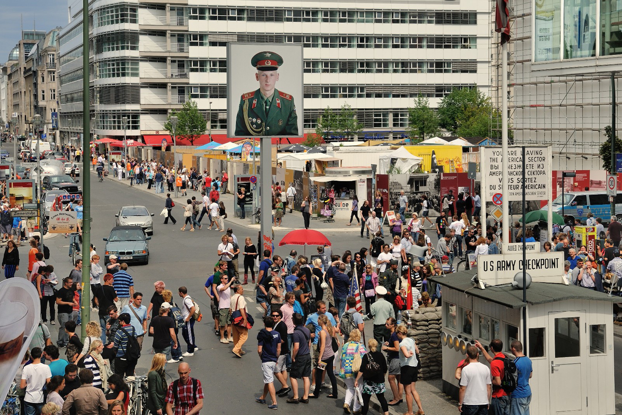
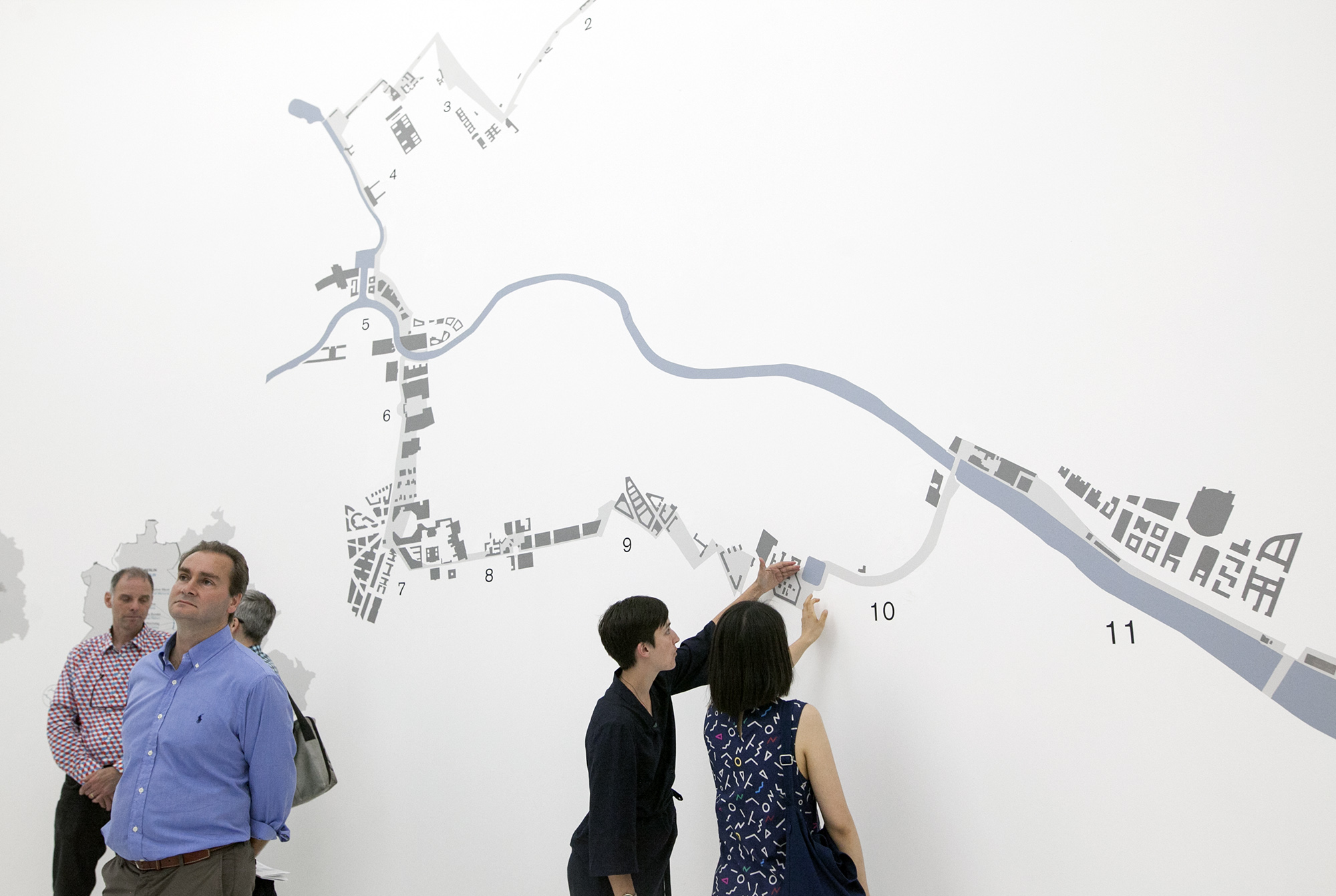
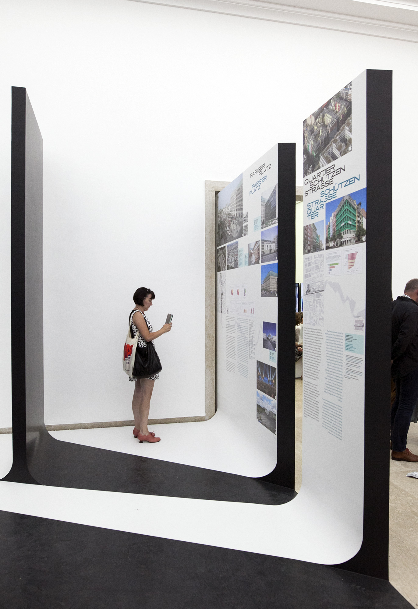
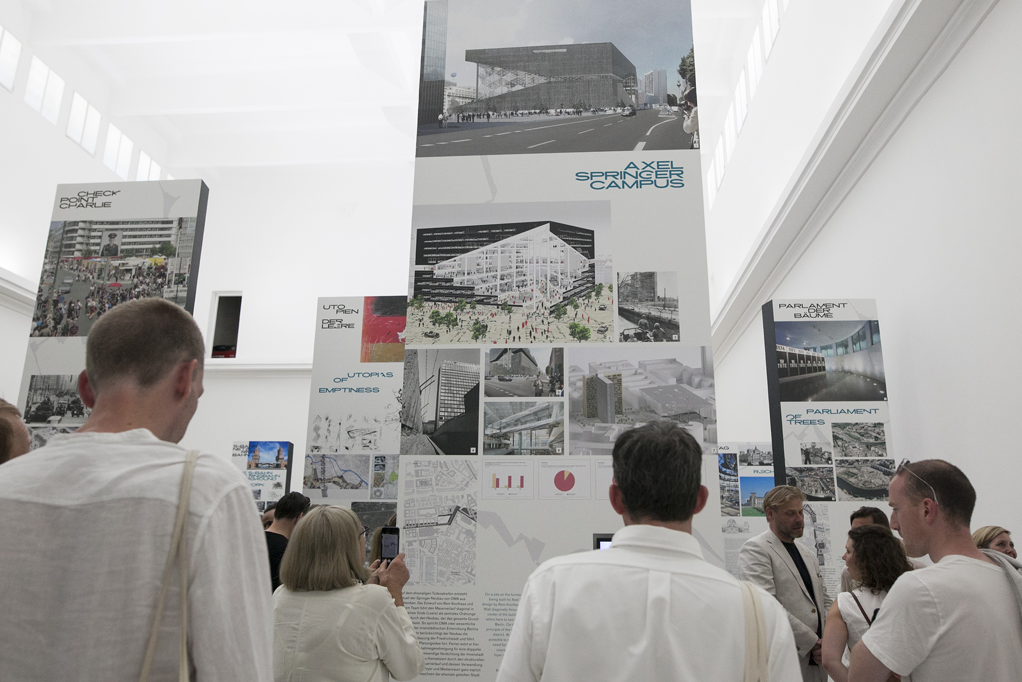
The boards in this Pavilion, as the visitor will soon discover, is at once site-specific and generic, depending on which face you look at. Their reverse (experienced by first navigating through the domino-arrangement of walls toward a back wall bearing a plan diagram of the Berlin Wall, then turning around) reveal information-laden case studies: each a physically intervened, contested or transformed space along the Berlin Wall. Checkpoint Charlie; Potsdamer Platz; Axel Springer Campus, S-Bahn and Ringbahn Overground Rail Network… Some are yet unbuilt projects, and others totally new to me. Unlike Eisenman’s memorial, these reverse faces do not present controversy in themselves, but rather plainly take stock of current debates surrounding the Wall, new and old, regional and local. The information-dense graphic format is more or less consistent with classic presentation standards for an architectural research project: each plaque features a key site plan (where the figure-ground manifests itself), urban or architectural diagrams, site photographs (archival, present-day or unbuilt renders) and even data infographics, alongside clear, explanatory text. In attempting to see all the case-studies, I found myself darting between black and white borders in the liminal spaces created by these boards. This brought to mind the no-go-zone between the formal Walls of East and West Berlin, or the “Death Strip,” which in turn reminded me that the Berlin Wall was not a single drawn boundary with two sides, but a thickened sandwiched zone imbued with myriad military codes and expectations from both sides—a crucial aspect that the exhibition drawings attentively point out with planimetric rigour and graphic clarity.
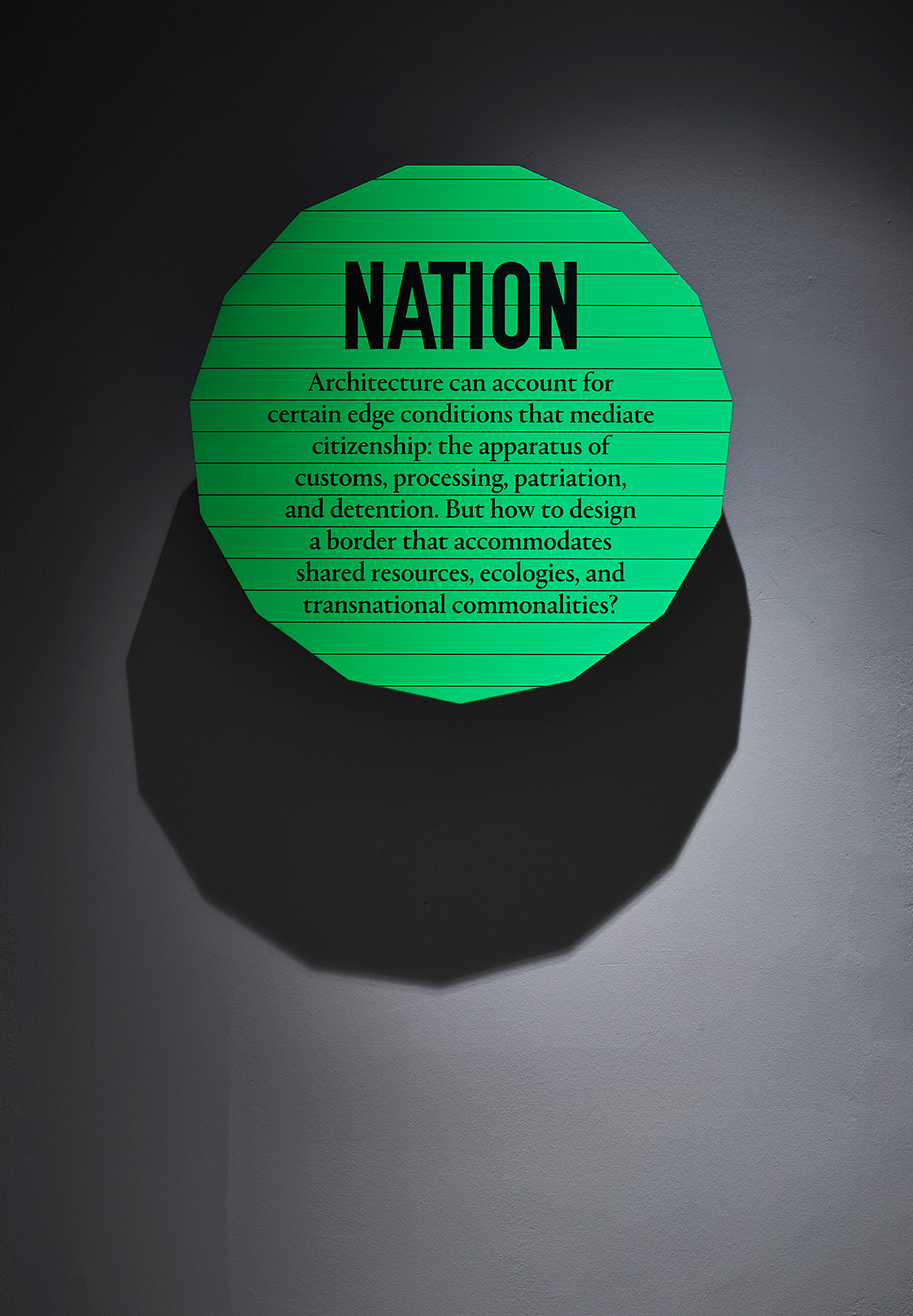
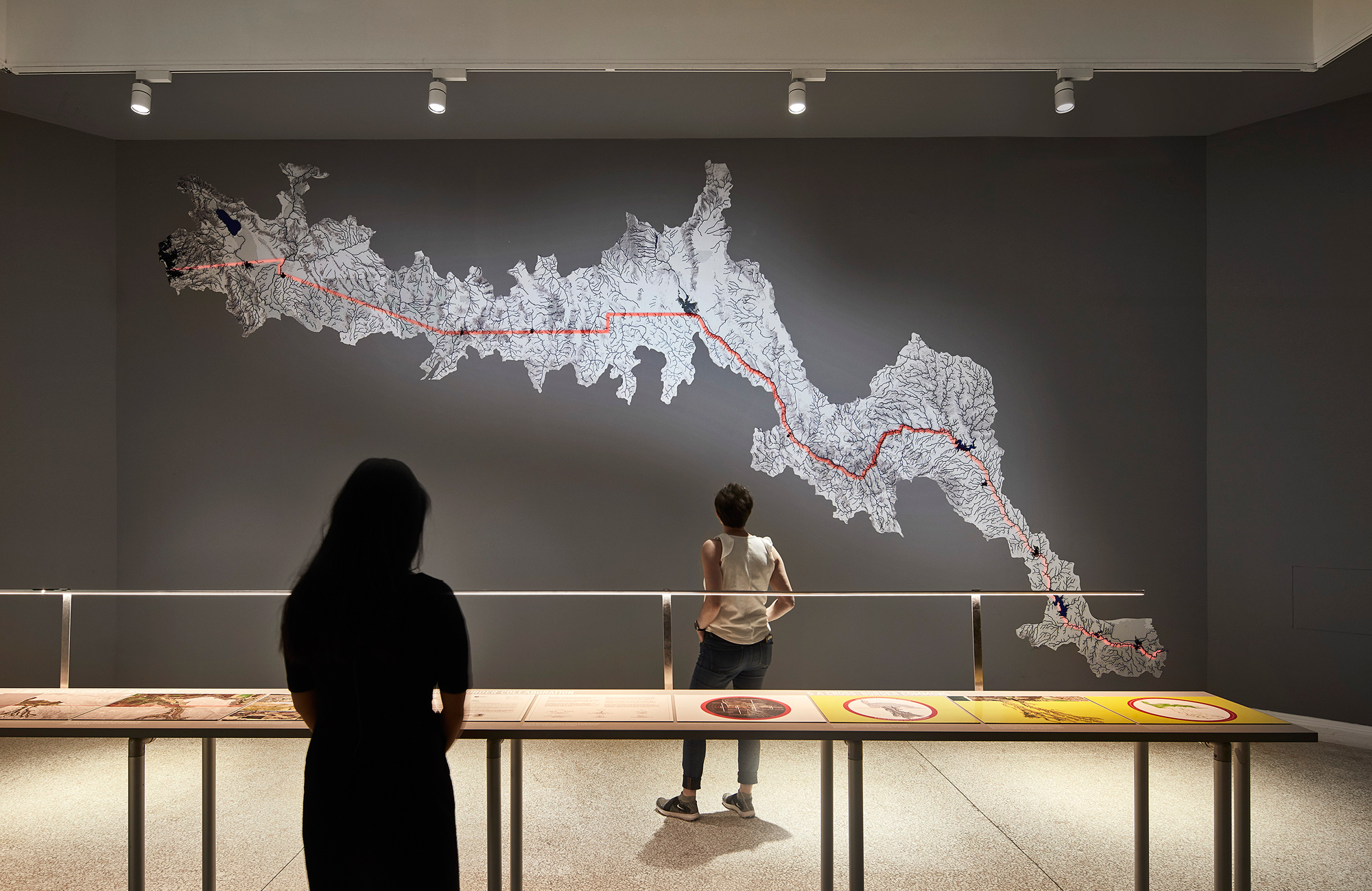
At the US Pavilion, another (in)famous border wall debate is being reckoned with, under the theme Dimensions of Citizenship. Exhibitors Estudio Teddy Cruz + Fonna Forman have stated of their MEXUS installation: “The wall cannot contain many things. The border is not simply a place where things end. This reality presents a challenge: un-wall our political imagination and consider a more porous border region.” There, another negation, unwalling. MEXUS, too, seeks to recover representations of the US-Mexico border as a thickened, heterogeneous region of indigenous and protected lands, ecologies, militarized zones, and even waste flows; it calls for “strategies of coexistence” between border communities rather than their isolation.
Their unwalling is less about dealing with the ghosts of a once-divided past, than about addressing the imminent threat of a far more intensely divided future. Any visitor that stays in that room long enough will be startled by the occasional eerie foghorn-like sound that corresponds with an animated red line projection (representing the formal US-Mexico border) being “drawn” onto a wall-mounted topographic map. Here, the typically visual border-line is given the sonic character of a warning: that these seemingly abstract acts of spatial demarcation actually produce real-time disturbances on the ground; that if we are not careful, the consequences of hard borders can be very hard indeed to undo.

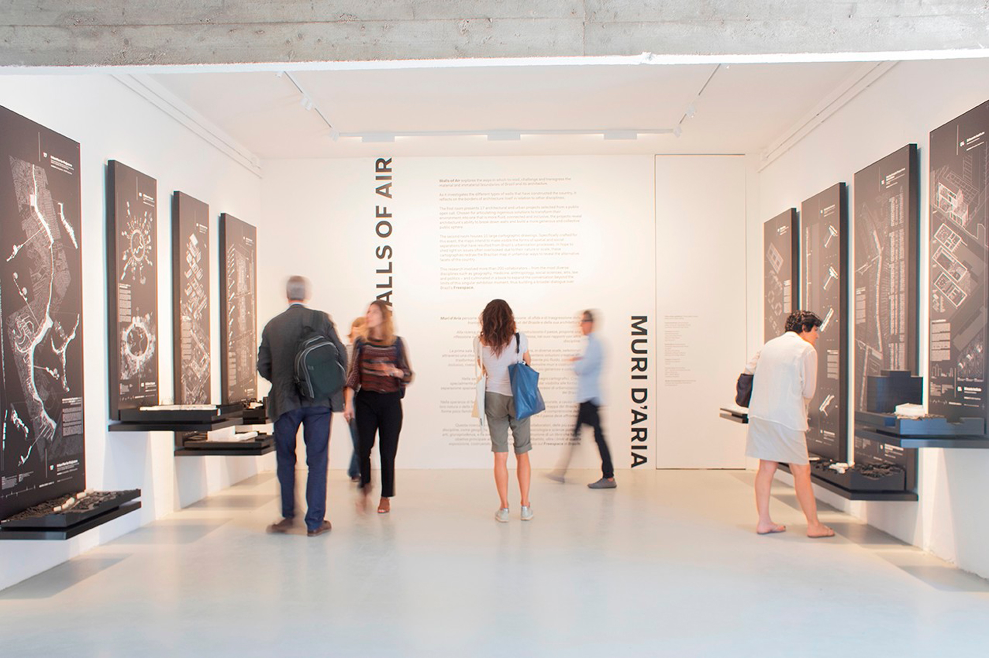
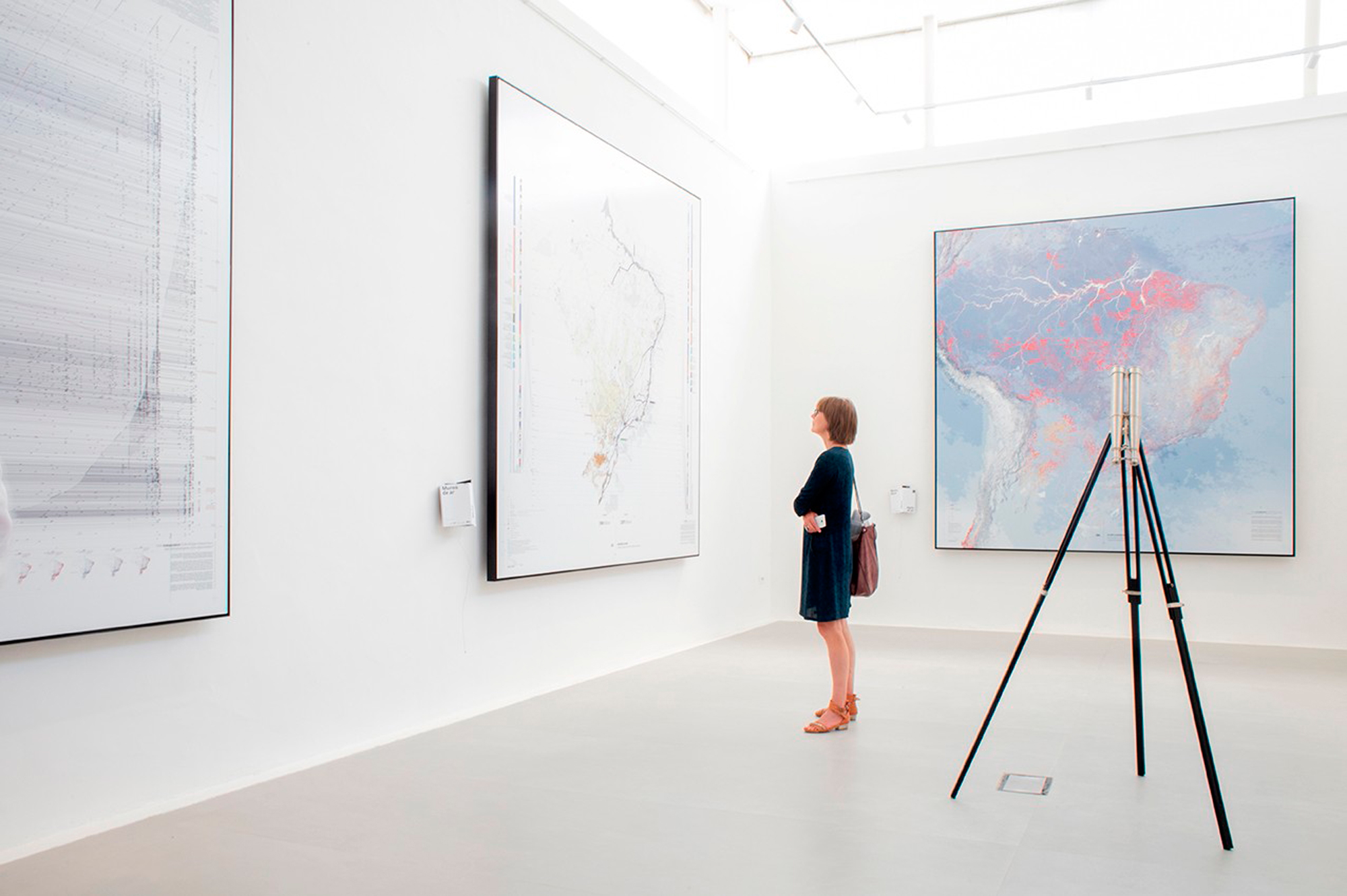
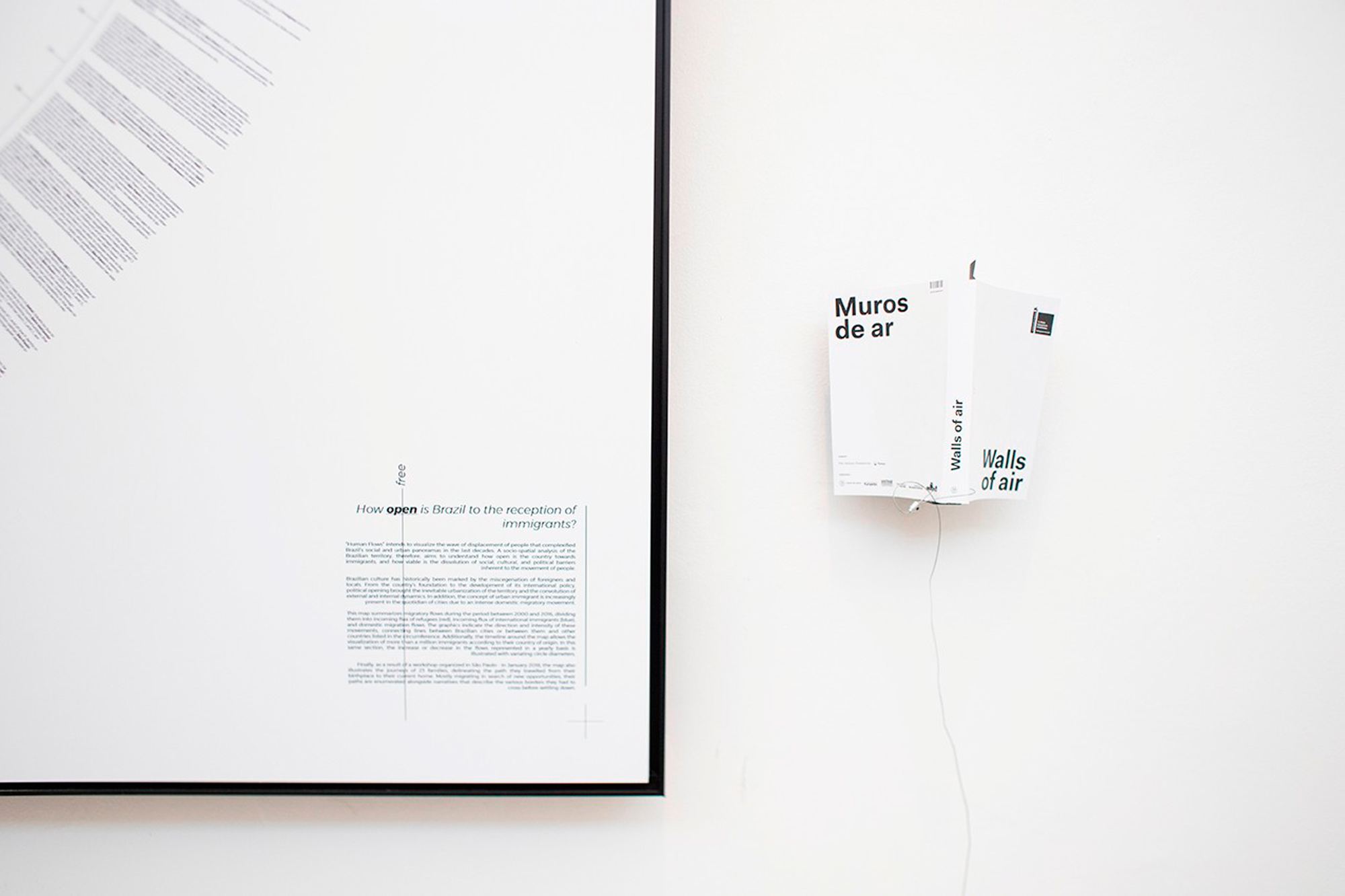
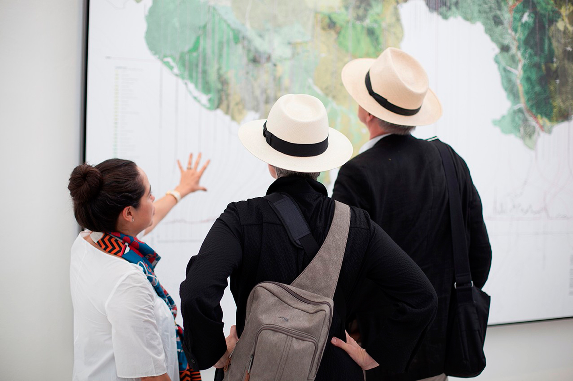
Across the canal, the Brazilian Pavilion’s Walls of Air also seeks to subvert the use of metrical tools of representation, which typically serve to codify and abstract spaces rather than diversify and “free” them. Large-scale drawings problematize the hard-and-fast lines of urban planning maps and natural region cartographies with additional, even contradictory complexities. It is a kind of undoing of the map typologies so familiar to architects.

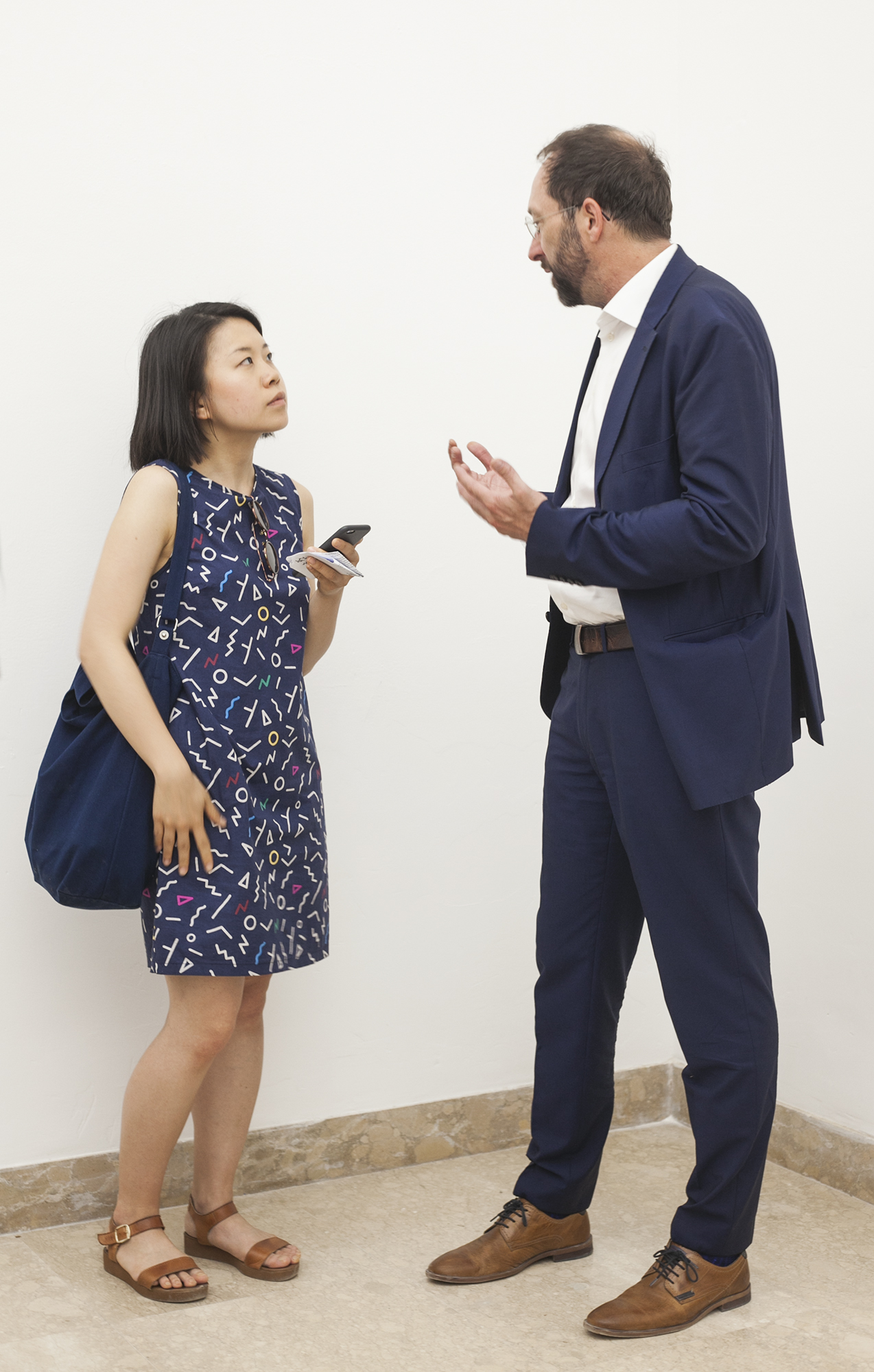
But back to Germany. I speak to Wolfram Putz, founding architect at GRAFT and a co-curator of Unbuilding Walls (the full curatorial team consists of GRAFT architects Putz, Lars Krückeberg and Thomas Willemeit, as well as politician Marianne Birthler, of the German Greens). Recognizing upfront it was “quite a conventional exhibition from the back side,” Putz explains their move toward the didactic rather than the speculative or wishful: “Our exhibition is not about what should have been, but about what it was, and what we can learn [from the Berlin Wall, 28 years on, in a context of rising nationalism and populism]. It’s about reality and not about dreams.”
The literal board-as-wall diagram, Putz explains, is an easily understood symbol: the number of boards is “something of a cabal”, analogous to the number of years since the fall of the Wall. Surprisingly for such an emblematic exhibition, these symbolic walls are actually shorter than the Berlin Wall (“the original was a little higher – you’re the first person to ask!”), both because the historical Wall varied in height along its length, and because the exhibition boards had to fit under existing openings into the Pavilion wings. These shortened walls omit the rounded concrete “belly roll” capping detail found on the original Wall, which was designed to impede climbing; GRAFT decided to displace the radius of this curve to the base of each board where it meets the floor in a symbolic detail.
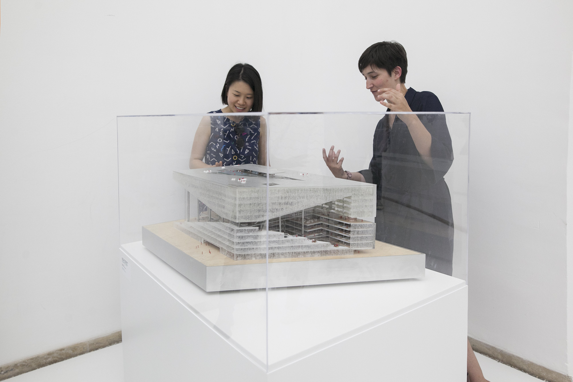
But what’s important here is the content of those boards. Putz highlights Rem Koolhaas’ Axel Springer Campus building as a favourite in the way it addresses the thickness of the Death Strip, which diagonally bisects the building, by reprogramming it as a traversable atrium for what he notes will be the biggest digital newsroom in Germany: a “beautiful symbolism [that is also] totally useful.” It does seem a little controversial to have so much Wall engulfed by so much corporate development (and the single-use private building is not insignificant in size, as demonstrated by a large physical model displayed in the corner). But as I looked around a room brimming with symbolic projects, I could see where Putz was coming from.
GRAFT’s educational “walls” ultimately operate more pictorially than spatially. The common graphic logic of the boards works to smooth out the distinctions between sites instead of amplifying their rough edges or moments of incomparability. The presentation boards could easily exist autonomously without their staggered (or any) arrangement, and indeed, could exist anywhere; its symbolic moves are not tethered to the Pavilion site. There is a curious shift between the modalities of art (traditionally more pictorial) and architecture (more spatial), considering that far more spatially conscious installations had been hosted at the German Pavilion over the past two Art Biennales. Anne Imhof’s 2017 shatterproof glass plane surface, horizontally cleaved the Pavilion interior into two, enabling live spatial performances to be viewed through the new floor, while Florian Ebener’s 2015 group show, Fabrik, completely transformed the naturally lit Pavilion into a pitch-dark, low-ceilinged, neon-gridded video-game-like space. For the 2016 Architecture Biennale under the theme Reporting from the Front, curators from the Deutsches Architekturmuseum (DAM) brought home the highly pertinent theme of Making Heimat both through the pictorial (by mounting information and images on walls) and spatial (by making four large openings in the listed brick facades of the Pavilion, signaling an “open house” for the arrival of refugees in Germany). This site-specific, literal act of unbuilding is a potent precursor to this year’s Unbuilding Walls theme, yet without being specific to Berlin Wall politics. Through demolition it defied the closed (and controversial) architectural heritage of the 1938 Nazi-inflected Neoclassical design of the German Pavilion.
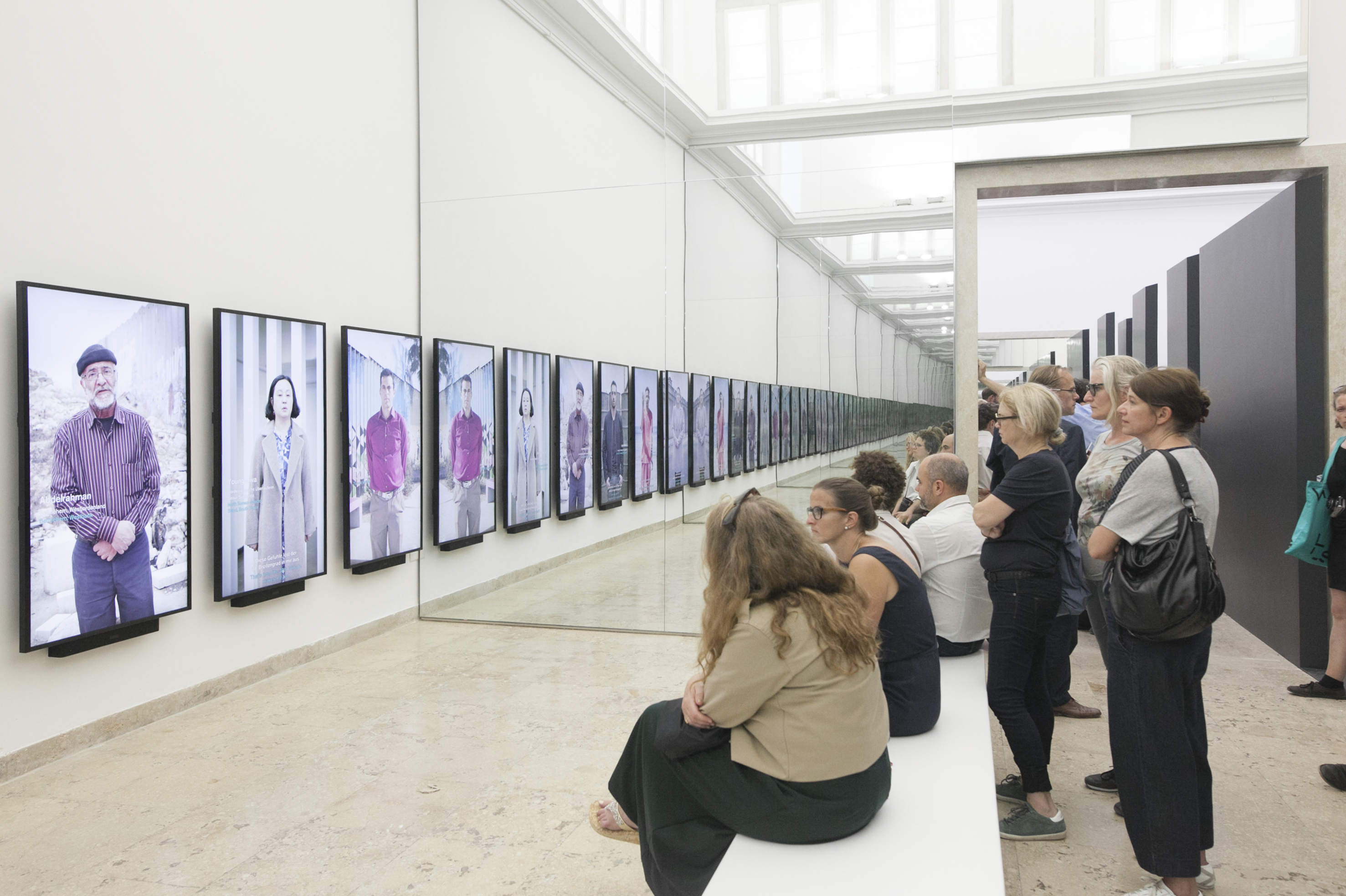
This year, critiques of the heritage-troubled Pavilion are subtle: from the use of mirrors to extend a “Wall of Opinions” media installation into visual infinity, to the gesture of blocking the building’s frontispiece with a solid wall. But in contrast to the aforementioned past examples, these are so nuanced that they seem a shade too accommodating for such a historically contested building envelope…
Nevertheless, Unbuilding Walls, along with the other wall-themed Biennale exhibitions, show us that, far from abstract lines or benign elements, walls have political thicknesses and can exist as heterogeneous territories, that they have very site-specific situations, that they are quick enough to erect but can take generations to unbuild and come to terms with, and that their unbuilding can come not only by physical acts of demolition but also by programmatic shifts or through renewed historical research. Putz remarks that in our present climate of growing populism across the globe: “What [the German Pavilion] can show is that building a wall is easy, and unbuilding a wall isn’t. It’s complicated. Think about raising a wall very thoroughly…”
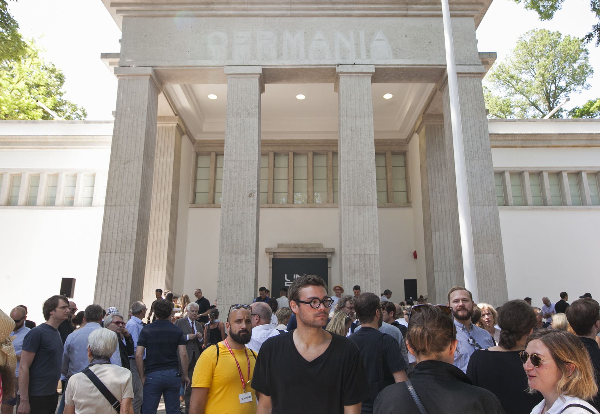
As corks were being popped all around the Giardini, with each national participation celebrating in somewhat isolated fashion, I returned to my original question—to complicate it further. What would it mean to unwall the curatorial disengagement between national Pavilions? Architecture’s deepening interest in geopolitics and critical issues of displacement and inequality tell us how far we have come from form-finding preoccupations, yet the effective silo-ing of themes or provocations from each other, set within the larger echo-chamber of the Biennale, and indeed the architectural discipline, suggests how much more a supposed international gathering of the minds such as this has to go.
Germany has literally broken down the walls of their own Pavilion before. What’s to stop national participations in a future Biennale from opening up the silos and co-producing a genuine forum on matters far larger than what can be contained by any single national designation?
Thank you, Wolfram, for taking time out of the opening ceremony of the German Pavilion to speak with us. You can find out more about Unbuilding Walls on the exhibition’s official website, and read about GRAFT’s work here. Warm thanks also to Tjaša Kalkan for lending her eye to documenting this exhibition. Unbuilding Walls is on show at the 16th Venice Architecture Biennale from 26 May through to 25 November 2018.