Edition Office explore the collision between art and architecture
In the age of the starchitect and 3D visualization, the design of space, as in almost all aspects of life, has become more speculative and computer-rendered than embodied. Enter Edition Office, a young practice whose architecture is grounded in raw materiality, research and lived experience. With backgrounds in sculpture, sound art and architecture, Edition Office announced themselves on the local scene not with a signature building, but with Sites and Modifiers, an exhibition of drawings, models and photographs. Their design for the new Gertrude Contemporary, Australia’s oldest contemporary art space and one of its most significant and beloved, is unveiled this week in Melbourne’s Preston South, a project that reflects Edition Office’s keen interest in the collision between art and architecture, and their awareness of the uneasy role culture and design plays in the gentrification and development of cities.
Recently, Edition Office’s Fish Creek House took out a Victorian Architecture Award, testament to the fact that their deliberate, pared-back architecture is gaining recognition and respect, even in this speedy age of instant gratification. Eugenia Lim sits down with directors Aaron Roberts and Kim Bridgland in their Fitzroy office to talk about how architecture can act as a vessel for the everyday.
Eugenia Lim
How long do you spend in the research phase – getting to know the site? Visiting and being there?
Kim Bridgland
It’s different for [each] project – sometimes you get a feel for the place pretty quickly, sometimes you need to let it work for a while; you need to go multiple times and let it build; synthesise in your mind.
Aaron Roberts
The sites tell you everything you need to know, if you can read them.
EL Not many architects would have that sensitivity. Often it’s about trying to impose a vision or a style, or rehashing existing forms on different sites, whereas one can recognise a strong dialogue between site and your intervention.
AR If you go back through the canons of architecture, there is a formal language around the work that we do. What we try to do is use architecture as a tool for amplification: a vessel to amplify particular ephemeral, site-specific qualities of the site; or a particular aspect of our clients’ lives that they would like to experience on a more regular basis.
KB It also acts as this ‘other’… There’s the client, and the site, and then there’s this third thing in the middle that joins us, and then joins the broader cultural context. A house, no matter how much it works perfectly for a client’s idiosyncratic needs, still speaks to the bigger picture. It’s really important to keep sight of that.
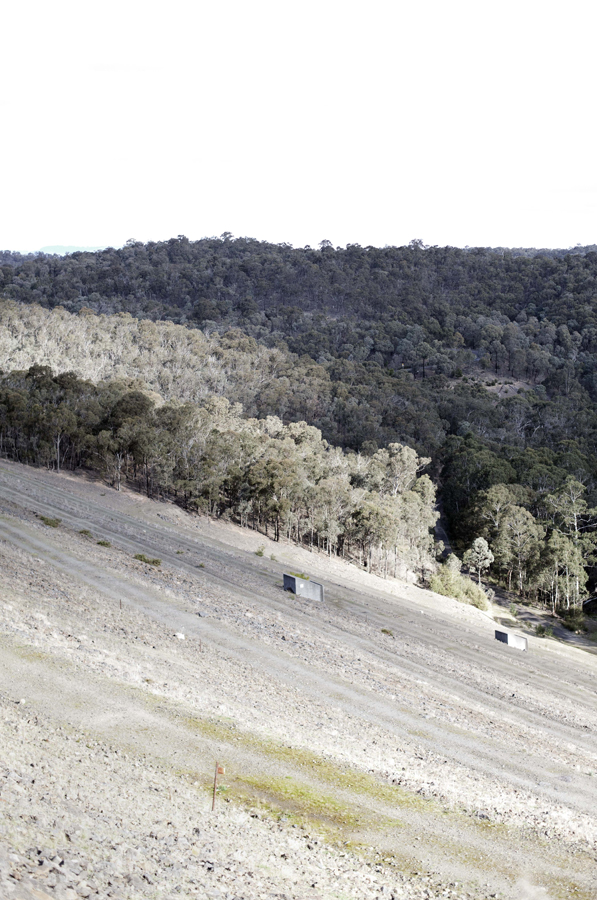
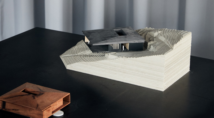
ARGoing back to the site portrait [Edition Office always photograph their site with care – ed.] – the portrait is trying to distill the site into what we see as most important about it, or key to it. The Kangaroo Ground site is all about the slope: this wonderfully dramatic slope – the project interacts with the falling earth of the site in a way that references the nearby Sugarloaf Reservoir; but here, it holds earth not water. Anchored to site, it both holds earth and allows it to flow around the perimeter walls. The wall acts as a reference for both the subtlety and drama of the tumbling ground plane.
KBWith the site portraits, it is also as fundamental as paying respect to a place. There is certainly a little bit of giving thanks through our work.
ELAnd I like the idea of you going in and reading it, and interpreting rather than inserting something that doesn’t necessarily belong.
ARSometimes we’re interested in inserting things that don’t belong, as well…
ELCan you talk more about that? There’s this kind of duality in your work and how you talk about ‘dissonance’ and ‘sympathy’ and I’d like to hear more about that.
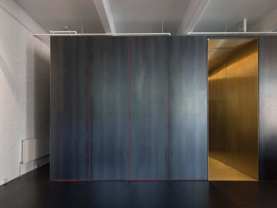
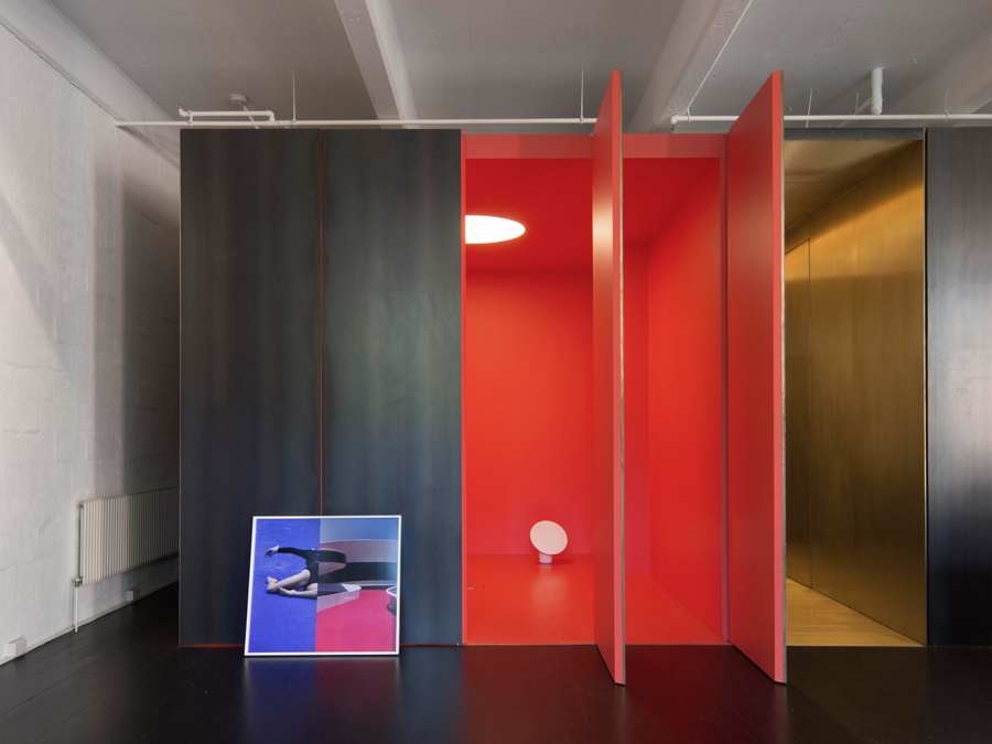
ARThe idea behind the architecture appearing dissonant is that it can insert friction between yourself and the site. When there is an element that doesn’t necessarily belong, it allows a fissure, or reinterpretation of place. It opens a crack through which we can recalibrate our understanding of place. Or the house. Or the client.
KBI think there’s a rhythm emerging from all our projects. They each have a certain level of singularity; a tight skin that holds them. They don’t bleed out into the landscape, they exist on a relatively distinct boundary – so they become a little bit ‘other’ to the place. We get very excited when something is both other and the same, when it speaks both languages at the same time – either to one set of eyes, or to two different sets of eyes, depending on our cultural lens. Landscapes have very particular histories, and very particular historical narratives depending on your cultural views. A house that has an otherness, a foreignness or ‘elsewhere’ to the place sets up a challenge to draw out and expand upon that narrative. That enigmatic signifier in it begs the question. We’re certainly not trying to answer that question, but we allow the question to exist.
ELHow are you able to work with clients so they’re open to those questions or ambiguities? Do you have a particular kind of client who goes on that journey with you?
ARThose ambiguities, or the cultural lens, or the narrative of place… they’re harder conversations to have. They come later down the track in answering the core brief. When we take clients through how the house is going to perform relative to place and experience, they’re pulled into this language and they start to understand that the architecture isn’t about a form or a style, it’s about an experience. Then you can start to break into other ideas: what’s the broader history of this place? Do you know anything about it? Can you tell us about it? Why did you choose this place? Those things can come out once you’ve set the tone for the conversation around architecture as a vessel for experience.
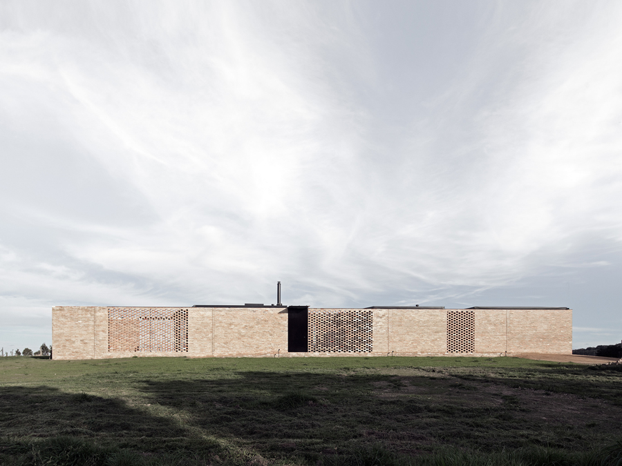
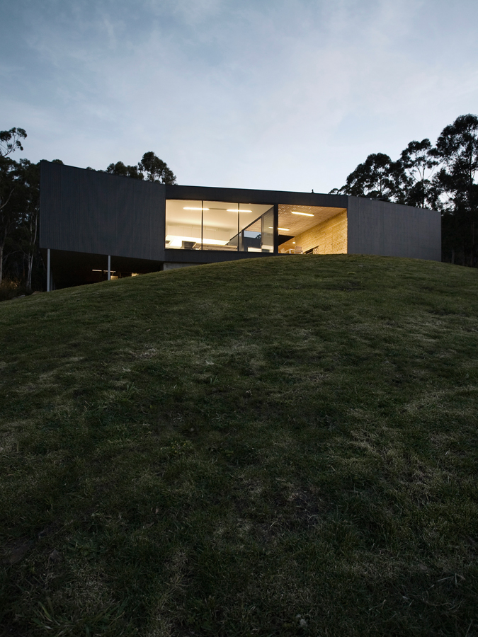
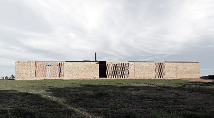
KBThe buildings are both entirely pragmatic and performative. The Fish Creek House, with its long rough wall that wraps right around it, serves a very specific purpose in its environment and its context, yet it is intrinsic to our thinking that it exists as a kind of monument. The three pavilions are pulled apart, they allow northern light and sun to penetrate deep inside, yet they also allow immediate views and relationships to open up across the protected courtyard gardens: there’s a wonderful internal logic and intimacy within the house. It screens off the high western sun and the highway and allows significant protection against the really epic winds of Gippsland. These are all pragmatic, performative gestures. And yet it also exists as this other thing, this thing on a monumental and foreign scale. I think that in every house we do, there’s no single move wasted on an overtly sculptural intent. Every move serves a purpose.
ARThere’s a heaviness to some or our buildings – we do like to ground the building. We like the idea of the architecture becoming a relic over time, embedding itself in the landscape. The idea of the relic that you return to after many, many years is exciting to us. This response can be mistaken for being too brutal or oppressive, where in reality the building has been finely tuned in a very sensitive way. That’s the other duality we’re interested in.
ELKerstin Thompson says that the act of architecture is always violent because you’re always changing something about the site…
KBWell, everything on the site has to give way for it. What you’re putting down is erasing a particular situation that has existed in that location and then allowing a new method of occupying that place to occur. Of course, change in itself isn’t always negative.
ARYou can’t deny that you’re adding something significantly different to what is there already. You can’t pretend that you haven’t.
ELWhat are you working on that moment? Gertrude Contemporary?
ARYes – two weeks left until it opens [at the time of writing – ed.]! It’s an enormous space… If you could leave it and strip it, it would be the perfect Superstudio receding perspective.
KBIt’s an extraordinary institution. Most people know it as a gallery, but its studio program has become a cornerstone of the Melbourne and Australian art scene over the last 30 or so years. So taking these two galleries, office spaces, and full-time studio artist-in-residences to a new home and identity – because of course Fitzroy is getting ‘the squeeze’ – is a total privilege.
ARIt’s so interesting to feel the gentrification of place through the nature of that project. [Culture] getting pushed out…
KBJust a stone’s throw down the road from the old Gertrude, we’re also working on a number of new multi-res projects that cater to increased demand for housing in these areas.
ELIt’s interesting isn’t it, to be engaged at both levels with the process of gentrification?
ARYes. The impacts of it and feeling a little dirty about it! It’s difficult, particularly in inner suburbs, where in reality we need the higher density, yet seeing this come at a cost as land prices and rent increase. The density will happen regardless, we’re lucky to be working with forward-thinking, design-conscious developers. Perhaps we need rent stabilisation like in NYC? It’s important that these areas retain their youth, culture and diversity.
ELThe cultural sphere: architecture, development, art and even this magazine are entwined with the process of gentrification and it’s critical to be aware of that.
KBBoth cause and effect… Returning to the project, there was a really high bar set in terms of delivering a significant programme on a really modest budget. We had to find a way to represent their mission and space within very subtle means.
The value is in the space to both create and display art. The challenge with Gertrude Contemporary was to establish: what is the architecture? What are you designing that is too expensive, that will limit their capacity to run?
ARWhat’s the cheapest solid material you can possibly get!
KBThere had to be respect for raw materiality. Leaving the backbone of the infrastructure raw and exposed, and allowing the singular mono-material gesture to stand in contrast to the existing shell, as much by necessity as by design.
ELHave you read The Art-Architecture Complex by Hal Foster? How do you balance knowing when to pull back on the architectural moves and when to let a space [breathe]?
KBFoster talks about artists taking over big Chelsea lofts at a time when industry was withdrawing from certain places. It was the same time that art came off the plinths and the wall and started occupying these leftover spaces: think Dia:Beacon and Dia:Chelsea. There came this collision between old architecture that wasn’t purposefully designed for art and these wonderful art objects that established a dialogue; a friction between them. The Gertrude Contemporary site is interesting and very similar. It’s not Zaha Hadid’s MAXXI in Rome; it’s an old furniture store. We’re exposing the old steel beams: the ceiling grid has been ripped out and we can see the guts of the building. Then you have the art and the studios in collision with it. It’s half new-built and half a raw shell…
ARAt the opposite end, you’ve got ACCA, almost designed to represent the sculptural nature of what’s inside. That’s not where we’re heading in the collision between architecture and art. We’re not designing a gallery to be an artwork unto itself, but rather creating an appropriate framework for displaying art. Having said that, there is something interesting in the nature of threshold and skin, holding back before entering a gallery. You might allow someone to alter their perception, slow them down; give them an experience prior to hitting the gallery proper…
ELBecause you kind of need that primer… the breathing space.
ARWe like to have an outer perimeter or a set boundary. Something that collects the volume of the architecture, for there to be a threshold moment before you enter into the thing proper: a recalibration. It started early on, when we were working on projects in Tasmania, where a site might have an amazing vista, unparalleled in its beauty. We would set up conditions where you would have to go through a tunnel or a portal, take the landscape away and then revisit more concisely through the architecture, try to amplify particular aspects of the vista.
ELYou are still working with the idea of threshold in your projects…
ARAbsolutely: the depth and kind of threshold, the edges before you get into the building. We are interested in how the threshold can alter or effect experience.
KBA conceptual palate cleanser. If you’re coming home after a busy day at work, it’s nice to have a gesture between here and there.
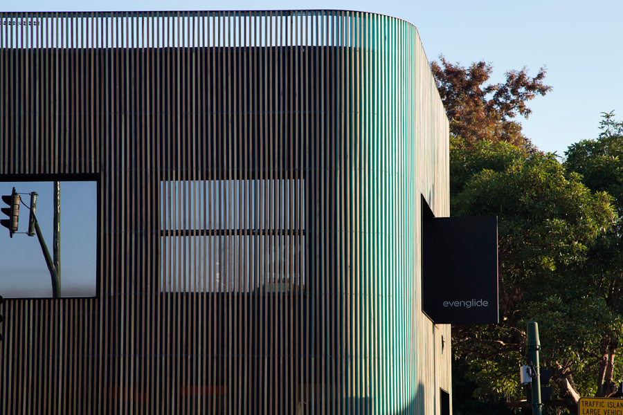
ELWhich we don’t tend to give ourselves these days, especially with these devices on all the time. We need an imposed limit. Which reminds me: years ago, I was driving back into the city. I had just been to a funeral. Somehow, there was this exquisite moment of coming across your project [Evenglide Showroom in Blackburn]. We were driving past all these takeaway shops, neon signs, and seeing this green timber structure was an amazing breath of fresh air. It was really beautiful – the tension of working in and against the context.
ARThe client asked us to build something on that corner that screams louder than everything else. And everything else is really loud [laughs]! So you have to step back! It’s a really quiet building, in a way, but as you go around it, the building shimmers and shifts to green, because of the nature of the colours of the timber.
EL: Can you talk about touchstones, or the things you’re looking at the moment that influence your work?
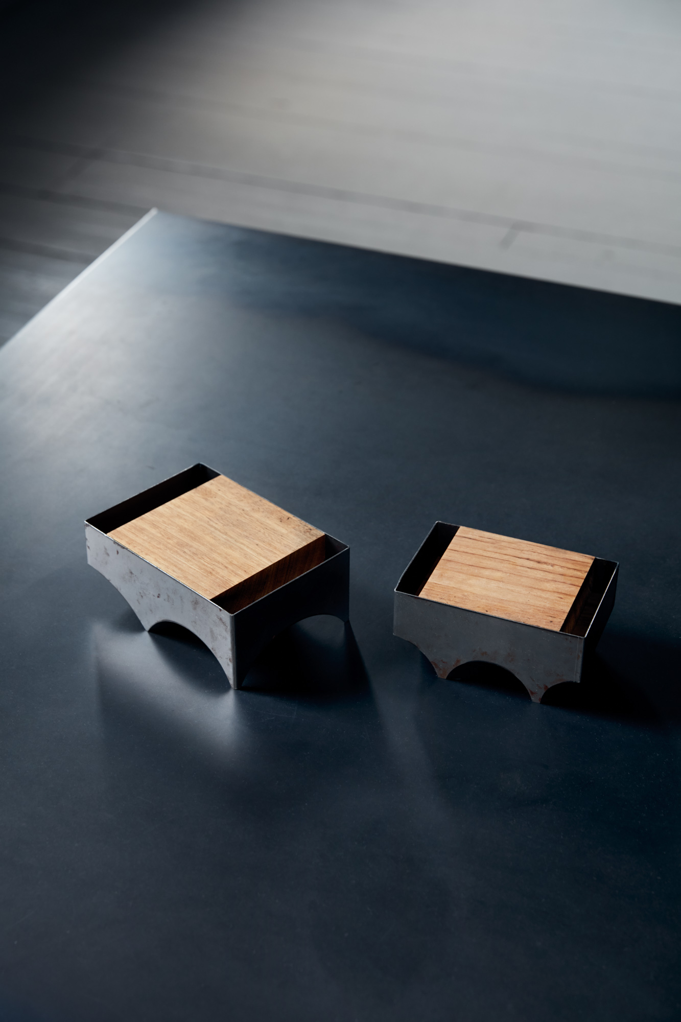
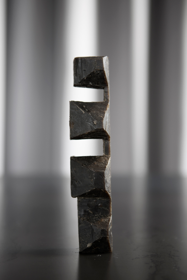
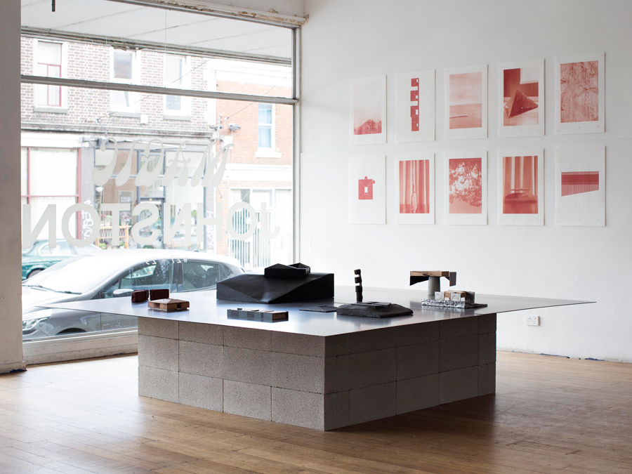
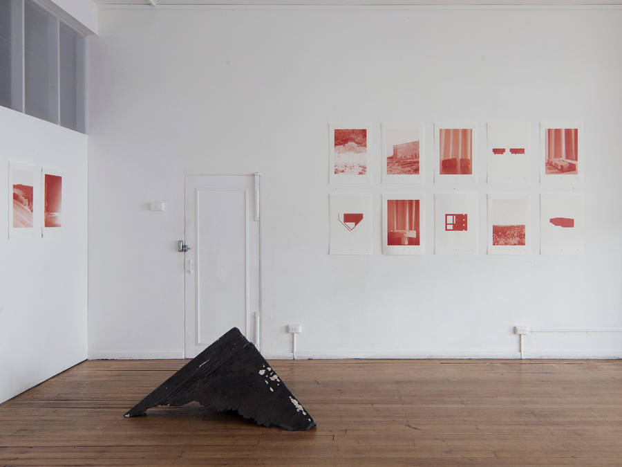
AR: As a starting point, models are almost like totemic objects that start to describe the intent of the building. Photorealistic renders can communicate one aspect of a project, but they don’t give that gut feeling of what a building feels like in the flesh, in the ground. They act as a kind of spiritual totem for the project, and anchor its spirit right at the beginning. But they also sometimes come after. For our first exhibition, we used them to almost re-represent projects.
KBThe practice is young, and we certainly needed to ‘catch up’ on some of the other work that predated Edition Office, and represent it in the way that we’re practicing now. It comes back to the question you asked at the beginning: how do clients come along on a certain journey with us? Allowing the visceral response that models bring along, allowing them to enter the conversation early, allows the client to trust you that there’s a certain feeling you’re trying to evoke, that you have control over.
ARIn terms of other influences – film is really important to us.
KBJohn Hillcoat’s The Proposition and Sergio Leone’s Once Upon a Time trilogy, Tarkovsky’s Stalker. There’s a lot of wonderful projections of person in landscape, the enormity of landscape, that cinema can capture. There is a shot in The Proposition of a white picket fence and the rose garden, and then the desert: a striking image of the collision of Australia’s white imported heritage, and this landscape we don’t know how to deal with.
ARThink of the futile attempt of trying to keep a Victorian garden in the middle of the desert…
KBThere is an ambiguity that film has a license to, which is something we want our architecture to allow. You go home, or to your place of work, and it can allow the world to feel a little bit uncanny.
ELI have been listening to a conversation between Rem Koolhaas and Wolfgang Tillmans. In it, they talk about the nature of architectural competitions: having to always present these polished, conceived ideas. There is no room for doubt in architecture.
KBWe want to try and bring it in – there is so much room for doubt in our lives!
ELCan we talk about the transition from Room11 to Edition Office? The foundation story?
ARThe short story is that we were based in Tasmania, and when I moved to Melbourne we opened a second office here. Kim started working with us fairly early on. We started working on more and more projects, more as a close-knit team, so the hierarchy disappeared, and we found that we were able to design well together. We had synergy around the work, but it was also really fast: we could make decisions and we could interrogate each other; the design was happening in a seamless way. That was exciting. After a while, we wanted to challenge the way we worked: we were keen to adjust the way we designed, and the we way we documented work. It sort of naturally diverged. We felt that a break away would allow us to do things in a considered and precise way.
KBWe also wanted to articulate, in a very particular way, what it is that we do and how it is that we think. Doing it the way we wanted wasn’t going to work with the amount of people [in Room11], and its lineage. So taking some of the heritage of that practice and focusing it into what we’re doing now seemed the only way to do it justice. We really wanted to commit.
ARWe wanted to start doing more exhibitions and publications, being more speculative.
ELWell, you announced yourselves with an exhibition, right?
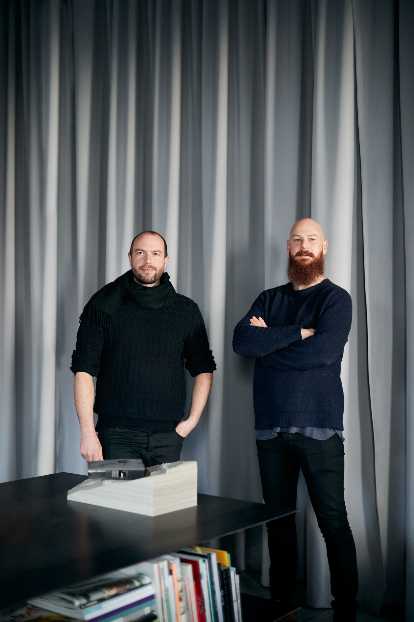
KBYes, that’s right – we wanted to make a real statement from the outset: that we exist as a cultural agent as much as an architecture office. We try to make sure that’s always communicated with our design. It’s not 100% architecture, it’s architecture as it relates to life – because architecture exists in the world.
Thank you, Aaron and Kim, for taking the time to chat with us. Gertrude Contemporary opens in its new EO-designed digs this week: if you’re an art–architecture lover, be sure to visit. To see more of EO’s striking and sensitive work, documented through stunning photography, head over to the Edition Office website.
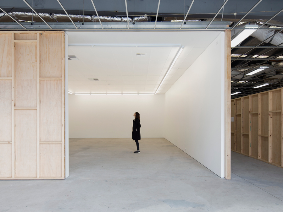
“Both entirely pragmatic and performative”: Edition Office’s Fish Creek House (2016). Photo: Ben Hosking.
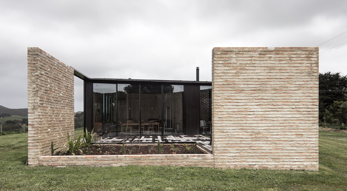
A sheltered courtyard is ‘hugged’ within a brick wall made with a custom mortar technique at Fish Creek House. Photo: Ben Hosking.
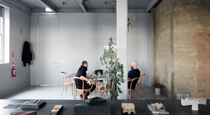
Models in the Edition Office HQ. Photo: Tom Ross.
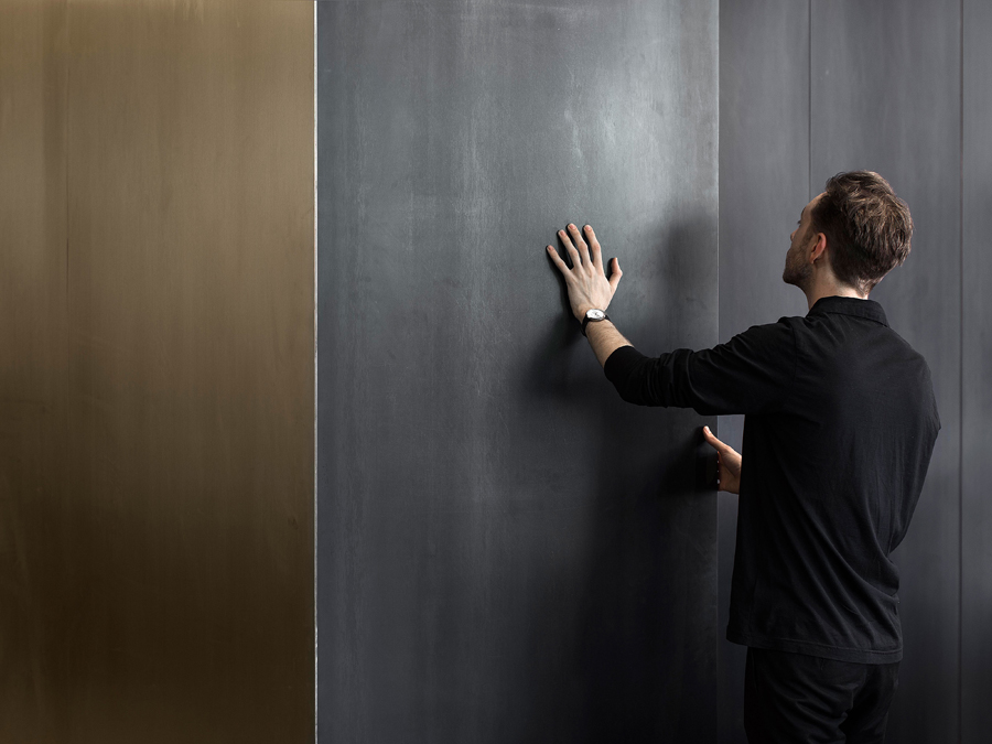
“We exist as a cultural agent as much as an architecture office.” Aaron Roberts (left) and Kim Bridgland (right), Edition Office directors. Photo: Tom Ross.
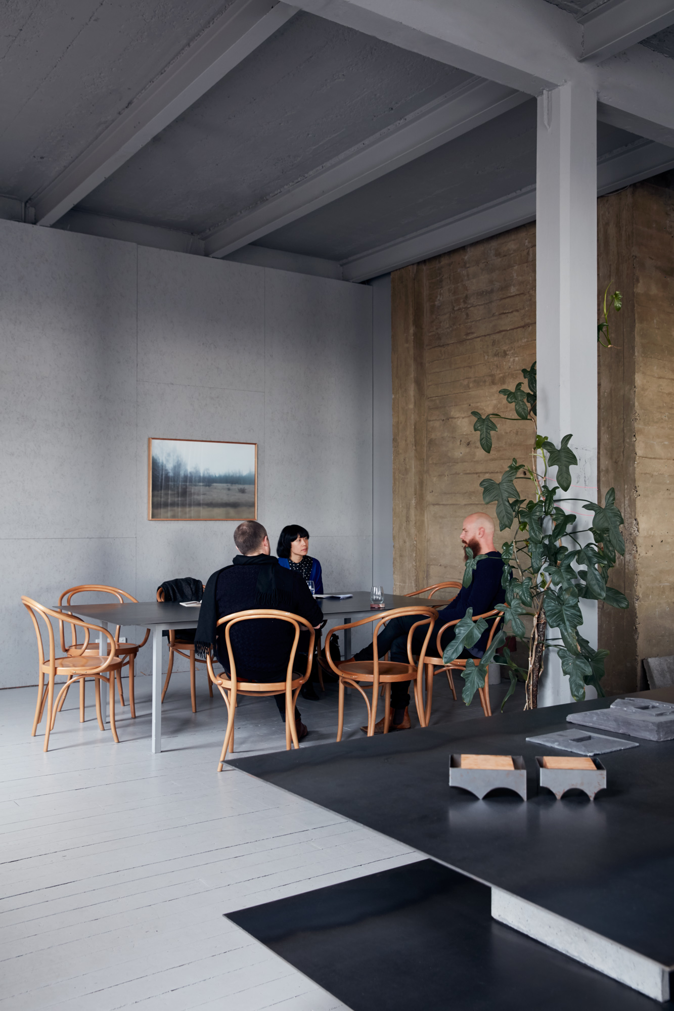
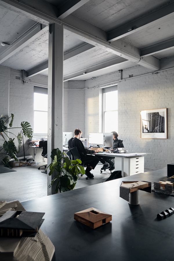
At work in the Edition Office HQ. Photo: Tom Ross.
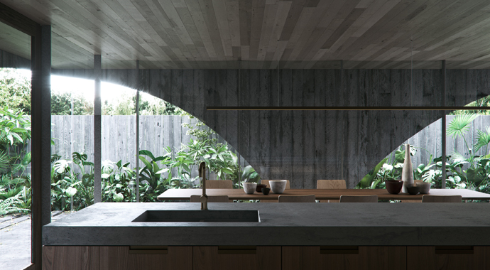
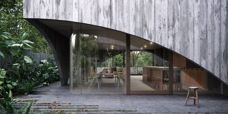
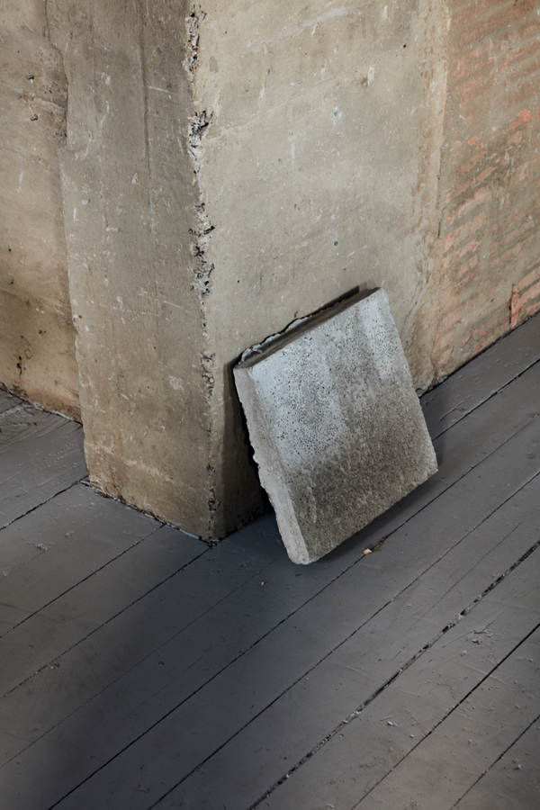
A heavy concrete skin balanced by light at Hawthorn House. Image: Edition Office.