Finding Muji
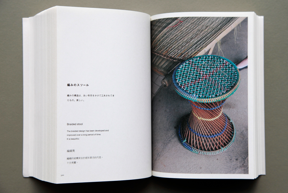
As MUJI prepares to open its first store in Australia this month, Leon Goh looks at the universally-admired company’s ‘no design design’ through the frame of its Found MUJI project. Founded over thirty years ago and originally titled Mujirushi (no brand) Ryonin (quality goods), MUJI’s core philosophy is about enhancing everyday life with embedded, accessible and usable design.
Here in Australia, there’s been a kind of ‘at arms length’ admiration for MUJI and its understated approach to product design and retail. Founded over thirty years ago and originally titled Mujirushi (no brand) Ryonin (quality goods), the company’s core philosophy is about enhancing everyday life with products that have embedded design intent, yet remain entirely accessible and usable. Creating objects with a limited colour palette and minimal packaging, MUJI has a range of over 5800 products. Some of the company’s most famous products include a CD player designed by Naoto Fukusawa, dining chairs by Jasper Morrison, a selection of furniture by Enzo Mari and the MUJI Labo clothing range designed by Yohji Yamamoto.
Over thirty years ago, MUJI began as an offshoot of the Seiyu department store but soon created its own retail network three years later – its first international store would open in London in 1991. MUJI eschews the usual hallmarks of corporate branding by limiting the use of their logo on their products while actively encouraging collaboration both within and outside of the company as a means to drive design and product innovation. In the MUJI company philosophy, the collective is privileged over the individual. Through its wholehearted focus on the brand and product, MUJI shifts the limelight away from the individual design “author”, reinforcing the collective effort required to bring its products to fruition. I’m hesitant to describe MUJI as a “lifestyle brand” because of the modern day PR-type connotations that this implies; but the company’s ability to touch multiple layers of everyday life – from homewares, clothing, stationary, food, transport and even housing – deserves to be venerated.

In stark contrast to its current state (at time of publishing, MUJI has over 400 stores worldwide and will open its first Australian store in Melbourne’s Chadstone this month), an article in the Guardian highlights a short period between 2000-2001 in which MUJI suffered a slowdown in profits and a slump in its share price due to poor performing product lines and rampant plagiarism by 100 yen shops. As writer Fiona Rattray notes, MUJI became “too dependent on brand-power, which was actually deteriorating at that time” – in other words, MUJI had become complacent. In a bid to reinvigorate the business, new president Tadamitsu Matsui realigned the company’s position back to its core philosophy – where product design coexists seamlessly with function. A new Japanese design team was created. Headed up by Shoji Ito, this domestic design team soon flourished, creating iconic products like their DVD and CD players (which went onto win several iF international design awards). Ito notes that his team is “very good at finding something that exists and distilling its essence”.
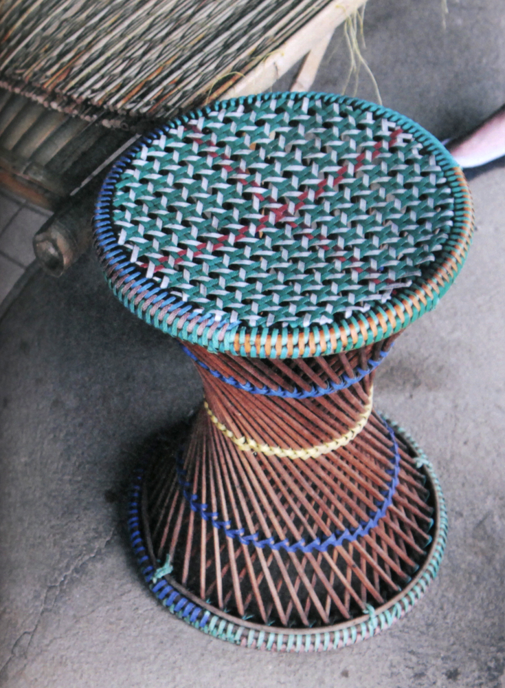
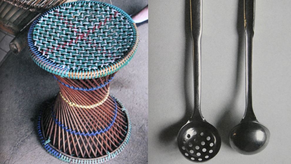
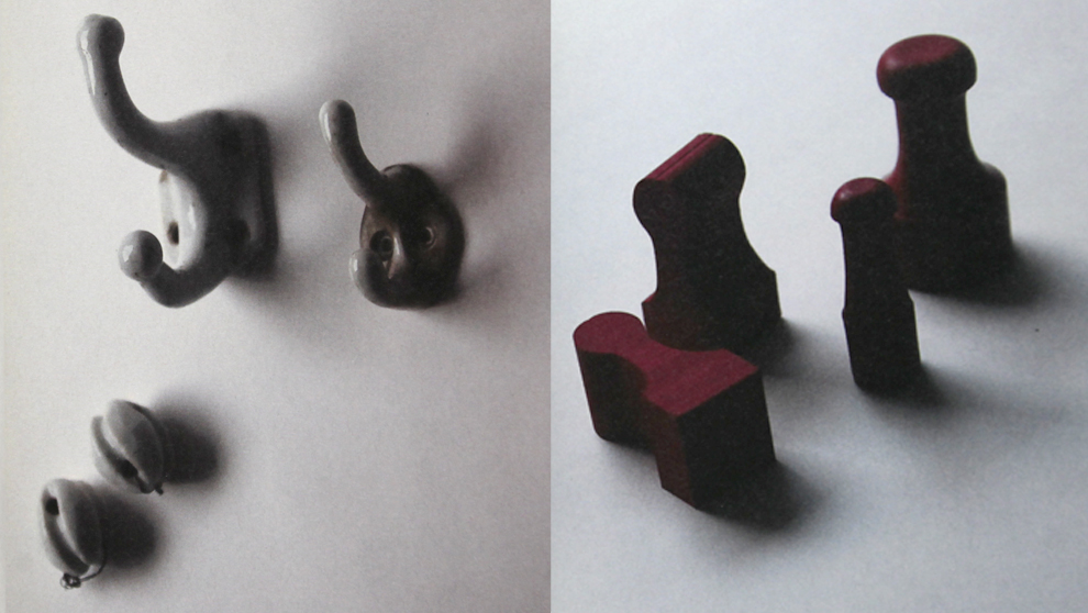
More recently in 2011, MUJI’s drive for innovative projects continued. Extending on the notion of kanketsu – the concept of simplicity to bring a sense of calm to strenuous everyday lives – MUJI recently began searching the globe for various unbranded low cost and handcrafted objects. Speaking with MUJI’s press office in Japan, I asked whether this project was driven by long time collaborators like Fukusawa-san and also whether this project was viewed as an important one internally within the company? “There were many people involved in the Found MUJI project, though the real main drivers of the project were internal MUJI staff.” A typically subtle and nuanced answer from this Japanese mainstay – always focused on the collective, never the individual.
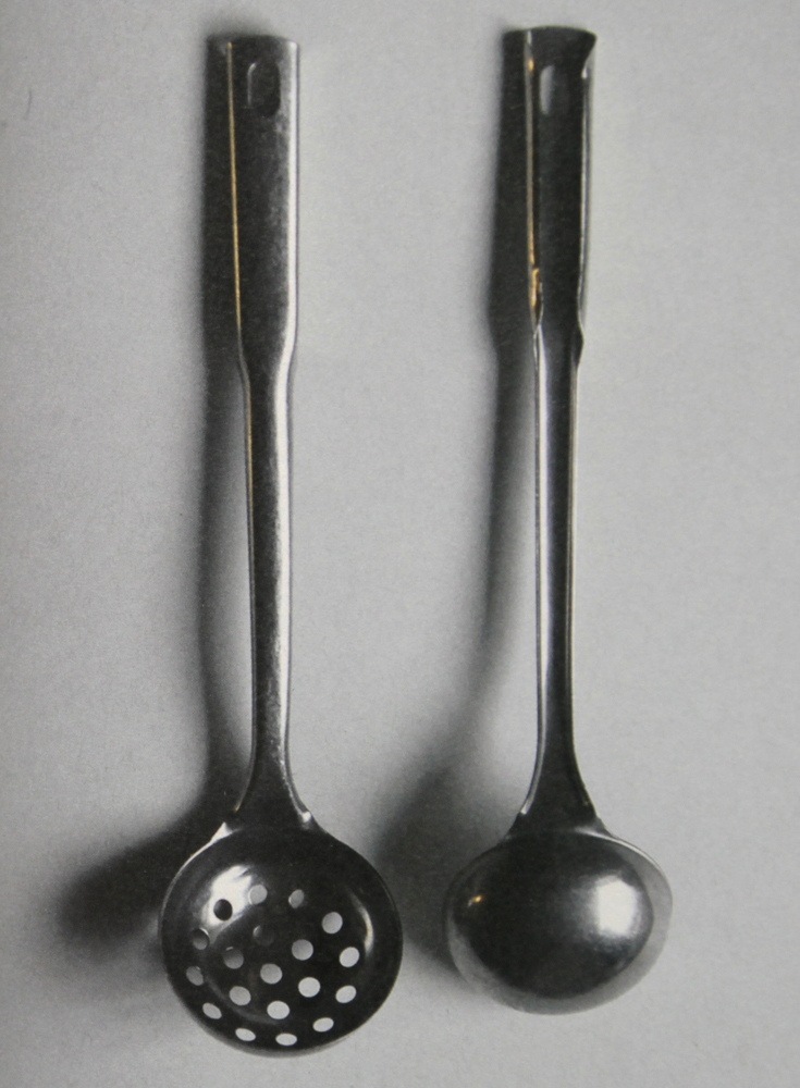
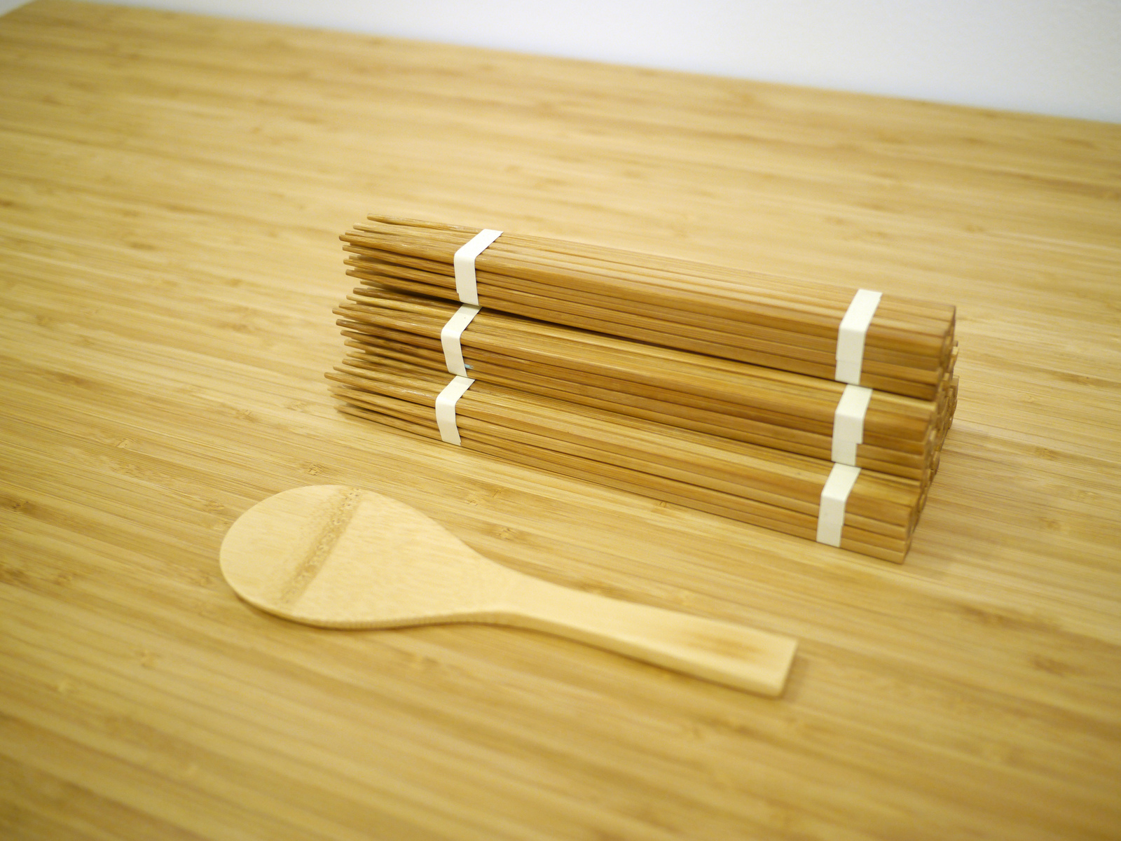
“Finding” these objects, which range from enamelware from France, chopsticks from China and tableware from Thailand, MUJI have removed these objects from their original cultural and historical contexts and extended their reach to new social spheres. Not only does this bring new audiences and agency to previously localised and small-time manufacturers, but you could also argue that the products themselves experience a second life as they are “recast” into different modes of living. Continuing the conversation with MUJI, I wondered whether Found MUJI was centred around the notion of returning to the original source? Was it about revealing the original design inspirations for some of MUJI’s own products, or simply showcasing and curating products deemed to be already “perfect”? “We think that we have started a very important activity here, which teaches us ‘a way of making’ for MUJI in future. From a product design perspective however, it is a movement for us to reconsider our original notion – ‘no design design’ – after 30 years of the brand. Found MUJI is a project to find/discover ‘beautiful everyday goods’ from the world, to give/add MUJI’s philosophy and values and to ‘present as a MUJI product’, to ‘re-live MUJI’.”
This notion of recasting and rediscovering is embedded at the core of Found MUJI. Most of the objects that are found are left entirely unchanged in terms of how they are reproduced by MUJI. In fact, many of the manufacturing processes for these products continue in exactly the same manner as the original, with MUJI not questioning their inherent use, value or function – if it has worked for this long, why wouldn’t it work in the future? Of the few that are reconfigured, any design changes that are made are minimal and focussed purely on enhancing function to better adapt to a modern context.
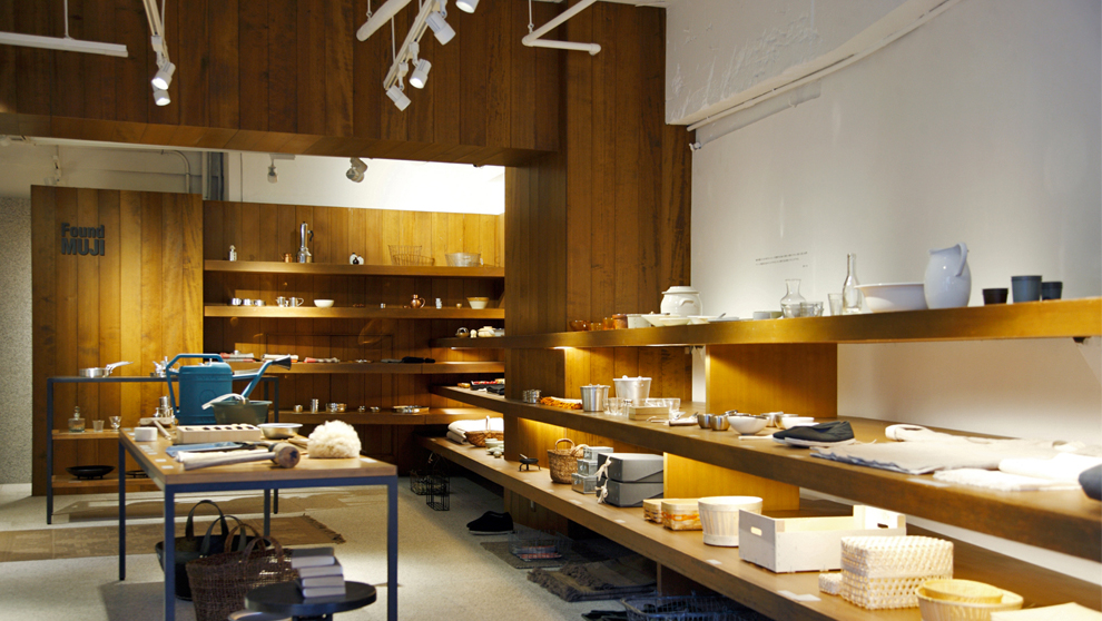
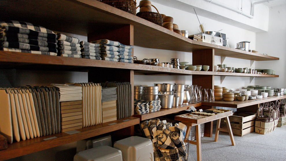
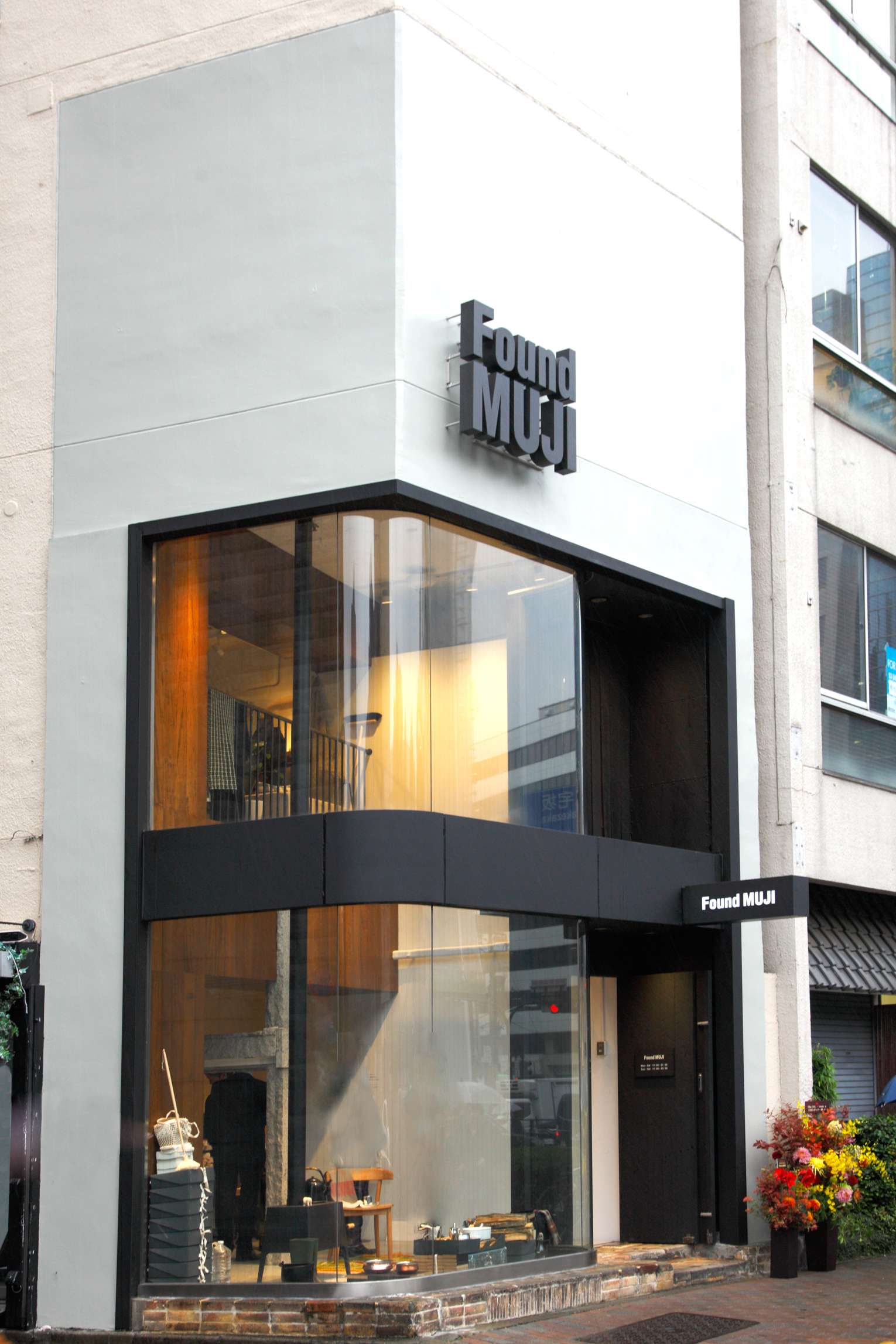
It certainly feels that MUJI has been reinvigorated. Reconfiguring its first signature store in Aoyama Tokyo purely to house the wares developed as part of this Found project, I ask MUJI if they could tell us the reason behind this choice? “The location of our Aoyama store is really a destination where ‘latest’ things and activities gather so we thought it would be an ideal place to realise, to communicate and to grow a new project for the brand”. Finding such strength by returning to core principles, it’s heartening to see such clarity espoused by a brand that no doubt has considerable commercial imperatives.
In a video produced by Herman Miller, which features Industrial Facility – designers of many of MUJI’s objects – they talk about being on the ‘edge of functioning’ – being part of a fragile world, which could easily fall apart if one system, for example transport or government, shifts dramatically. Designing MUJI’s Plywood Sofa Collection in 2002 and the ubiquitous MUJI phone in 2003, Industrial Facility’s approach radiates an emphasis on what fellow designer Jasper Morrison calls the “Super Normal” – the notion that the super normal object is the result of a long tradition of evolutionary advancement of everyday things. Industrial Facility continue in the video by emphasising the notion of creating equilibrium through design: “designing in an environment that does not work well is a great environment to design objects that work well” – tension in order to obtain balance. As modern beings that exist in this hectic and commodified world, we can easily participate in a cycle of purchase, use, perhaps abuse and discard. However MUJI’s return to its first principles is to be celebrated due to an embrace of notions of provenance and everyday functionality – concepts that are increasingly in short supply.
