Dan, Paul, Eike: Mid-City Mountain Cabin
Dan Honey and Paul Fuog are Melbourne design luminaries. Together with their young daughter Eike, they live in a Clare Cousins-designed apartment in Melbourne’s iconic Bible House building. Olga Bennett visits them at home.echo adrotate_group(2);
Dan Honey and Paul Fuog are Melbourne design luminaries. Dan is one third of Office for Good Design, curating and producing some of the most interesting design programming in Australia, while Paul co-helms design studio U-P. Last year they conducted Field Experiments, an ongoing cross-cultural project that explores traditional crafts around the world by engaging in collaborative making with local craftspeople. Together with their young daughter Eike, they live in a Clare Cousins-designed apartment in Melbourne’s iconic Bible House building. Olga Bennett visits them at home.
“Home is where we are all together and a space we can share with friends and family. It’s not a definitive geographical or physical space, rather a place for laughter, being free, relaxation, making ideas and being inspired.
We bought the apartment three years ago. We were hanging out in New York and returning to Melbourne without a place to live. Although we had no home, we had defined a blueprint on how we wanted to live. We wanted a small, contained space to house our few possessions. We wanted something central and connected, living without a car meant we needed to rely more on public transport and people coming to visit us. Shared living (public and private) was important – we wanted good public space and also a space we could easily rent out when we were away for short or long period. We saw the Bible House apartment on the internet and bought it the weekend we got back.
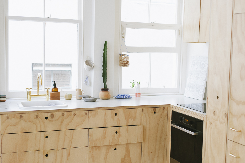
We learned more about Clare’s work while Dan was at State of Design. We were attracted to her work, her emphasis on the interior, her unfussy approach, and she had achieved some really good outcomes in small spaces, including retail fit-outs.
The brief was two fold. Firstly a verbal description of how we wanted to use the space, our intentions, for example, getting two sleeping zones out of the one existing bedroom. The second was a visual document, not all architecture or interiors but a collection of random images that helped to represent our interests, where we sat aesthetically, the kinds of things we connected with, ideas that were important to us.
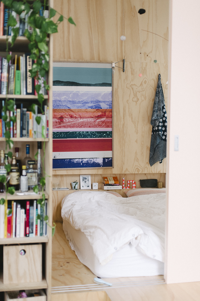
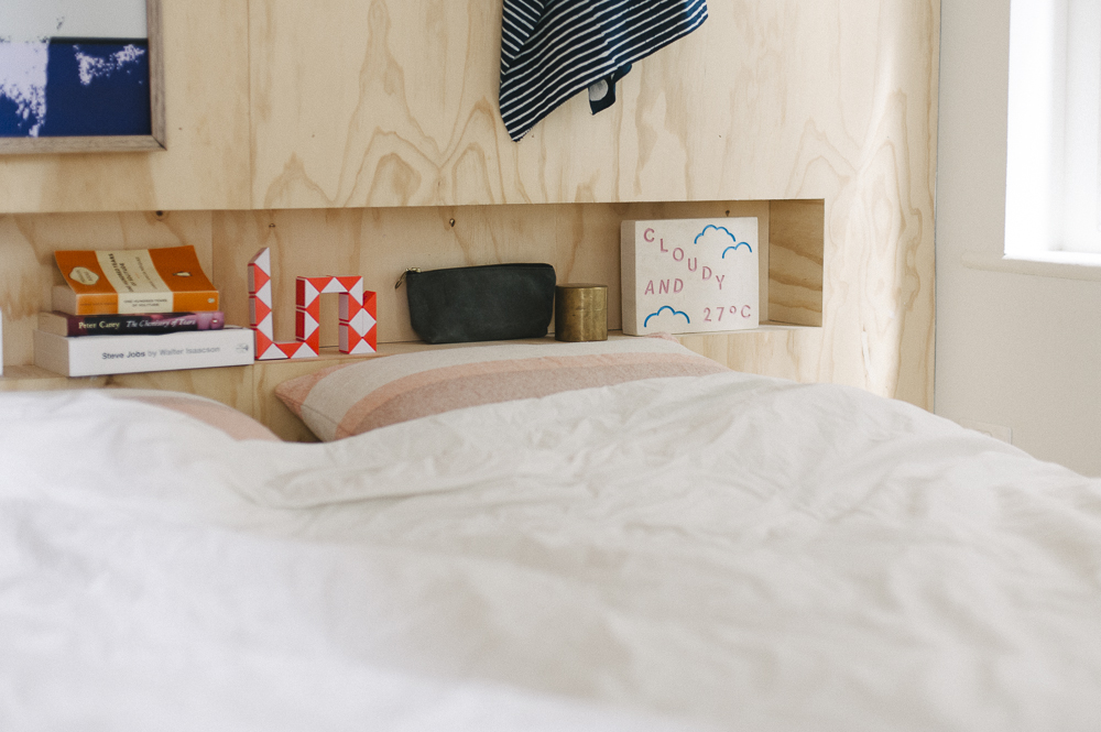
Inspiration came from a number of places. Most obviously Japanese design, in particular the Mountain House by Atelier Bow Wow and works by Torafu Architects. We were attracted to integrated interiors where there were few texture / material changes. This creates a sense of space and fluidity, where one space seamlessly flows into another creating a sense of openness.
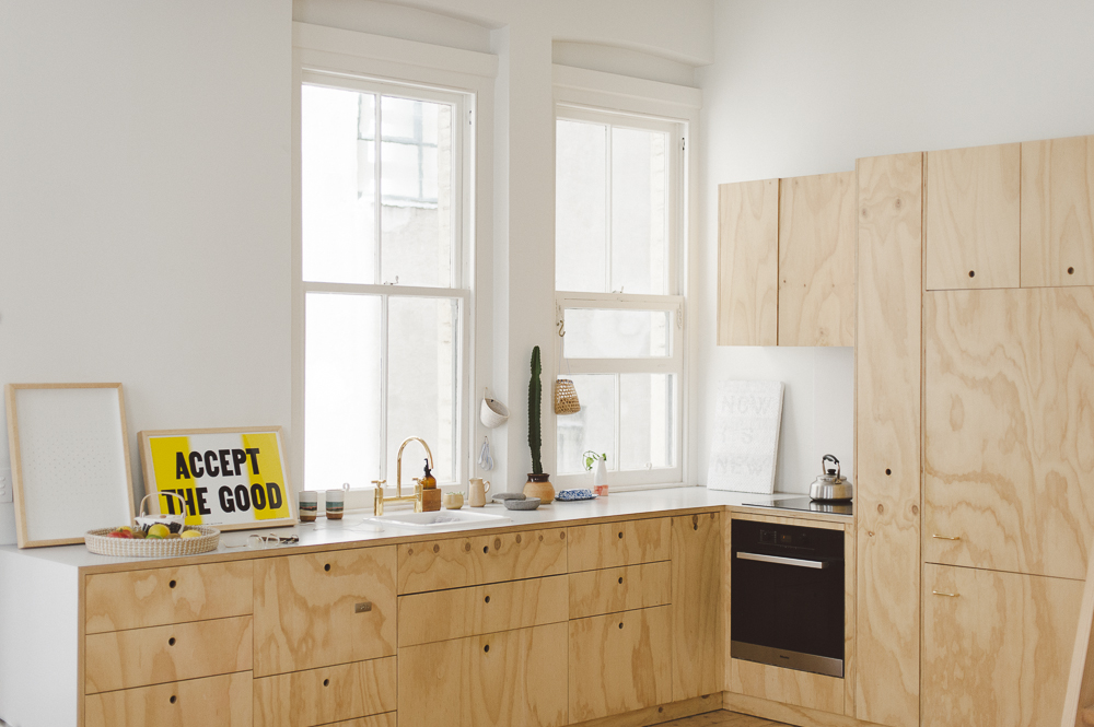
We were inspired by utilitarian approaches, for example the Frankfurt kitchen designed by Schütte-Lihotzky in 1926. Rational, efficient and unpretentious, the design featured built-in organisers and appliances, cost effective materials and was especially suited to small spaces.
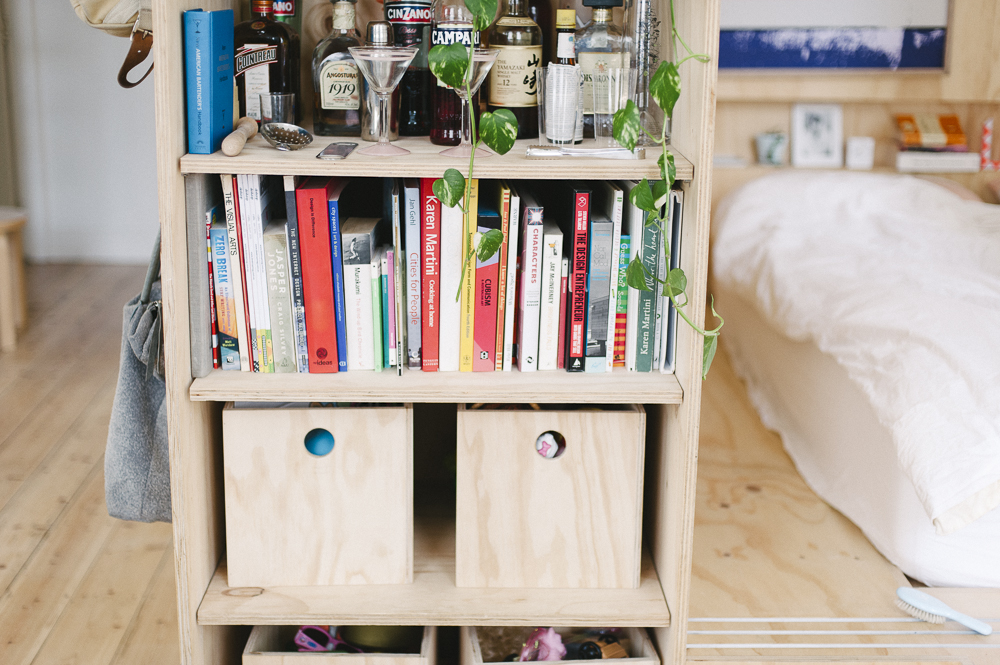
We have always loved Californian modernism, architects like A. Quincy Jones and Pierre Koenig. Although on a grand scale we couldn’t play much out in this apartment we certainly tried to incorporate many of the principles – readily available and economical materials, open floor plan, partitions rather than solid walls, built-in storage and seating, flexible and active spaces.
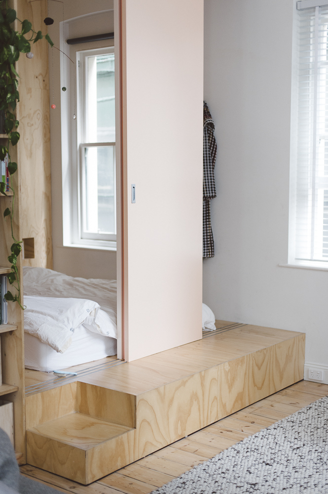
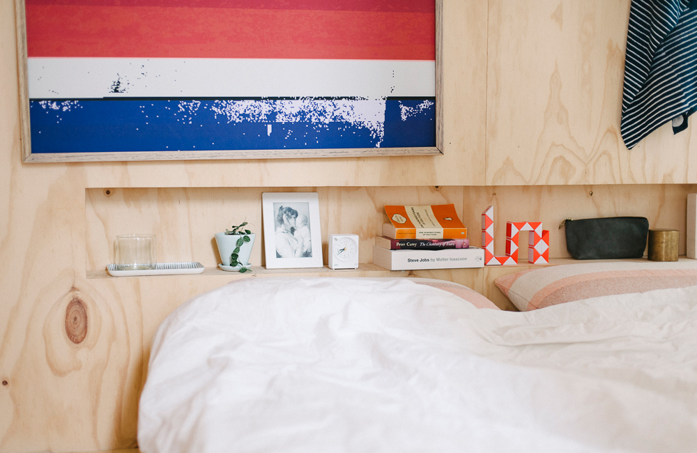
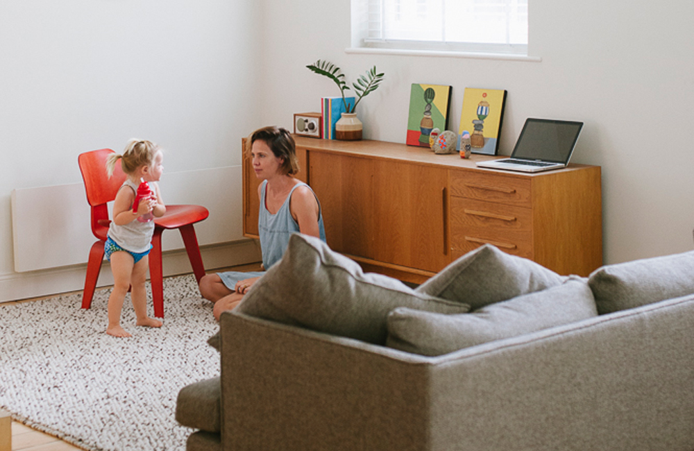
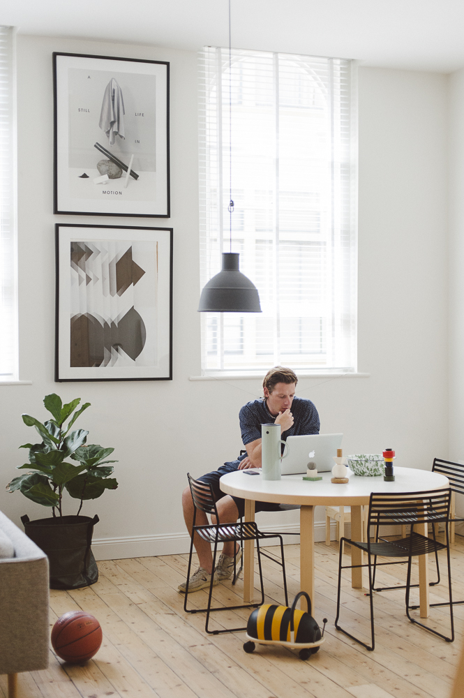
We also looked to Scandinavian cabins and mountain houses, which seems weird. The space was really heavy when we first occupied it – dark walls, benches, floors. We wanted to lighten it up, create a more natural and airy environment. It worked, as our guests (and ourselves) often forget that we are right in the middle of the city. It feels calm and serene.
Our apartment is small, just 75m², but we rarely feel on top of one another. Everyone said we would need a bigger house with a kid. She is two and we are yet to feel that.
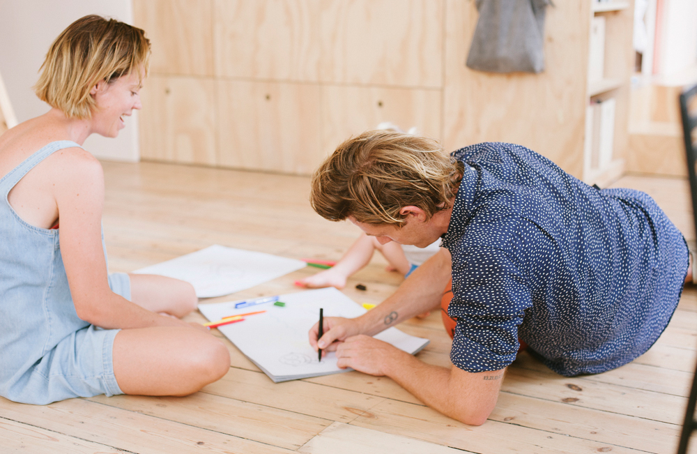
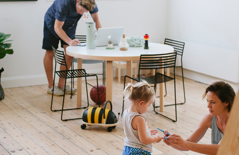
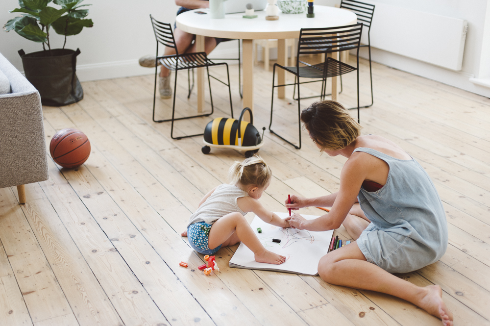
Having a young child means there is less time for work (a good thing). Life is more compartmentalised. Eike is our little friend, one of the team, who comes along for the ride. Like us, she enjoys new adventures and meeting new people but also needs quiet times and quiet moments, so it is about striking that magical balance. Right now her favourite words are restaurant and croissant, an indication that perhaps we should be spending more time at home.
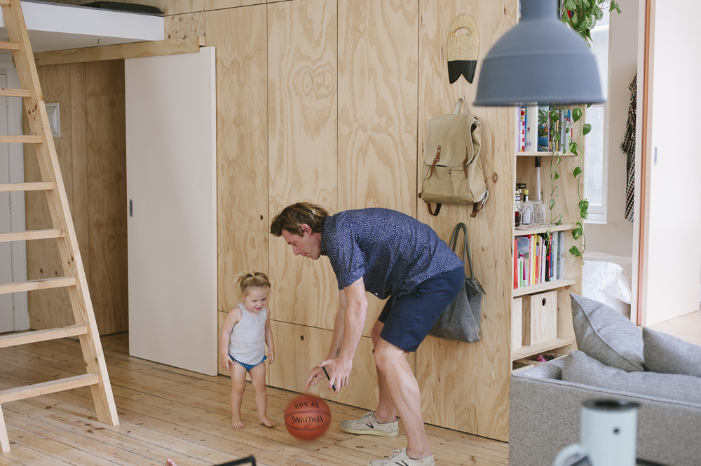
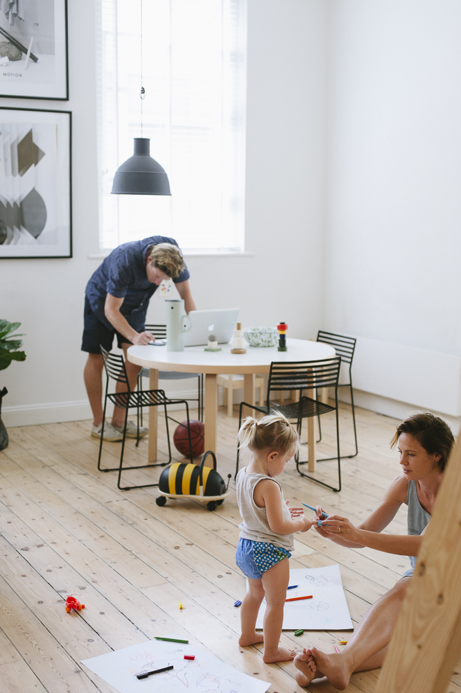
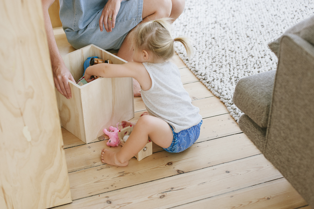
We renovated the house before Eike was born. We thought we knew what was needed but of course we had no idea. Luckily, Clare, our architect, has two kids. She designed clever things like integrating huge pull out drawers into the wall partitions. These are our daily dumping ground, making sure we don’t feel completely overrun.
Every day starts the same. Paul is always up first. Wakes Eike. He brings Eike into our bed and has a shower. Dan and Eike play around in bed. Paul prepares breakfast that includes fresh fruit, yoghurt, muesli and toast. He grabs coffees from downstairs, comes back and gets fed up that Dan and Eike are still in bed. Dan and Eike finally get up and get ready. Eat a nice leisurely breakfast together. Look at clock. Realise how late we all are (again). All order then disintegrates for the remainder of the day.
Melbourne’s design community is colourful but small. This smallness is a good thing in many ways, creating an intimacy and closeness. We all know one another and so it is easy to drum up support from within. The community is engaged and eager for new experiences, and so finding supporters, participants and audiences for new projects isn’t difficult. On the other hand, this smallness also presents some challenges. Melbourne is a place for creating new ideas but it is hard to spread these ideas outside our tight knit community. News travels in, but it doesn’t travel out so well. In this way, it is difficult for local design projects to have a global impact and make a significant contribution to the conversation happening outside of the city. As a result, things can feel parochial and this is frustrating. In an attempt to work around these challenges we seek collaborative partnerships with designers from other parts of the world.
Adventure and discovery is essential to what we do. To remain creatively charged we need to pull ourselves out of the everyday, refresh our eyeballs and wake up from the coma of comfort. We subscribe to the idea that it is daft to work hard all your life, taking a break for just four weeks a year, and then live it up when you retire, that day may never come. So we live for now. We’ve carefully shaped our work so that it gives us both the freedom and the need to explore. For example, Field Experiments was conceived to bring all that we love together; design, travel, making, sharing, exploring, collaboration…
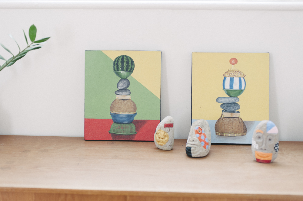
Field Experiments was a collaborative and shared project where we worked, lived and explored the island [of Bali] over 90 days and nights with two other designers. The experience has created a greater openness in both our work and home-life. At work, collaborating with others has become much easier as we are more prepared to let go and trust in others, and at home we are more open to sharing our private space with others.
Through Field Experiments we learnt how to use design in a different way. For the project, we used design as a way to learn about another country, its people and their culture. This was rewarding and it changed our mindset on how design could become more enriching, for example, helping to build tolerance and understanding.
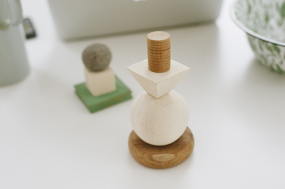
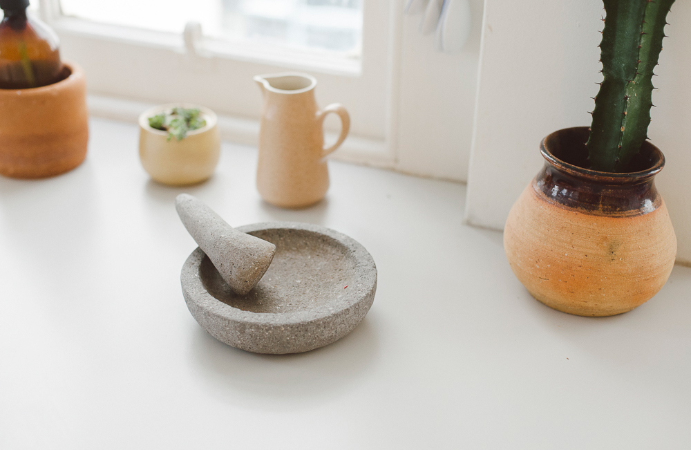
Most of the objects we created were shipped to New York for our exhibition in May. There were a few things we couldn’t part with when we left Indonesia and these were squeezed into our luggage. Although neither of us have been attached to decorative domestic objects in the past we’ve found it nice to be surrounded by the ‘experiments’. It has given us a greater appreciation for what a ‘souvenir’ could be, not just something bought from a middleman but handmade objects that are filled with strong memories of people.”
Dan and Paul are are currently working on concepts for The Other Hemisphere in Ventura Lambrate in Milan and also Broached Commissions at the Ullens Centre for Contemporary Art in Beijing. They are also working on their own show for Field Experiments that will be part of New York Design Week in May. All photos by Olga Bennett.
