Kerstin Thompson on vernacular architecture by the beach
Australian summer means slow languid days spent at the beach. On a recent escape to Port Fairy in Victoria, I became enamoured with beach life and this distinctly relaxed mode of living. On this topic of how the beach dwelling can influence our way of being, I spoke to Kerstin Thompson, architect and beach house believer, on the idea of ‘making do’ with less, and how her own coastal projects seem to resonate a Robin Boyd-like simplicity.echo adrotate_group(2);

Being summer, the beach getaway is incredibly enticing. I wanted to ask you about how you contextualise and design this kind of built form in your practice?
In terms of our work, design and buildings are all about ways of living. Beach houses or second houses are often the way that practices start. It tends to be quite a common first project, even more than a renovation. Often the client is likely to give a bit more latitude and experiment in their non-permanent house.
Once you have done a few of them the differences between the beach house and the primary house become more evident. You start to be able to see them as a survey and think about the different groups that they fall into. In terms of personal experiences, you come to the design of a project as an architect with formal training, the things that you have learnt about architecture in school, both rationally and intellectually; but you also bring your own experiences through childhood. The two converge – almost always aspects of our buildings register a childhood memory or something intuitive about a space you’ve previously known.

The Australian beach house is a particular approach to living and holidaying. Do you have fond memories or personal experiences that continue to resonate?
I spent a lot of summers as a child in Merimbula, NSW. A lot of those summer memories are rooted in that place. There are certain things that I remember about the house – my mum and dad built that house and my father designed it – he was not an architect so it was entirely do-it-yourself.
They wanted something that felt Mediterranean so an arched verandah featured. It was a small and very compact house actually – and it was made out of concrete block which was a cheap way to build at the time. It was very builder-driven of course but it had surprising clarity to it. Now that I think about it, my love of the concrete block perhaps stems from that… memories embedded in the house, a collection of feelings that are evoked.

Beach houses are so embedded in the Australian vernacular. You’ve previously talked about the notion that the beach house represents ‘the coming together for parallel lives’. Can you expand upon this idea?
With the beach house or the second house, it’s often the place where people go to get away with one other chosen person or family. Or it’s about getting together with a lot of people. So that sense of the collective experience and many lives intersecting in one place is quite central to how these spaces operate.
The beach house is essentially about ‘making do’, you don’t design for every situation, it’s about people’s behaviour and learning to adapt to fit the space that you’ve got and vice versa. For instance: kids bunking together, fitting as many into a room as possible; or how the front lawn becomes an informal gathering, camping place. Similarly, the notion of a single bathroom – negotiating who’s next for the shower – is all part of the deal. These adaptive ideas about beach houses I find really interesting.
I think back to my time at Merimbula again and tasks like washing the dishes were entirely social. You’d get lost in conversation during those pursuits, time fades away… I think there’s something quite important about that.

What about this notion of the beach house encouraging a mode of living or behaving that is the antithesis of living in an urban environment? Tell us more about your thoughts on this…
Urban living is largely about your day-to-day – ingrained habits and making your space fit. Alternatively, your habits fit your space, but they are definitely intertwined. I would say that as soon as people spend a few days in any space, they start to form routines and rituals. So there might be subtle shifts in how you prepare a meal in your urban situation; it might be slightly more makeshift in a secondary house.
If I think of something like light, you would tend to live around that natural cycle. At Merimbula, the house had lots of west-facing windows, so I remember this fantastic time at the end of the day when the table would be bathed in that glorious golden light. The golden hour. I used to love just sitting in it. The light really made you want to be in that space, to make the most of it. In any other house with a different aspect you might spend your days differently.
When I think about this, I consider what the beach house might not have. It’s not the sort of building that seeks to replicate a city existence, it’s more about what the house can’t give you…that’s what the beach is really for. That makes a really big difference: the building doesn’t have to do it all. Space in a more modest form – which is my idealised version.
Recently I stayed in a beach shack in Port Fairy and was able to experience beach living with fresh eyes. I feel that archetypal Australian notions of landscape play a big part in how beach houses are designed. In your experience, is this something that you consider when designing a new beach house?
Yes definitely. What I’ve learnt is that when we first go to a site, I think one of the key reactions is whether it’s going to be a shack or whether it’s a more ‘hunker down’ space… so perhaps there’s a light weight option and a heavy weight option – though I’ve never thought about it as oppositional before. The landscape definitely informs, whether it’s a minimal form of shelter where you can feel the elements, like perhaps the Blairgowrie house, or if its more about the refuge, the bunker or the bastion, an entirely different relationship to the outside.
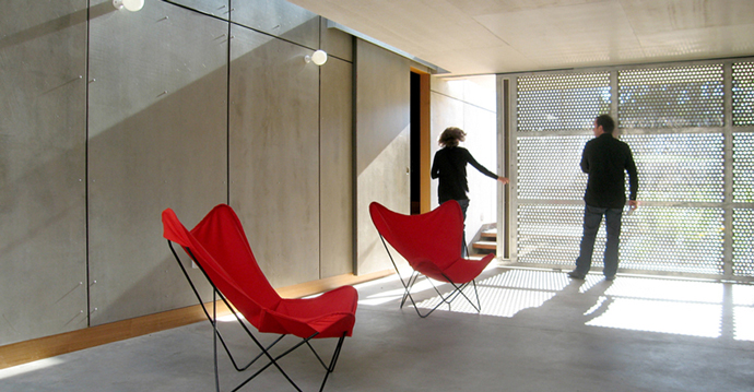
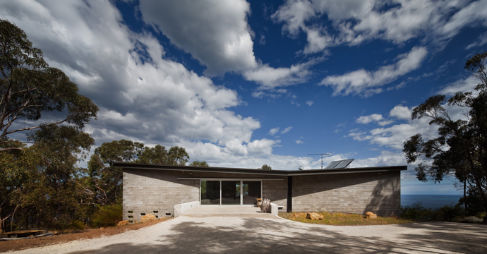
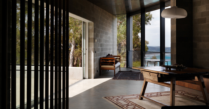
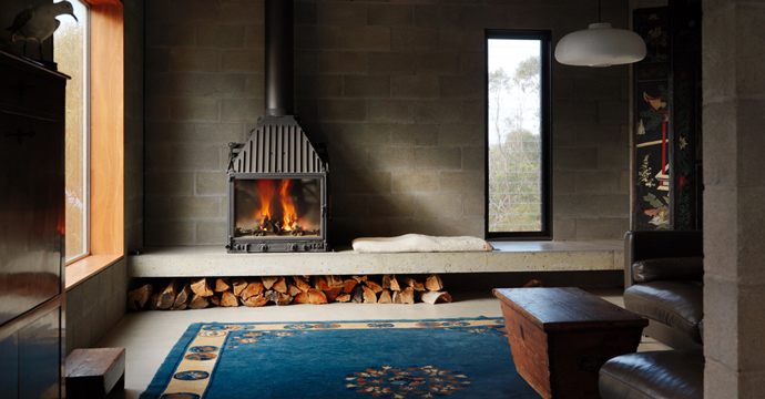
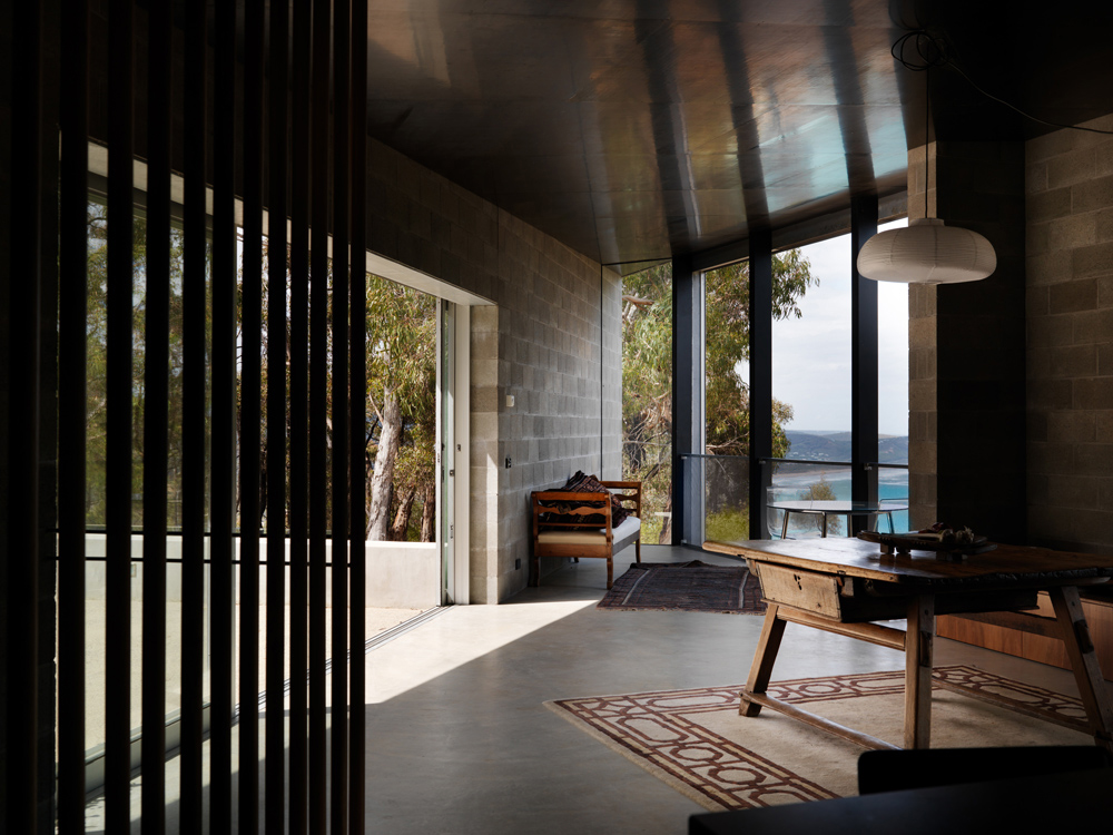
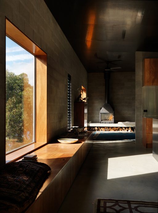
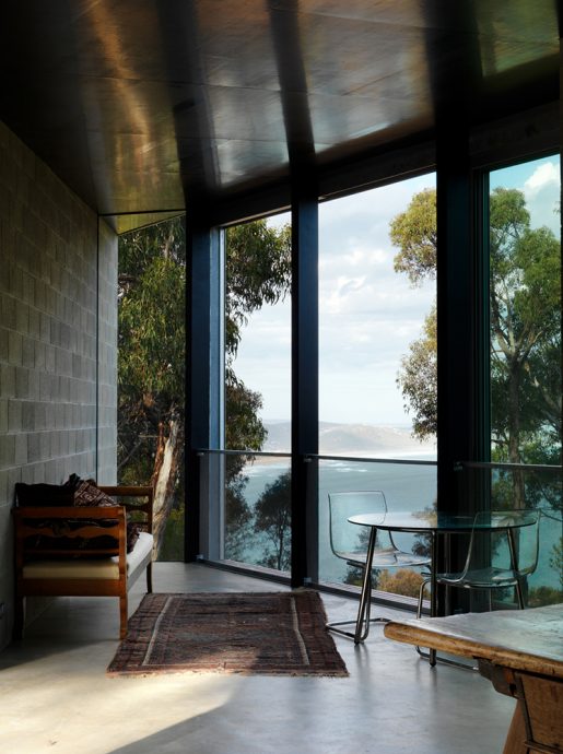
You have a strong sense of flow between ‘inside-ness’ and ‘outside-ness’ in the Blairgowrie house whereas with the Big Hill house we recently designed – partly because it felt more exposed as a site, but also because it’s more bushfire prone – ideas of mass and inflammability resonated and were translated into built form with an interior that was deliberately distinct from outside. Much more a bastion than a shack.
I wanted to talk more broadly about Robin Boyd’s contribution to this vernacular. In a 2009 Monthly Magazine article, Peter Conrad revisits Robin Boyd’s The Australian Ugliness:
“Boyd describes an Australian rite of passage in reverse: our necessary escape into the wider, larger world is followed by the homecoming, when we look with newly opened eyes at the place we left and see for the first time its strangeness, its savagery and its abstract, inhuman beauty.”
This, I feel, really rings true about the strange beauty of the landscape. In your experience, how does this inform choices of materiality?
I think something that I’ve noticed is that good architecture will always draw out and amplify aspects of its situation and its place. I’ve noticed too that things you might have had a blind spot to may become clearer when the building is there. It becomes a way of heightening your understanding of place, actually.
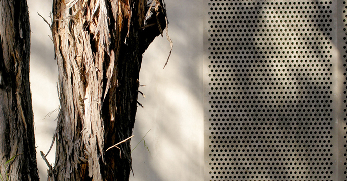
For instance, with Big Hill it was once the building had gone up – which had a lovely dark blackness to its interior – that it immediately drew out the blackness in the iron bark trunks. All of a sudden, the forest felt even more beautiful. And similarly, as soon as you put a wall in a landscape, shadows start to appear that you wouldn’t see otherwise. So that relationship between the built form and place can really draw out things you may have otherwise missed. Whether in the city or the bush, it’s the same thing, this amplification of place by architecture.
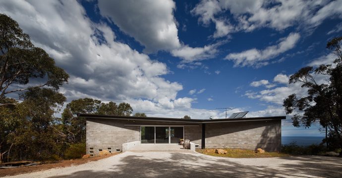
In your essay ‘Building on the Sublime’, you talk about your beach house at Big Hill, ‘aligning surface and structure…offering a purity of form and construction that exhibits a Boyd-like preference for the reduced over complexity’. Is this simplified approach important to your practice?
Yeah definitely, and I think it’s even more important because Melbourne’s architectural culture – perhaps this is a new world tendency – is very ‘additive’. It’s like food: you know when you mix a whole lot of cuisines there’s always one ingredient too many or maybe an extra step you could have done without. So I think a lot of local buildings are that way – some of it is not deliberate and some of it is, in order to mix things up and create a disjuncture.
Do you think this is particularly a new world approach?
I think so, because there aren’t so many rules. There isn’t some law that’s been around for 500 years that circumvents that freedom. I also think probably partly in reaction to that, as you get more experienced, I feel you do seek a more synthesised and singular response.
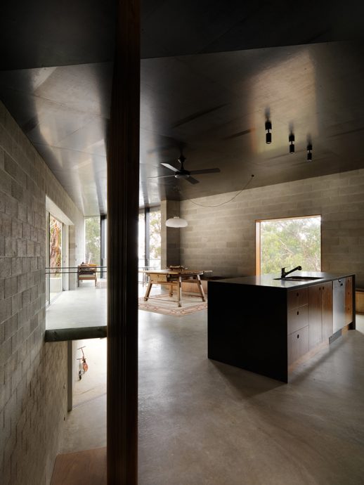
There are some design elements in your beach houses that to my untrained eye reference some of Boyd’s simple visual language. Is this something you seek out, or is it a more instinctive response to the client, site and brief?
Probably a bit of both. Sometimes it’s an unintended consequence of being in Melbourne and growing up around certain buildings – these buildings I guess are recognised as your local legacy. Inevitably that influences you and similarly there are schools of thought that you align yourself with and not others. I think too that some of it is intuitive. So in terms of the Big Hill house, at the time I wasn’t looking particularly at Boyd’s work as references except that I knew that there was an interest in geometry that came out of Melbourne’s Modernists. It was when the building was nearly completed that I started think, ‘gosh I can see a connection in the windows with Jimmy Watson’s façade’ for instance I think this was is the back of my mind without even recognising it.
Or strangely, the feeling of NGV’s Great Hall, the mass of those walls and the darkness of that space and the blackness of that ceiling… I realise in retrospect that there’s a quality to that space that I was trying to speak to. So it’s a subliminal process until you recognise the links.


When speaking about your work, you often bring it back to the ‘act of living’ above anything else. Why do you think this is so important?
In really simple terms, I believe that ultimately, we make buildings to hold life. That’s what they are for… well, that’s what I think they are for, and I think we can lose sight of that so easily. So in that regard, that is the driver. Making the thing that can hold people, their things or events – the building should be gently playing its role and is not the main attraction.
I have since thought that a mistake people can make is in thinking that a building can provide them with a life that they don’t actually have. The fact of the matter is that it can’t. And I think sometimes architecture is expected to provide a kind of liveliness through visual articulation or a form of distraction. It’s quite a hard thing to get around, but I do sense there’s a pressure for buildings to perform, to be visually expressive or active as a way to fill in what might not be there through living. So we try to strive for the opposite of that. Simplicity or synthesis is what we seek throughout all of our projects. It’s a hard thing to explain and achieve, especially in a culture that it so visual. But essentially, architecture is about living, whether it’s a police station, or a house.

As we move towards greater urbanisation, Australia is now one of the world’s most urbanised nations. What is the place for the Aussie beach shack in all this?
The difficulty comes when the pressures of a more urban way of living are expected by the sea. The building can then become really bloated, establishing boundaries, formal rooms etc. and all of a sudden you are right up next to your neighbours and you enact things that you were essentially trying to escape from. So I think the shack has its place, but we need to be mindful about what’s distinctive about it and not lose that sense.
I wanted to bring it back to a Boyd quote that you reference in your essay:
“The object of a design, in architecture as in anything else, is to say or do the essential thing as simply and directly and purely as possible” (page 133, Living in Australia).
How important do you think this notion of ‘simplicity’ is to design?
Well, putting myself in a more reductivist camp, I do think that simplicity is important. It’s about an economy of means, which I think is entirely worthwhile pursuing. Building is by nature an extravagant and violent act. It will always be a better thing to not build, so when architects say that they are building in a sustainable way, it’s never sustainable on one level…
If you are going to build, then aim to do it in a way that is careful with its use of things. Consider: ‘have I got the most out of this element’, instead of adding ten things. Can I make this one detail fit a number of purposes? I think that’s something that we are interested in and that’s partly for aesthetic purposes, but there’s also a bit of pragmatism and economy in that. It’s all of those things together that I think give it value of a different kind.

Kerstin Thompson Architects (KTA) was established in 1994 by Kerstin Thompson. Based in Melbourne, the work of the practice spans architecture, interiors, landscape and urban design. Projects range from the intimate and small-scale through to major infrastructure, and are located across urban, coastal, suburban and rural landscapes. Recent projects include Marysville and Carrum Downs Police Stations, the Visitors Center for the Australian Garden at RBG Cranbourne, Monash University Museum of Art & Ian Potter Sculpture forecourt. Recent residential projects include House at Big Hill and Napier Street Housing in Fitzroy. To view more work by KTA, visit: kerstinthompson.com
