The Purple Rose of Cairo
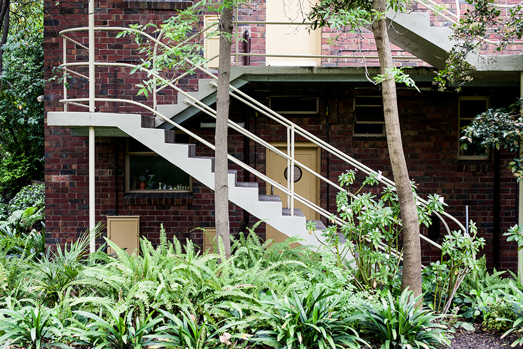
The 1930s Best Overend-designed Cairo Building on Nicholson Street, Fitzroy, is an example of minimal living mastery that inaugurated our This Vertical Life column in 2012, with an article that reflected on the modernist apartment building through the eyes of former residents looking back fondly. We included an image of current resident Michael Roper who was at the time renting a 24sqm studio in the northern bend of the U. Since then he has become the proud owner of an equal footprint across the way, completing an award-winning new fit-out with his studio Architecture Architecture (which he co-directs with Nick James).
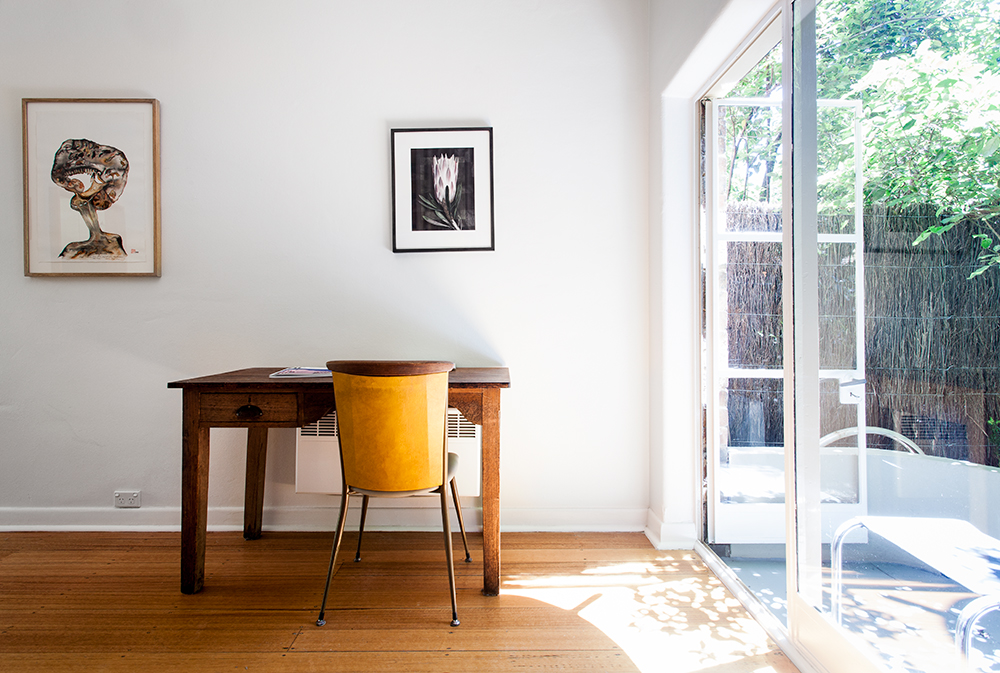
Michael invited me over for breakfast one sunny winter’s morning where the light was so perfect as to showcase Overend’s handiwork in all its glory. Immediately upon stepping inside Michael’s home my eyes were drawn to the lush leafy green outlook of the shared garden beyond, which Michael says is truly what makes the space. It’s the trickery of organic architecture, inviting the outside inside, that negates the feeling of being boxed in.
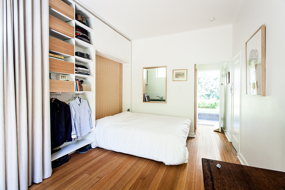
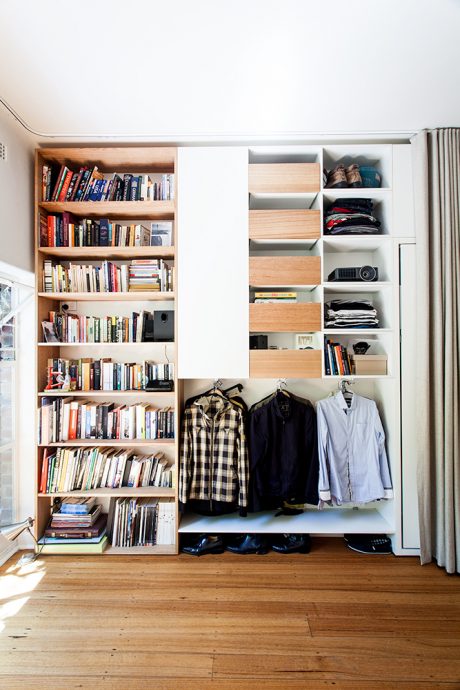
Architecture Architecture’s fit-out pays its deep respect to the ingenuity of Overend’s original work, while making subtle updates to improve functionality and flexibility. Simple, low cost materials have been used throughout – Victorian Ash employed sparingly, so as not to over-emphasise the warm orange glow of the floorboards, offset by an abundance of white melamine that is fresh and unassuming.
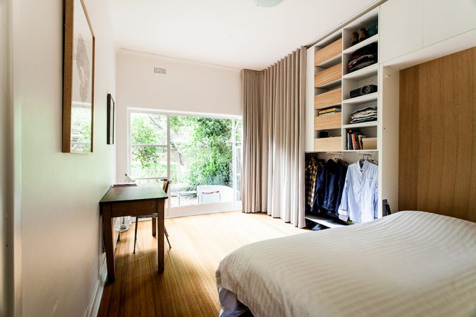
When we visited Michael in 2012, he struck a casual lean beside his bed, which was positioned directly in-front of the window, iridescent with light –previously the only possible configuration in the Cairo studios due to the kitchen door opening out into the room. While Michael enjoyed awakening in a pool of sun, he saw that the space could be better utilised if it were possible to free up the area behind.

This was achieved by relocating the kitchen doorway to the entrance hall, where Michael believes Overend may have originally sited it before the whole building was refurbished in 2000 (but admits this could be because he doesn’t want to believe Overend initially got it wrong), and abandoning his freestanding bed for a fold-out that can be neatly disguised within one wall.
When I arrived, the apartment was configured for sleeping. The bed was freshly made and occupying roughly half of the main room. In order to transform for entertainment, Michael effortlessly flipped it up and dragged his desk into the centre of the space. Voila, a dining table, able to accommodate 1–4 with the addition of stools from the verandah.
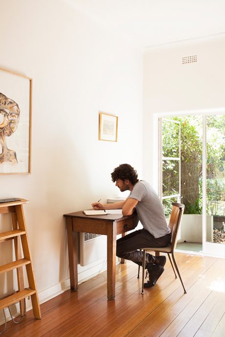
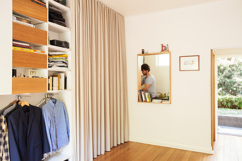
Watching Michael prepare our meal I could see the kitchen is very tiny, but not prohibitively so. In the latest issue of TOO MUCH magazine, I read about an architect couple who spent a year living in Kisho Kurokawa’s Nakagin capsule tower as a fieldwork exercise. At first it was a challenge but they soon found themselves falling into a happy cadence of living that became second nature. Describing their culinary routine they said, “In the rare moments when we cooked, one had to stand still in a strategic point, while the other prepared everything”. It sounded to me an intimate dance of sorts where each has their predetermined and complementary task.
I could imagine a similar approach being necessary in Michael’s home. There is only ever room enough for one (or barely two) in the kitchen, but the pottering cook is never far removed what’s going on beyond their domain. The previous doorway has been modified to a timber-clad opening at waist height to create a vista out to guests, without requiring a fully open-plan layout. Michael tells me he has hosted many a successful dinner party, and once you’ve experienced the magic of the apartment it’s easy to see how.
The one anomaly is the bathroom, which is humongous in comparison to other living quarters. It’s at least double the size of the kitchen, which reflects the different priorities that existed at the time the building was constructed. Michael suggests the charm of the 1930s bachelor-intended dwelling was offering perceived luxuries to offset its small size. An inordinately large bathroom was one of these features. Another – the curvature between the walls and ceiling, meaning the eye does not catch on a harsh edge that would conjure tinier proportions.
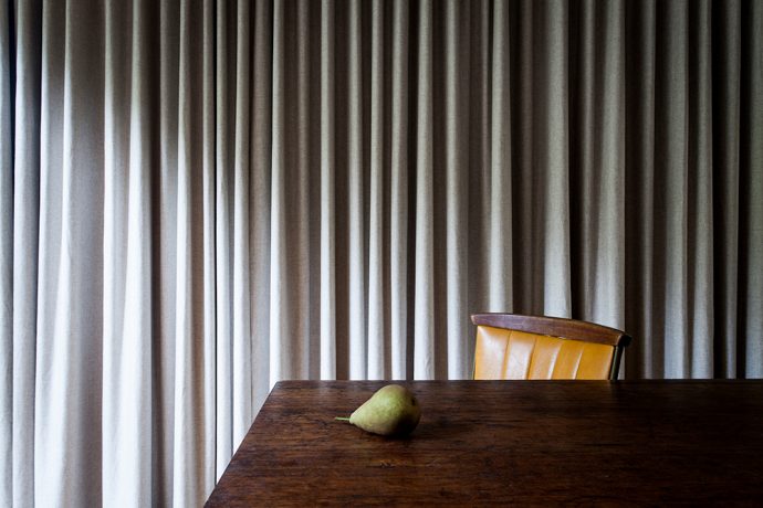
Now that he’s lived in the new configuration for some time, I asked Michael if there’s anything he’d change or add. He reflected that when he first moved in he was fresh from several years living overseas and, having sold all his belongings before returning, it was easy to lead a minimal existence. He is now ready to begin adding more ‘layers’ to the space, with plans to construct a simple shelf above the desk in the same Victorian Ash with a white powder-coated steel top (evolving from but in keeping with the melamine finishes). However, he is wary of adding too much clutter – we talked about the beauty of living as a traveller within one’s own city, which is what the Cairo studios encourage so beautifully.
Architecture Architecture is a small Melbourne-based practice with a commitment to thoughtful contemporary design projects. Their work spans all scales of (mostly residential) building, from petite apartment fit-outs to expansive warehouse conversions. The Purple Rose of Cairo is the recipient of commendations at the 2013 Australian Institute of Architecture awards and the 2013 ArchiTeam Awards. Thanks to Tom Ross of Brilliant Creek for his stunning photos.


