Singing the praises of the six-pack apartment in Richmond
The six-pack is the unsung hero of Australia’s vernacular architecture. Their sweep through the inner suburbs in the 1970s left a significant mark on the urban landscape. Though often reviled, we at Assemble Papers love them for their solid build and functional design. Jack Chen has carefully renovated a 33 sqm apartment in a modest walk-up block in Richmond, showing what a six-pack flat can do.
The six-pack is the unsung hero of Australia’s vernacular architecture. The humble walk-up apartment building, with that distinctive boxy, Lego look in red or cream brick, first started springing up in the 1930s around Australian suburbs – wealthy, poor and middling alike. The construction of six-packs reached its crescendo in the postwar period, when thousands of owners replaced the footprint of a detached house on a single lot with a long and thin two- and three-storey apartment building, always sans elevator. It is not quite clear where the name comes from: the six-window façade to the street, the footprint of six flats per level, or the uniform look of tightly packed flats of monotonous design; but the name, unreferenced, persists both in informal conversations and theory books. The no-fuss design was a by-product of planning regulations that didn’t differentiate between single- and multi-family dwellings, regulating apartment buildings only by site coverage, setback and height.
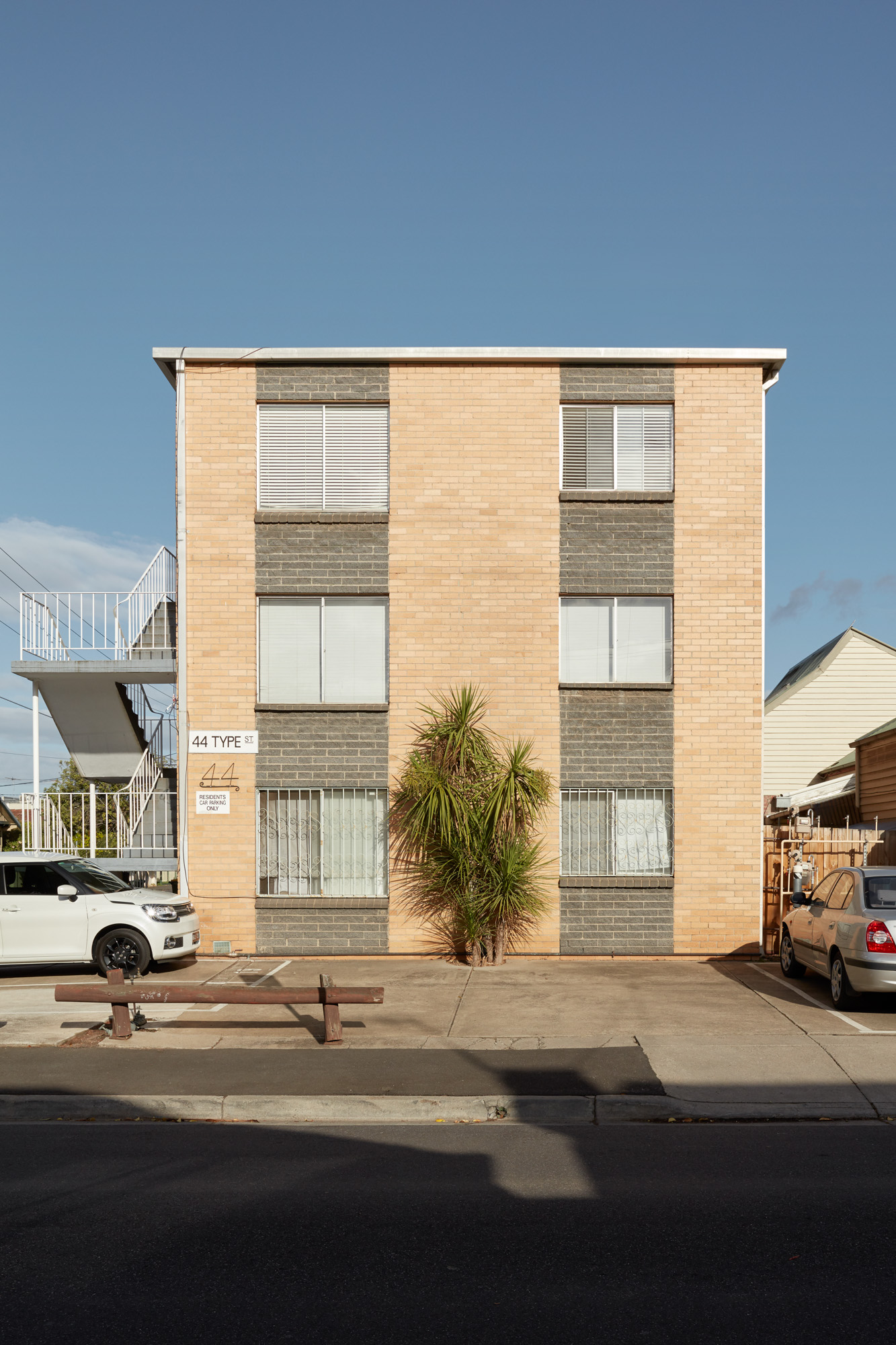
The typology was a huge money-maker: it could fit eight to twelve families where before there was one, even if the apartments themselves were the epitome of modest. So many were built so quickly in St Kilda, that they increased the population of the suburb by 10,000 in one decade.
“Walk-ups are the most common apartment format in Australian cities and towns,” writes Charles Pickett for Powerhouse Museum. Despite this, they have rarely been appreciated. Architectural historian Miles Lewis called them “the worst disaster ever” to blight Melbourne’s residential landscape, dismissing the whole period of the 1960s in architecture as “the reign of the six-pack”. Writing in 1979, Harry Seidler noted: “The total effect of this demolition of individual houses for replacement on the same site by now quite standard three-storey flats is truly horrifying. The results are barrack-type buildings, their long dimensions filling the depth of the narrow allotment. What used to be yards at the back and on the sides…are denuded of vegetation and paved for cars. On floors above, the living rooms of adjacent blocks face each other across the five-metre wide canyon…”
The ’six-pack’ flats, however reviled, have remained an affordable and popular entry point into the property market – particularly with the introduction of strata title laws in the 1960s. Although larger apartment buildings, equipped with elevators, have become more common in recent years, Pickett notes that the walk-up format “has proved a surprisingly tenacious survivor.” As Melbourne has seen a boom in apartment construction in the past decade – many of them of extremely low design standard – the humble ‘six-pack’ has also been increasingly appreciated for its solid build (usually double brick and concrete) and good-sized apartments.
“Over the years I’ve come to appreciate their dorky, humble charm,” says Assemble director Quino Holland, whose architecture practice Fieldwork recently completed a project designed in direct homage to the ‘six-pack’: “their funny proportions, daggy brick colours, external stairs, funny little decorative flourishes and clunky-but-honest construction. Their sweep through the inner suburbs in the 1970s left a significant mark on the urban landscape. I think it is time to take a fresh look at the six-pack, and see what we can learn from their 70-year history.”

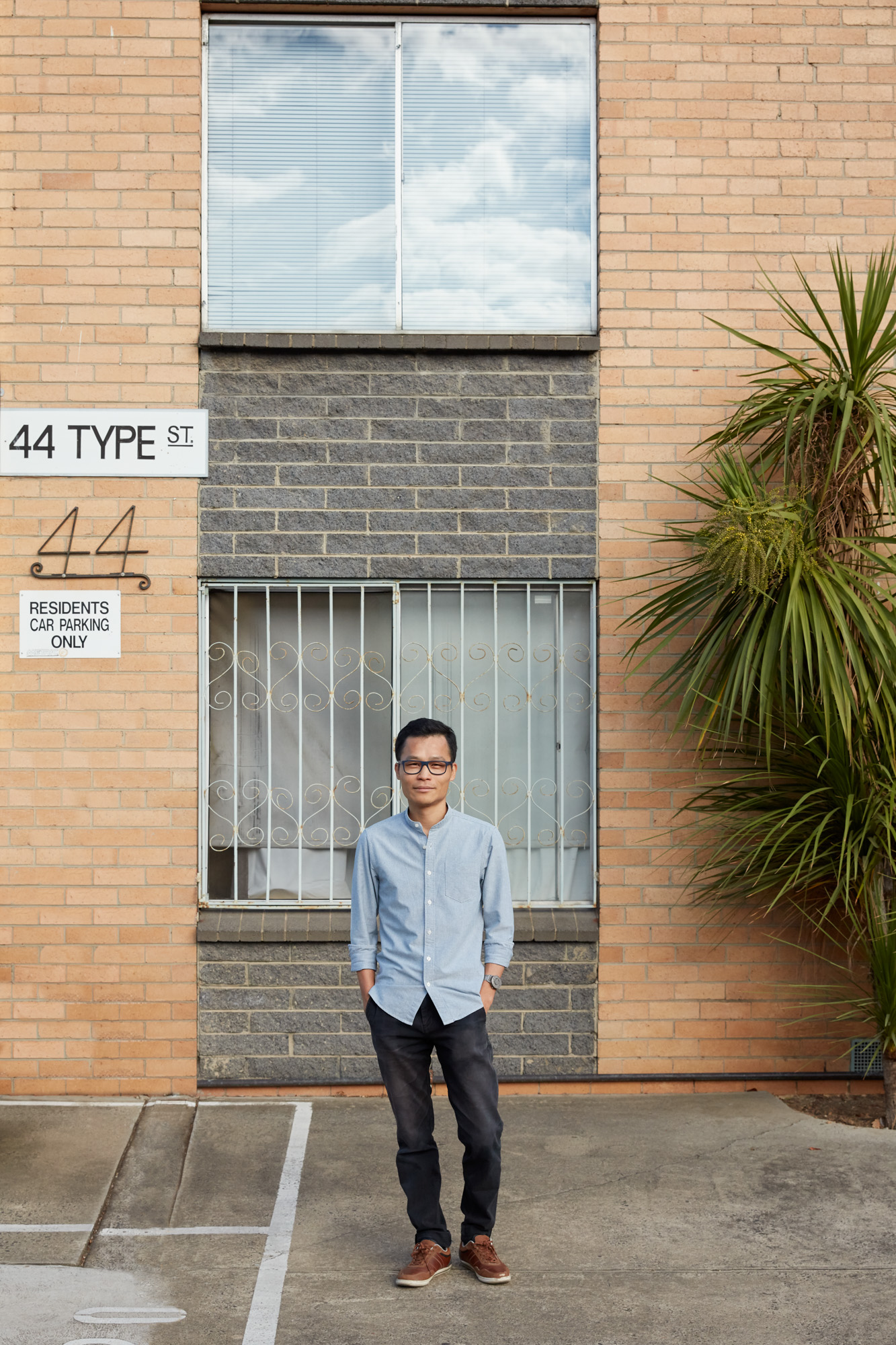
Rare is the Melburnian who never lived in a six-pack building, be it for a solitary PhD experience, as a stopgap between more luxurious living situations, or as their first purchased property. Jack Chen’s experience is a common one: when the architect first moved to Melbourne from Sydney, four years ago, renting a flat in an unassuming six-pack building in Richmond was an easy way to land. A year later, another apartment in the building came up for sale. “I already knew what to expect, the flaws and the advantages,” he says, “It was an easy decision.”
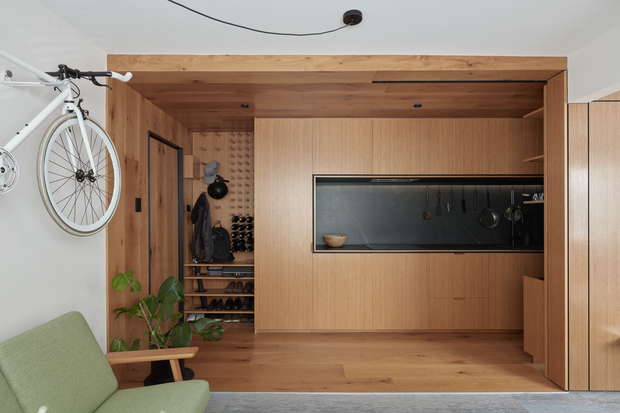
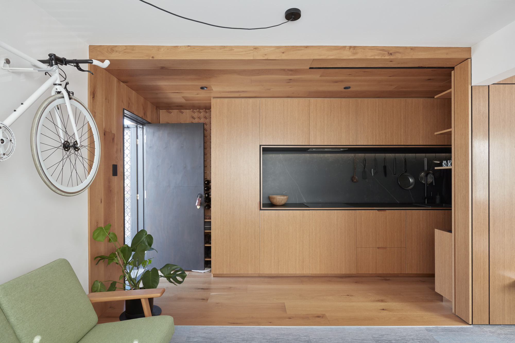
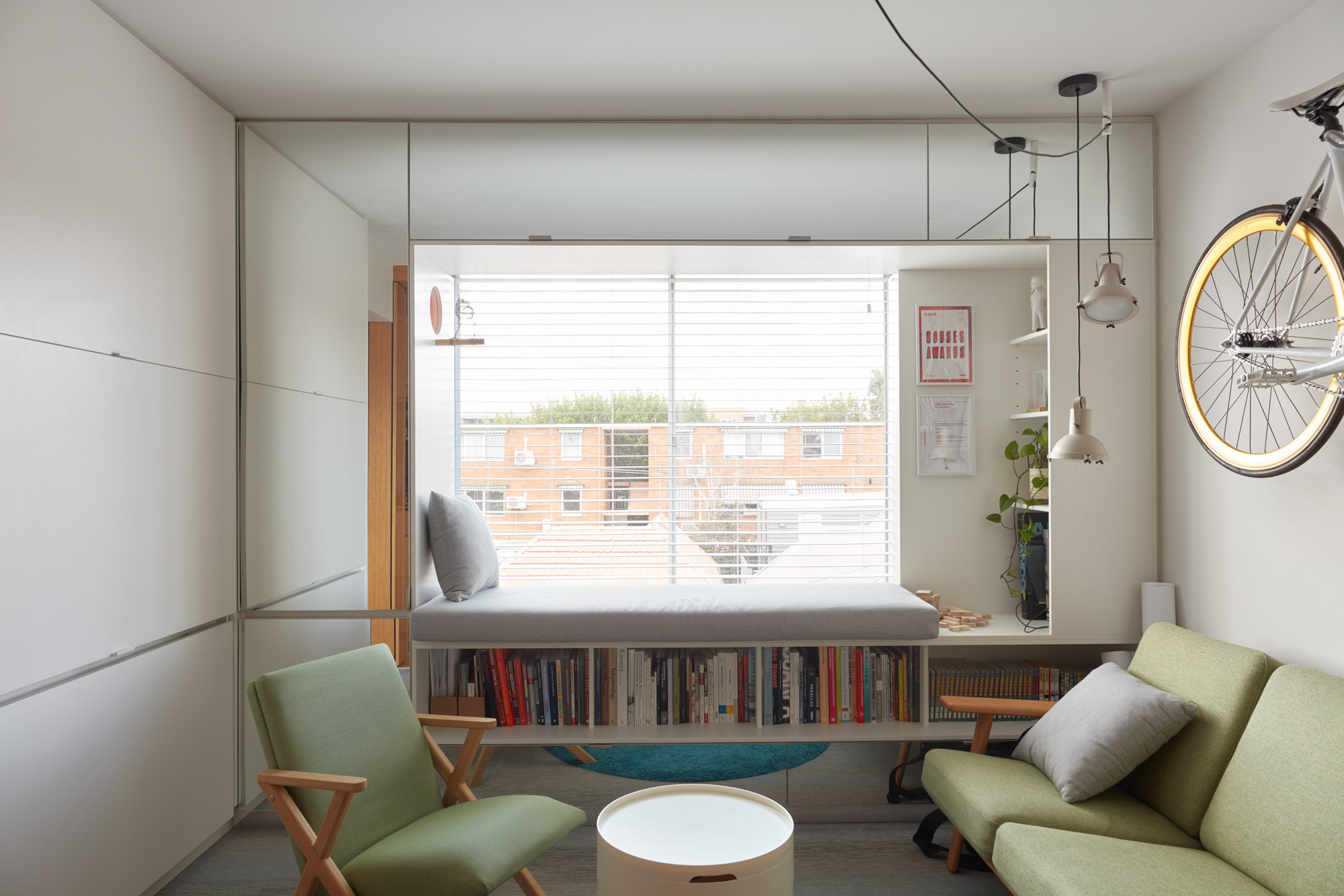
Jack has since renovated the apartment to maximise the qualities of the 38-sqm floorplan, turning what used to be a typical ‘70s flat into a veritable jewelbox. The sensitive redesign brings the warm texture of wood into the services area of the apartment, and an interplay of multiple functions to the living spaces. “Two thirds of the renovation budget went to one third of the space,” he says. “It created a cabin-sort of feel.”
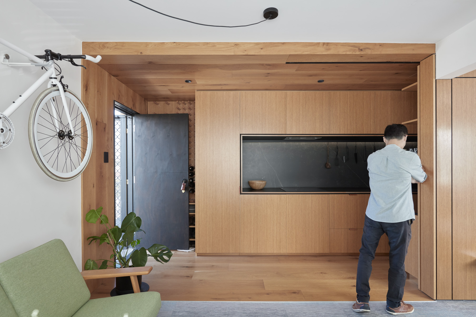
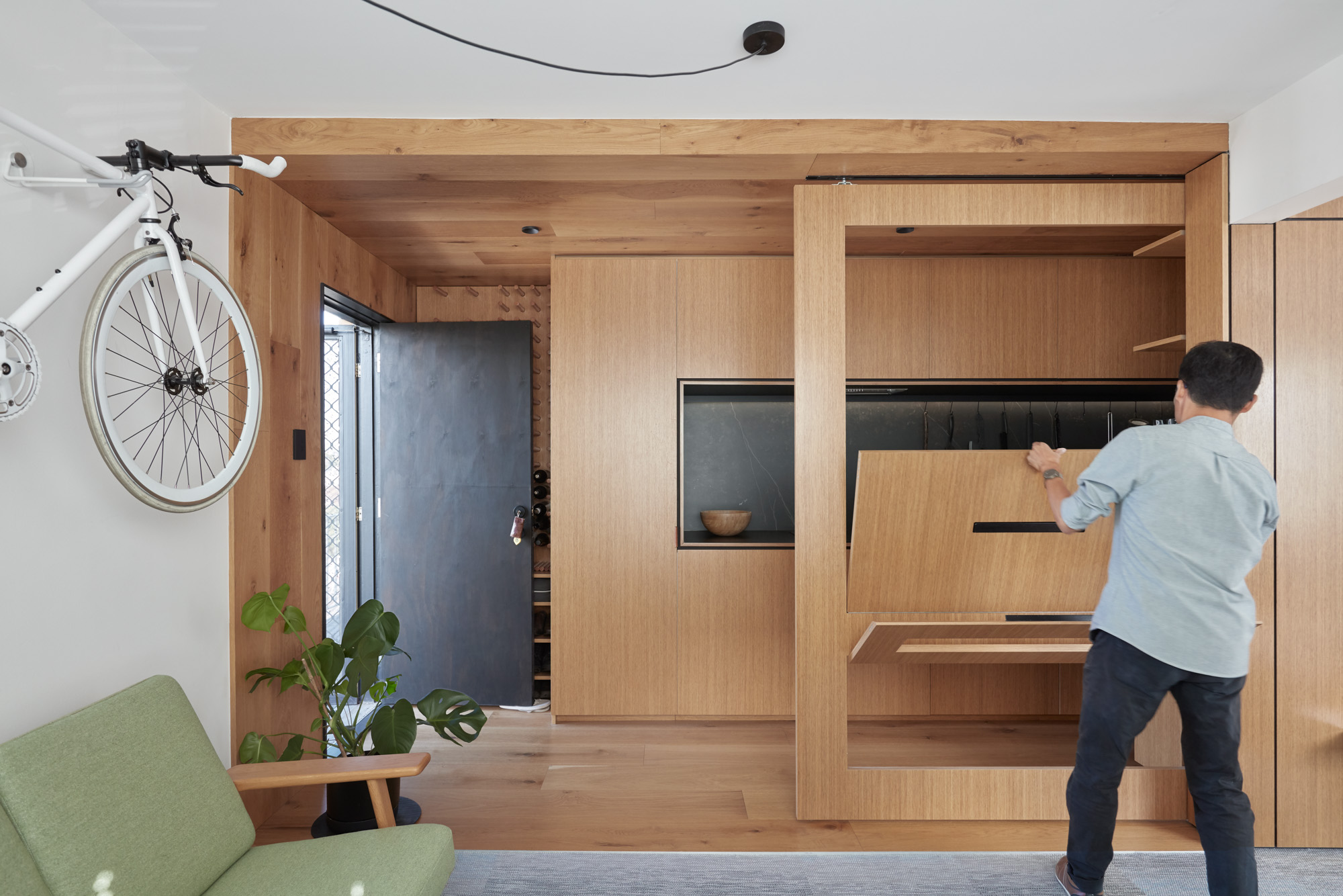
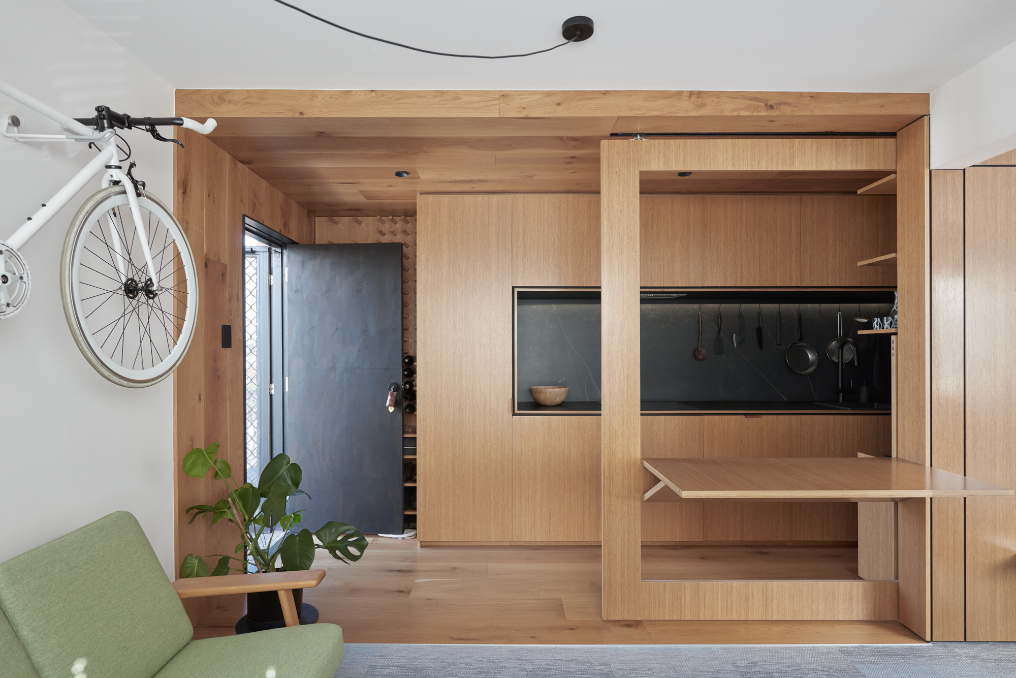
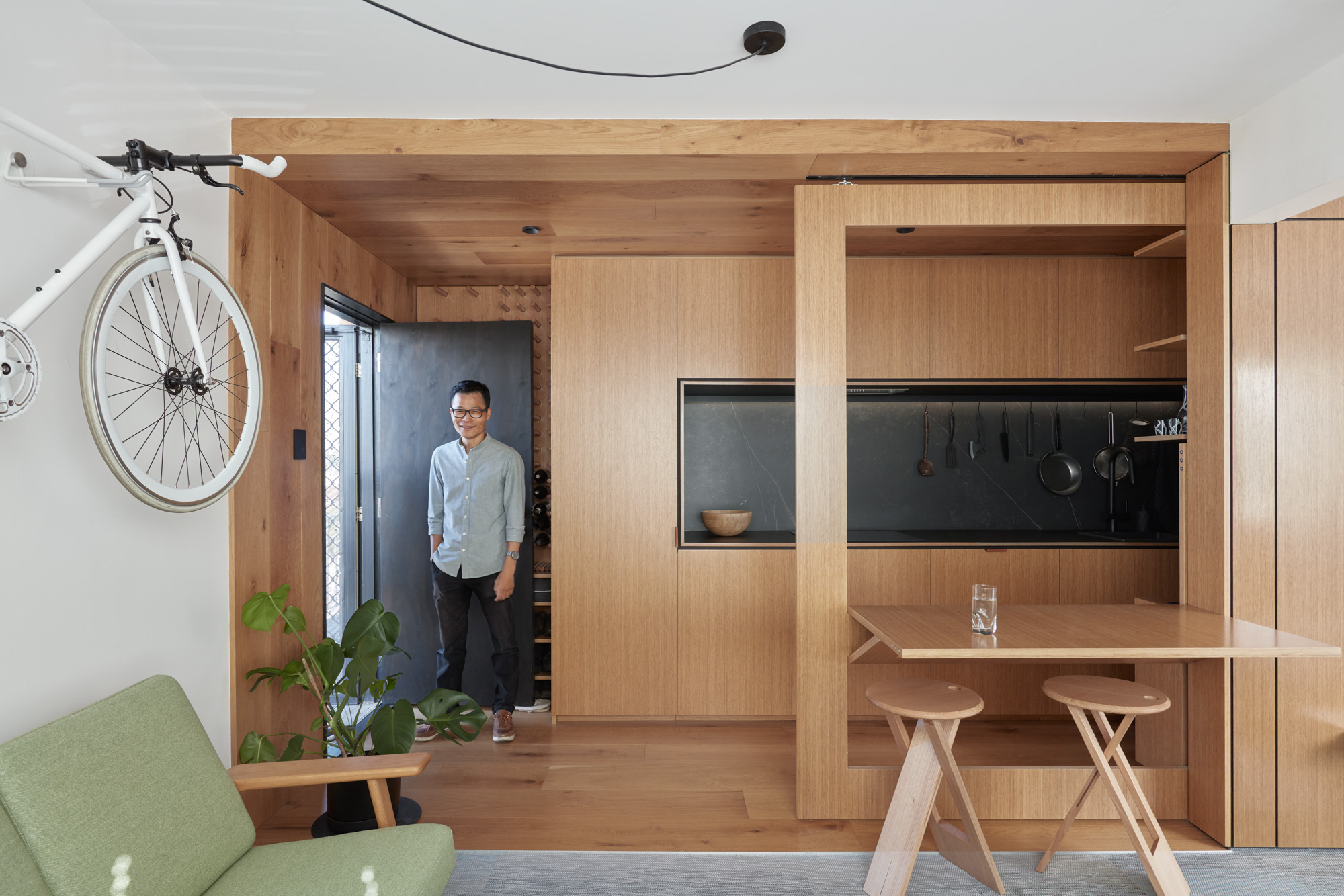
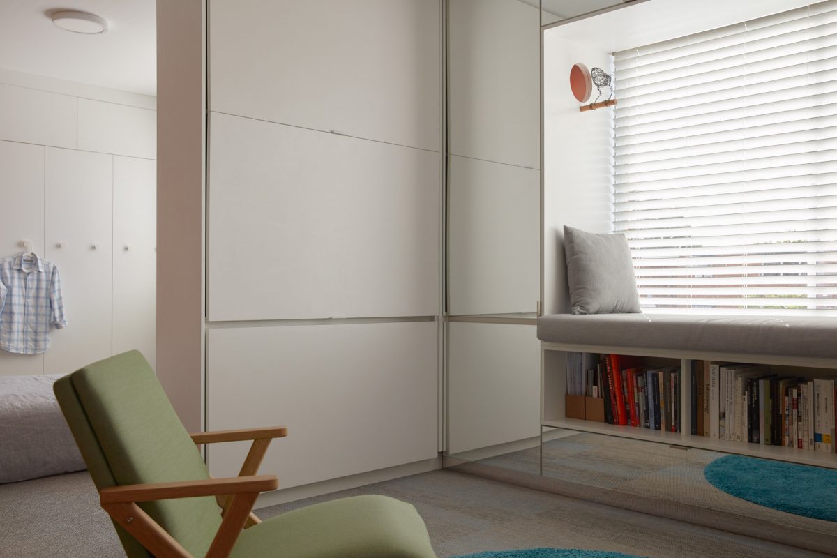
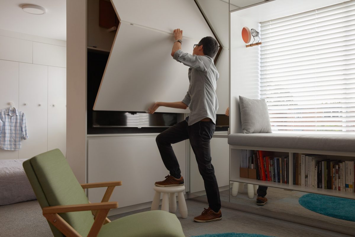
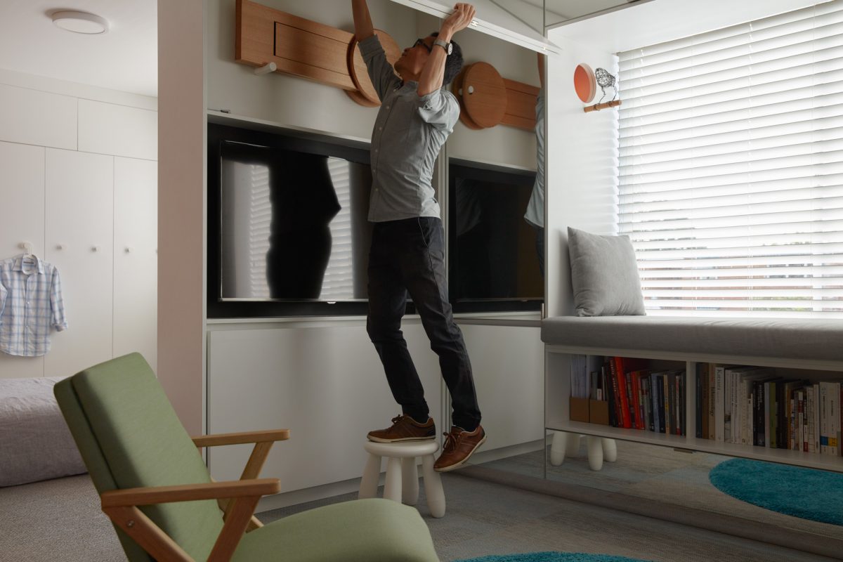
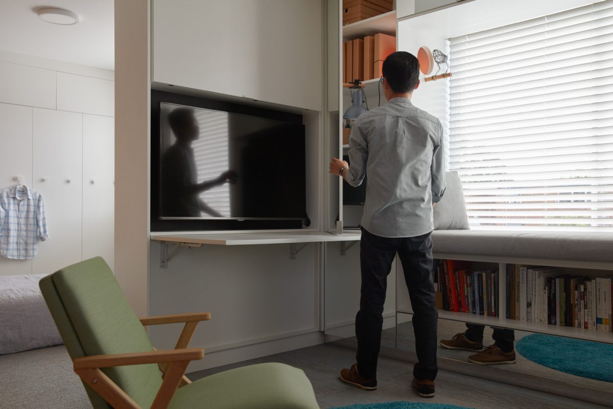
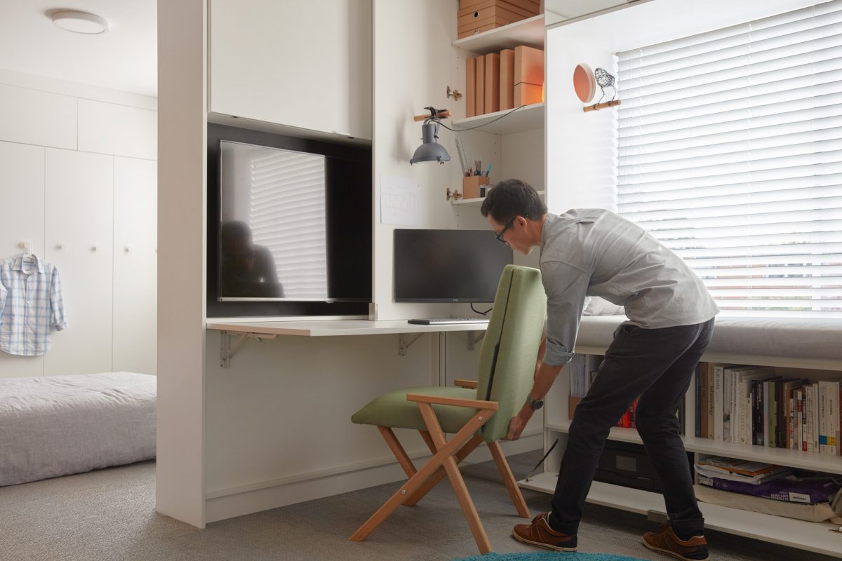
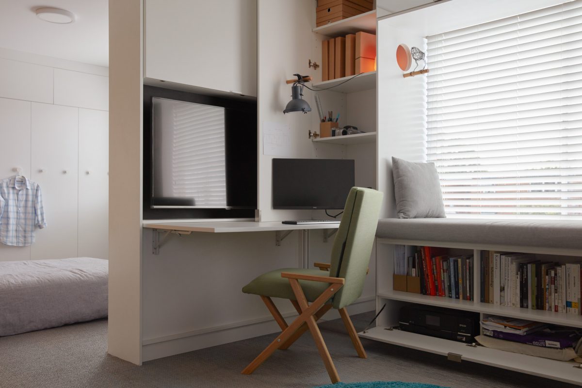
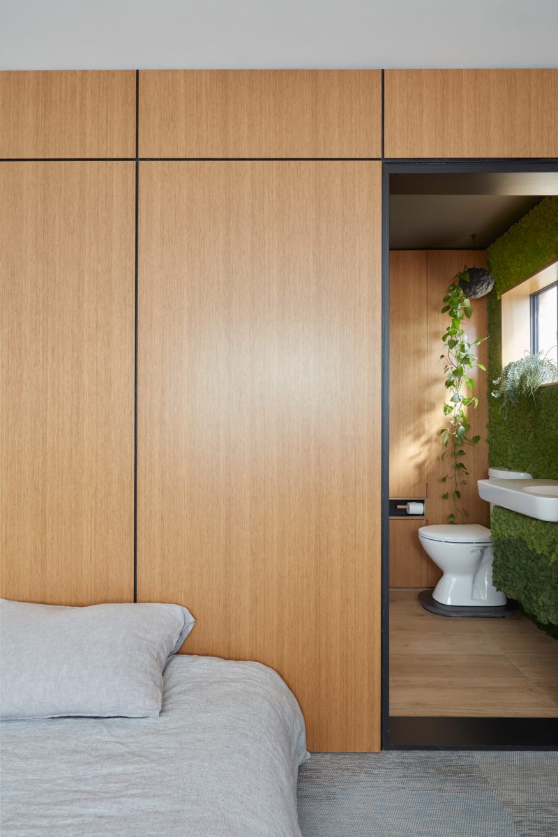
In Type St apartment, surfaces fold, bend, slide out and disappear seamlessly. An extra timber partition slides out to become a dining nook, with foldable stools stored in the wall. An office corner can be pulled out in minutes. There is a TV and appliances in the wall, and the hallway coat and shoe rack doubles up as a wine rack. The glass wall between the galley kitchen and the bathroom can change transparency at a touch of the remote, providing privacy when needed, borrowed northern light at other times.
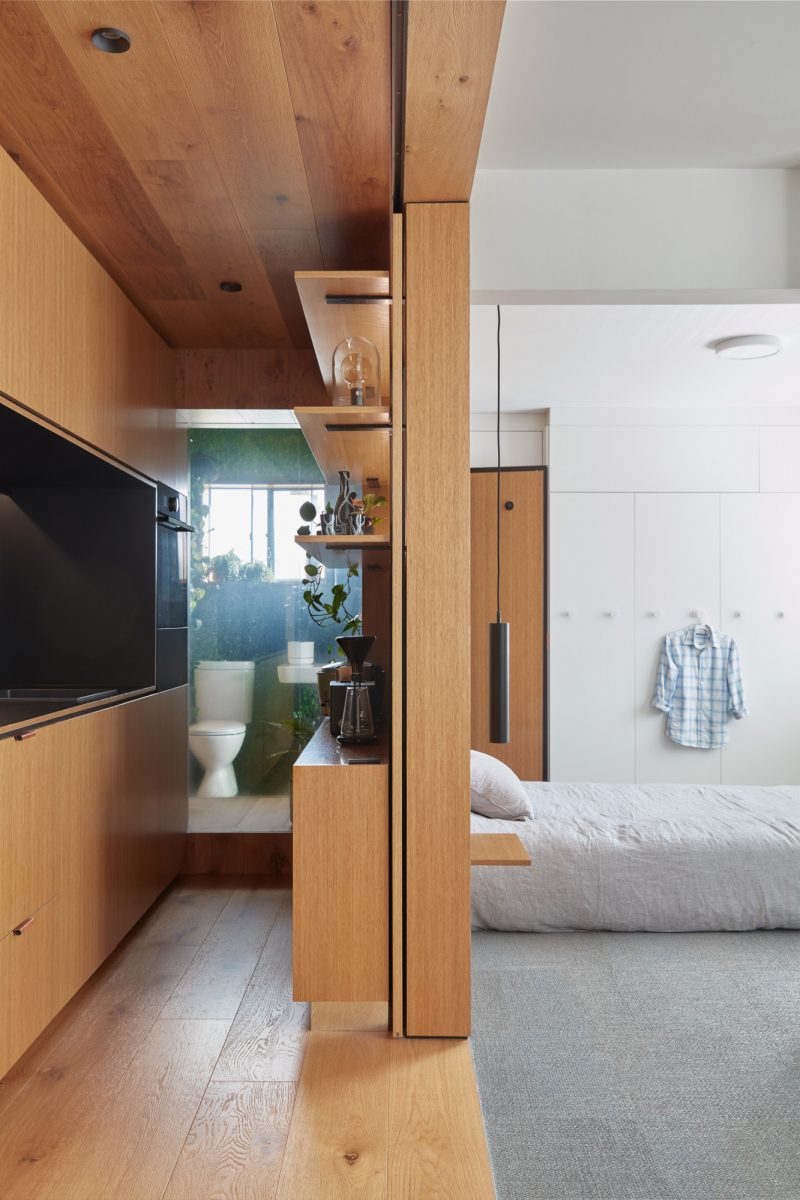
“It’s mostly off-the-shelf technology and appliances,” Jack tells me. A first-time home owner, Jack had a limited budget, but plenty of design know-how. Much of the furniture, lights, and appliances are off-the-shelf: Bunnings features heavily in the fittings, as does Ikea. The flooring is humble office floor material, synthetic and easy to clean. “It comes in tiles, so it’s easy to rip out and replace. Sections of the flooring were damaged during the renovation – I just took the damaged part out and bought a new one.” The only real splurge is the sofa and the modular armchair, which were shipped from Sweden.
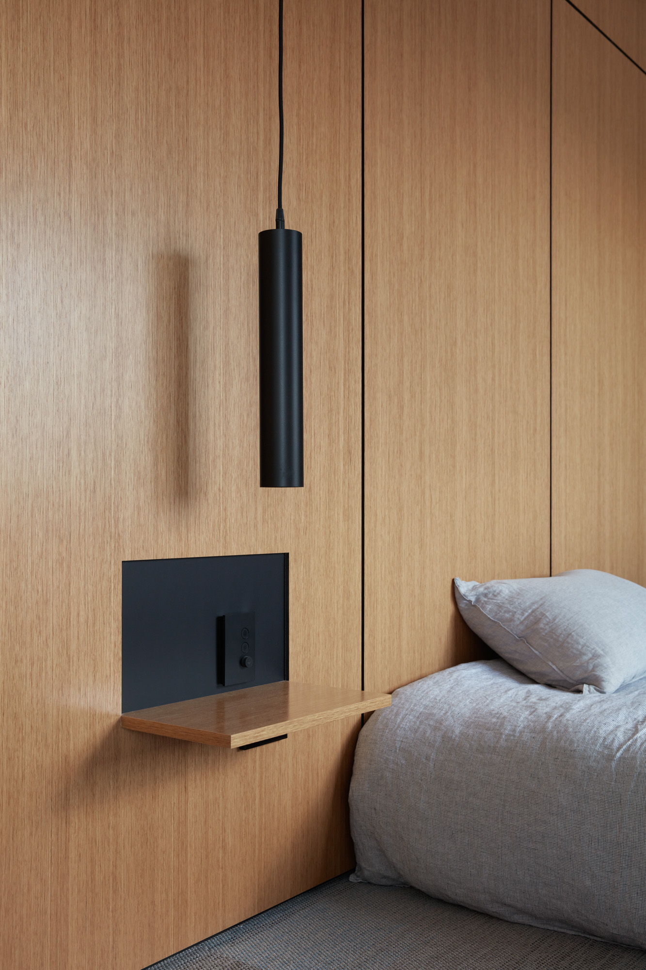
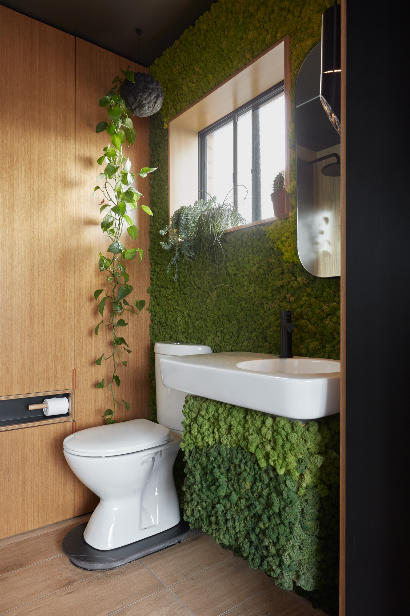
Replacing the wall between the kitchen and the bathroom with glass was the only structural change to the apartment, keeping the renovation budget small, and the original floorplan intact. And yet, the transformation is profound. Inside, the space resembles the beautiful, multi-purpose architecture of FujiwaraMuro’s skinny houses in Japan, the apartments of Taiwan’s A Little Design, or Gary Chang’s celebrated 32 sqm ‘Domestic Transformer’ apartment in Hong Kong. Yet, step outside, and we are on that familiar external walkway of a 1970s sixpack, with the Melbourne Central Business District views just visible to the west.
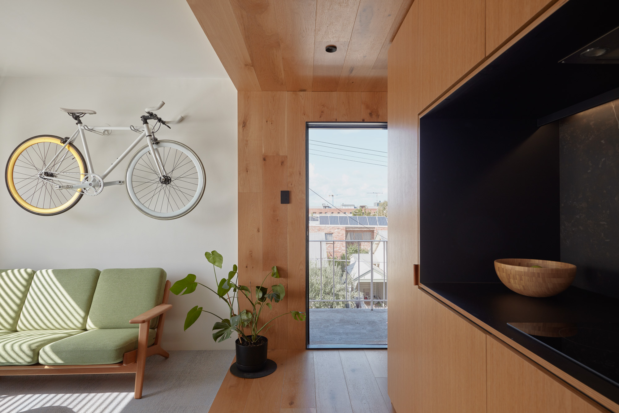
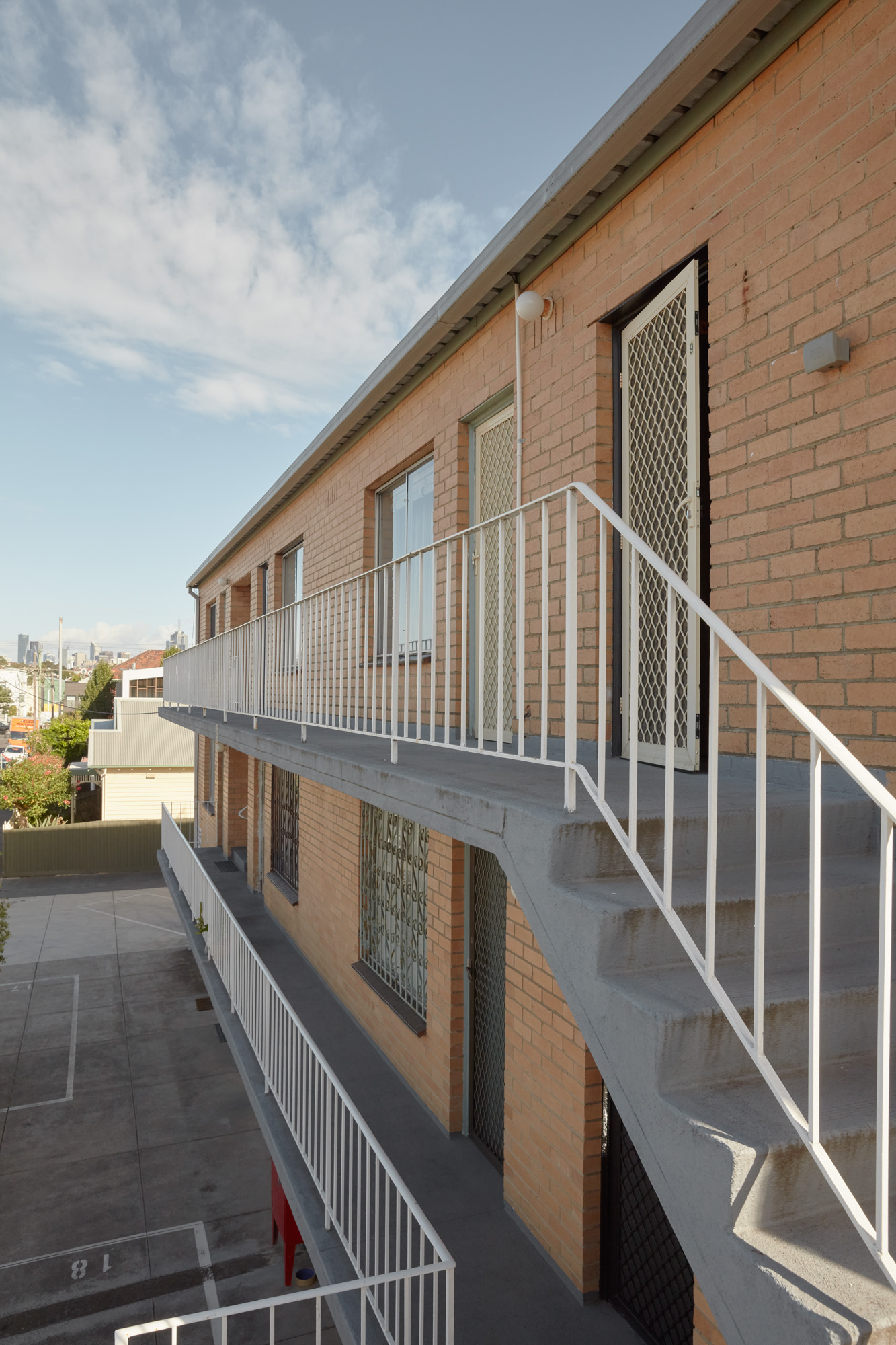
Humble six-pack apartments are still rarely accorded the same careful design attention that one sees in cities where space is at a premium. (Indeed, properties below 50 sqm are still seen as a high risk investment, and most banks will refuse to finance them. Only one bank would offer a mortgage to Jack.) Jack’s is the only fully renovated apartment in the building, inhabited by a mix of rotating renters and owners, as well as social housing residents.
The modest shared laundries on each floor, and the ample, unnecessary car parking on the ground floor point to an absence of aesthetic vision for the building. Built quickly and speculatively, six-pack buildings were rarely designed to maximise shared spaces, and this building is no exception. For a diverse, but fledging community of long-term and short-term residents, there are very spaces to meet. “We meet on the staircase,” Jack says, “The couple next door would sit outside and watch the sunset. It’s a wonderful view of the city.”
But the opportunities are there. With only twelve apartments, a six-pack is a boutique-sized development. The common staircases naturally form a safe public-private space, with dense opportunities to meet the neighbours. In a future ‘version 2.0’ of the apartment, Jack would love to create a skylight to the shower. “That kitsch idea of showering under the stars,” he says, self-deprecatingly. Potentially, he wonders if strata titling makes it possible to buy the roof and create a rooftop terrace or garden that could be used by the residents.
As the city continues to densify, apartment living becomes more normalized, and space continues to be at a premium, six-packs offer ready-made resident communities of a very manageable size. In time, Jack has a vision of a spectacular building coming to life: “We could put in vertical planters, remove all this excessive, unused parking – there is so much potential to build a community.”
A very warm thanks to Jack, who invited us to his glorious apartment. We at Assemble Papers cannot get enough of six-packs, and would love to hear more about clever uses of this underappreciated housing typology. Those interested in Jack’s other projects can check out his website. This article also appears in AP print issue #11: Transitions.

