Compartment Studio
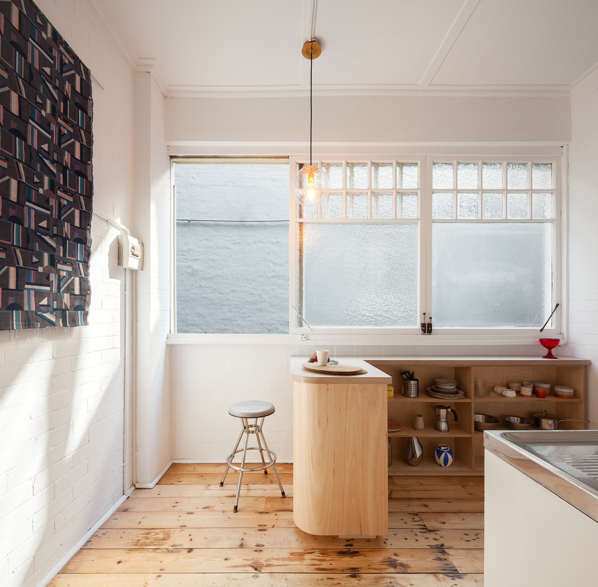
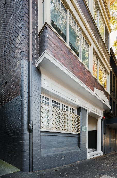
Completed in 1929, the majestically named Versailles building is just one of architect Claud Hamilton’s many art-deco mini-masterpieces in Sydney’s Darlinghurst and Kings Cross area. When interior designer and local resident Sarah Jamieson found the opportunity to buy one of the 36-square-metre studios inside the building, she knew she had to take it. With a background in fine arts and installation design, Sarah – small footprint living enthusiast and director of Sydney design studio Catseye Bay – saw the pocket-sized studio as her ideal first apartment project, giving herself the challenge of dividing up the tiny apartment without compromising on space or natural light. Here, in her own words, Sarah tell us more about the process of converting the studio in a way that’s empathetic to its original form.
“The small size of the apartment was really the driver and the opportunity for the project, a beautiful constraint. It’s actually the first apartment I’ve worked on – the other projects I’ve done have been in the realm of exhibition design, event spaces and installations. I feel like I have a hybridised kind of practice that draws on my experience across fine arts and design. This apartment is an example of that approach.
I’ve lived in the Darlinghurst and Kings Cross area for 15 years, and I have a dog that I walk twice a day through the streets, so I know the area like it’s my backyard. But even though I live close by, moving into the apartment and going there to work every day really created a different experience of the city for me.
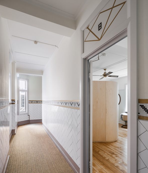
The apartment was really dilapidated when I first found it – it hadn’t been done up since the 1930s. But what drew me to it is that there was a lot to work with. The building itself is really pretty, and the interiors of the public spaces were renovated in 2015. The renovations are contemporary but draw on a deco language. I liked the idea of contributing to the aesthetic conversation that’s already happening in the main hallway and up the stairway of the building too.
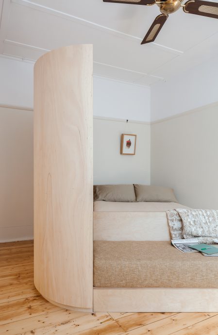
Initially the apartment was just one room with a separate kitchen and bathroom. Because Catseye Bay was the client, I wrote a brief where I asked myself how I could accommodate the actions of living – sleeping, eating, lounging, dressing, bathing and studying – and started to think about those actions and how they connect in time. Lounging, sleeping and studying can sensibly coexist quite intimately, so I then had to look at the things that need to be separate, like bathing and maybe dressing.
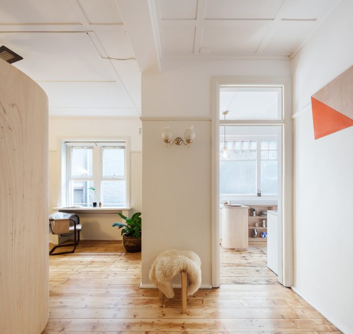
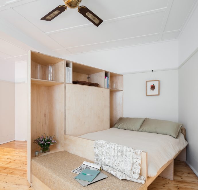
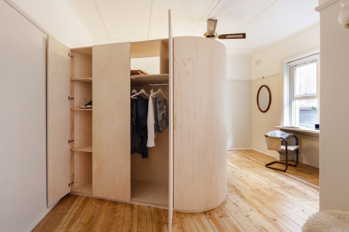
The curves of the building were also an influence on the design. It’s not even that spectacular, the curved brick on the building’s exterior, but walking past it all the time I started to notice it more and more. It’s such a gentle detail. I really wanted to reference it in the apartment itself. I became interested in approaching this idea through furniture, rather than building more walls. Working with the plan of the apartment, the curves really enabled me to subtly generate different spaces within it.
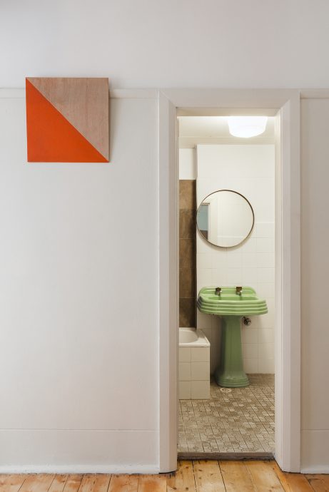
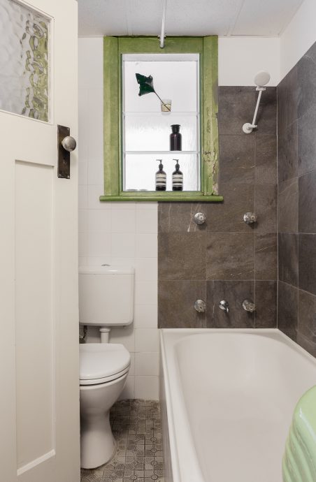
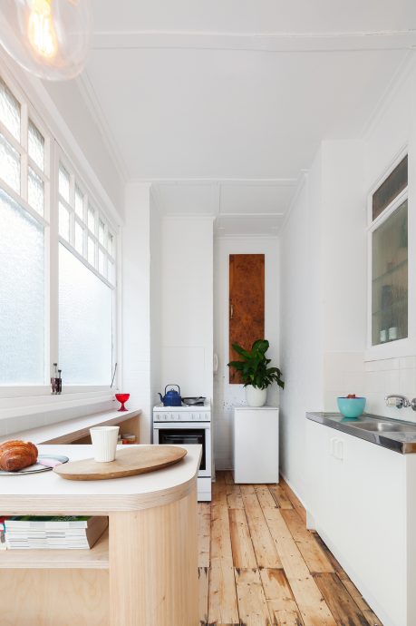
As for the material palette, that unfolded over time. I wanted to tie in the joinery with the paint, and I also wanted to see how to fit that in with the pine of the floorboards we found underneath the carpet. With the finishes, everything was stripped back to its original: the kitchen sink, stove and flooring were all kept and stripped back to their original forms. Similarly, with the bathroom, we didn’t do much except new tiling and a new vanity. I really didn’t want to just add to the space, I wanted to let it exist in its simplicity.”
Thanks to Sarah Jamieson for walking us through the Compartment Studio, and to Kat Lu for her photographs. To see more of Sarah’s work with Catseye Bay, visit catseyebay.com.