The Barn, Hobart
Second only to Sydney in colonial age, Hobart has one of the longest settlement histories in Australia. Its myriad journey from penal colony to proud culinary and cultural behemoth is reflected in its architecture, with a swathe of heritage-protected Georgian and Victorian buildings throughout the CBD. Nearly three years ago, local graduate architects Liz Walsh and Alex Nielsen were lucky enough to happen upon a tiny early c19 gem in near original condition. Our Hobart correspondent, Judith Abell, caught up with Liz and Alex to find out how they went about transforming its humble meterage into a compact home and place for entertainment.
What is considered of value varies according to perspective. When graduate architects Liz Walsh and Alex Nielsen tried to buy a tiny 1829 Georgian stable just on the edge of Hobart’s CBD, they were repeatedly refused finance. “Stables” were not an option on the bank’s drop-down menu and the more conservative institutional eye could not imagine that this tiny relic of another time could increase in value within a small budget. Liz and Alex, on the other hand, saw infinite value within the patina of timber stalls, the weight of the brick and stone walls, and the detail of the timber roof structure. Living nearby, they passed by the small barn every day. Liz finally jumped the fence one night to explore further and consequently fell in love. Filled with junk, the building still had the original infrastructure for holding horses, including chaff bags nailed to the wall (even now, it’s still possible to catch a subtle scent of the building’s previous equine occupants). With considerable negotiation and the help of a builder to price possible works, the pair were finally able to obtain the funds required and were given one short year to complete their renovation.

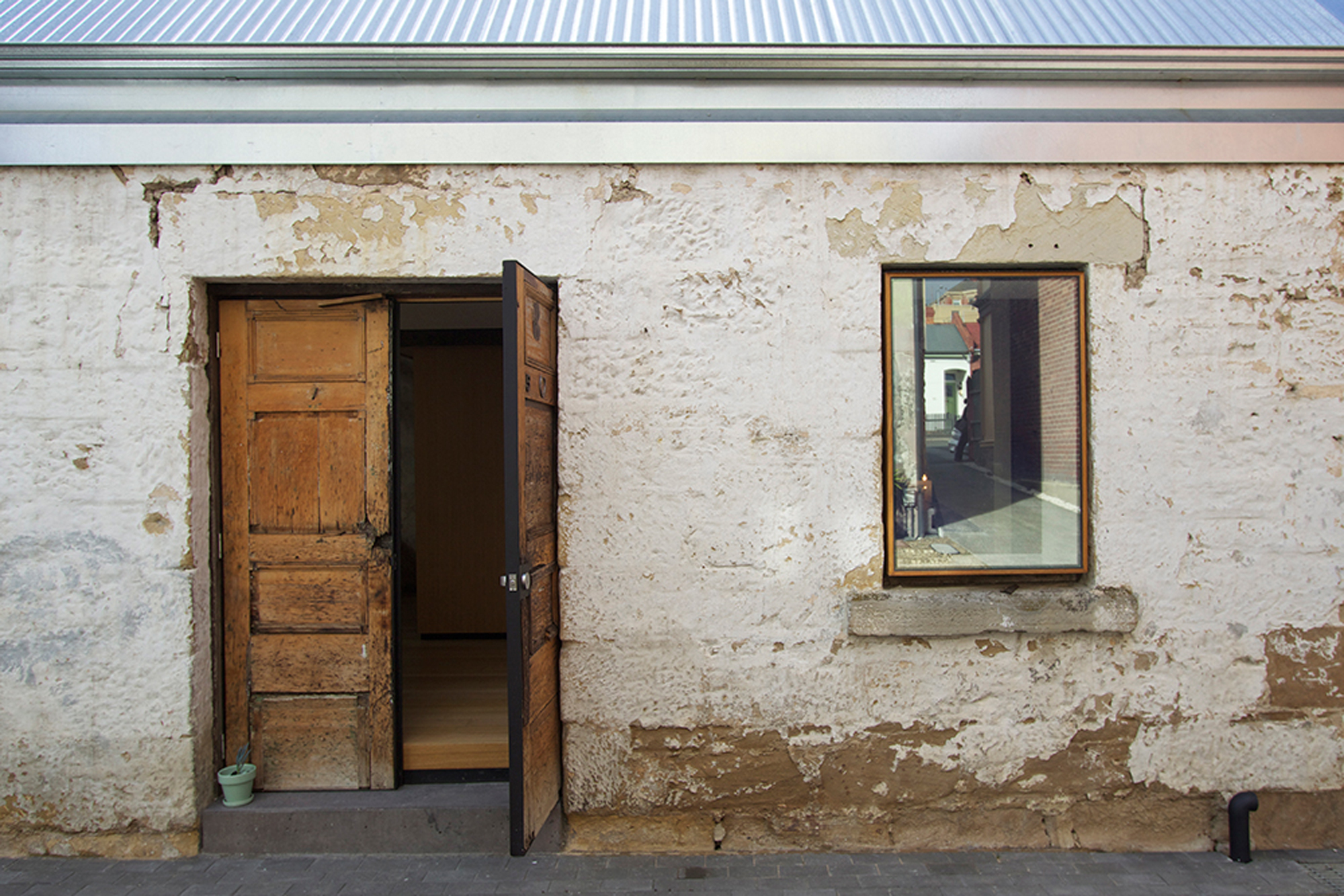
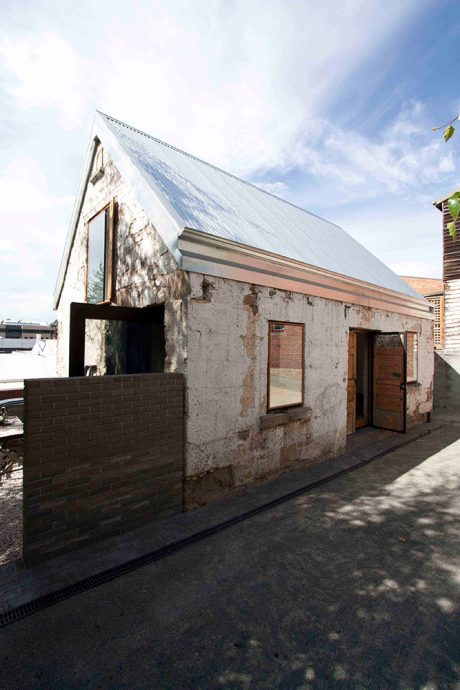
The main building is a simple, two-storey, gable-roofed barn, with a large door in its long sandstone side, two shuttered openings at the front, and a number of small ventilation slots in the rear brick walls. In its original state, it also had a lean-to on the northern side. The walls have a cavity construction, which is unusual for this era and type of structure, but an advantage towards creating a warm and dry residence. The barn sits at the back of two large terraces that have recently been renovated and is the perfect city pad, being only a few minutes walk from Hobart’s central business district.
The design for the dwelling came about through considerable discussion and argument, which is unsurprising given their shared profession. The practice Alex works for had completed a design scheme for the building some time ago, so there was also the shadow of someone else’s thinking hovering left of stage throughout the process. Interestingly, given its size (a mere 63sqm), the couple’s aim was to make a building that could be many things, while still satisfying the bank’s requirements for it to include two bedrooms, a bathroom and a kitchen. While they wanted to make a home, they didn’t want it to “feel domestic”. They hoped that it could also be an event space, perhaps an office, or something else not yet imagined. Although a non-negotiable item on the brief was the capacity for a group of 20 to share a meal.
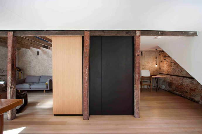
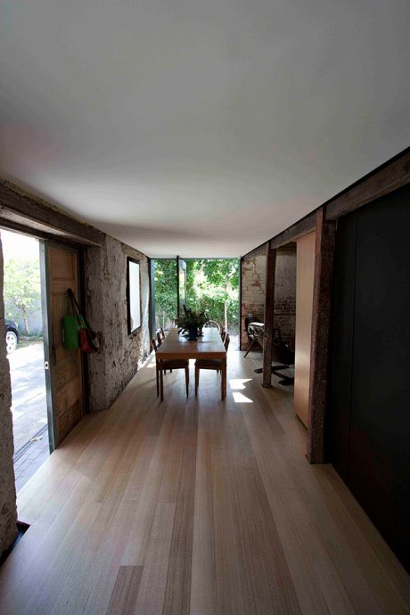
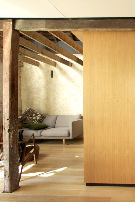
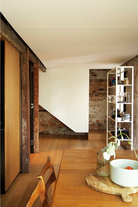
The final configuration comprises living, dining, bathroom and spare bed nook on the ground floor and a bedroom with area for a study on the upper floor. With such a tiny space and the desire for malleability in usage, Liz and Alex focussed on creating a diverse range of volumes. To do this, the major move has been to establish a long, low space, adjoining a small, high space. The former accommodates the entry and the dining area. It is just wide enough for a table, with chairs either side. The tinier but taller space is currently the lounge room. This double height volume extends to the underside of the original timber ceiling, and offers a view up to the study zone within the upper floor, through a transparent mesh wall.
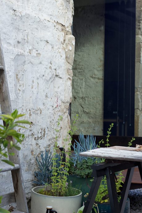
Another method for introducing diversity into the dwelling is through the selection of and orientation to glazed openings. On the ground floor, the dining space is oriented to a large new glazed pivot door to the north. This is the biggest move that Liz and Alex made within the original skin, and has been transformative for the living spaces. It brings warming northern light, extends the perceived length of the dining area, introduces an additional courtyard room to the dwelling and offers mid-ground views to neighbouring yards, whose overgrown vines become the barn’s borrowed landscape. Importantly this opening also reorients the occupants toward the walled, semi-private gravel court—an essential piece of outdoor space in a context that is otherwise overlooked by the neighbouring terraces. Upstairs a skylight brings east light and a view across a mess of city rooftops for the bedroom. And glazing within an existing opening in the end gable offers a view across those wonderfully overgrown neighbouring yards. In each case, the openings align to particular spaces, bringing a unique character to each area.
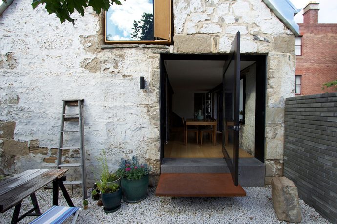
Liz and Alex also expanded the perceived sense of space by increasing the scale of an element wherever possible, with the intention of drawing the eye up or out. The pivot door is as large as it can be to open up the volume of the lower floor, and the central service core (holding the kitchen and bathroom) is a tower extending to the ceiling, providing storage at the upper level.
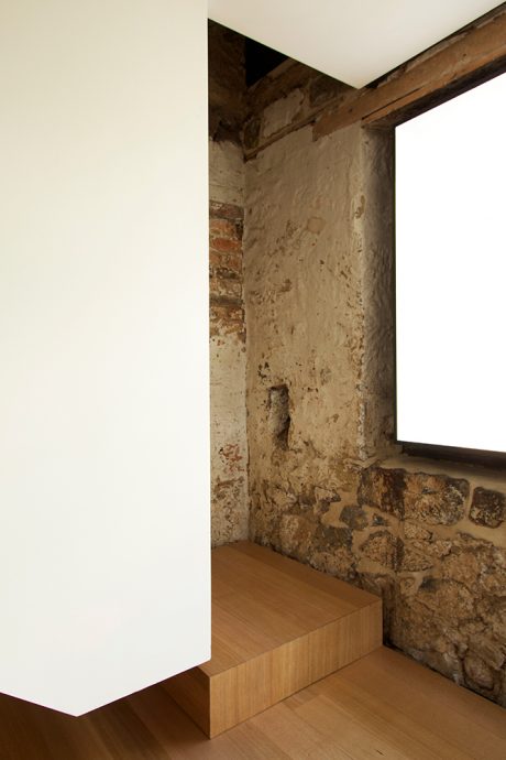
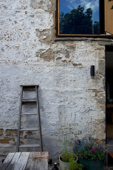
The emerging architect couple have a great love (if not obsession!) with detailing and this shows in the final resolution of the barn. Their approach is a split between details that respond to the heritage context and those that offer a contemporary response to volume and materiality. For any work that touches the original fabric of the barn, there is a 50mm shadow detail and any contemporary addition ‘touching’ this fabric is coloured white, to set it apart from the heritage grain. So frames detailed for the original glazing on the entry side of the barn appear to hover within their opening, the crisp construction revealing the appealing irregularity of the stone. And the original diagonal line and aged material of the timber stable stalls is highlighted via a more modest shadow gap within the new bathroom.
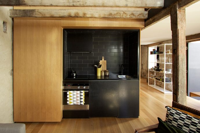
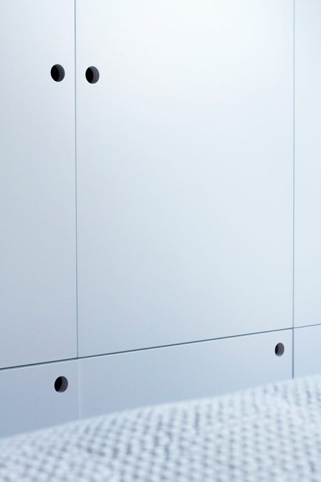
New components, such as the pivot door, the kitchen and the bathroom, are black and—where possible—new elements are wrapped by their materials, to emphasise their volumetric properties. This can be observed in the tiled alcove of the kitchen, the wrap of the floor to the wall in the bathroom or the way that the white plaster ceiling appears to wrap down to enclose the side of the stair. With the aim of minimising domesticity and emphasising form, joinery is defined only by the edges of its openings or simple cut out pulls, which act as a punctuation across vertical surfaces.
Things have changed considerably since Liz and Alex attempted to bring a bank on board two and a half years ago. Having lived in their residence for just six months, they discovered they have the perfect Airbnb stopover. Their guests love being tucked away in the barn for a few days, but other groups have also expressed an interest in using the barn for a range of different events. The fact that those visitors to the house can see potential in this dwelling beyond its role as a compact home is a testament to Liz and Alex’s consistent and considered approach, which has provided a series of unique indoor and outdoor spaces within a tiny floor area. Nearly a year since completion, the barn is in high demand and the couple are renting elsewhere, while contemplating knocking on the bank’s door again to purchase another property as their home. I look forward to revisiting when they’re ready for their next small footprint adventure.
Many thanks to Liz and Alex for hosting us at The Barn amidst an Airbnb changeover. If you’re contemplating a Hobart escape, we highly recommend hitting the hay in this little stable (puns intended). Put dibs on your dates here. Photos by graduate architect Bek Verrier and proud Barn owner Alex Nielsen.


