Gallery Oh by Sarah K
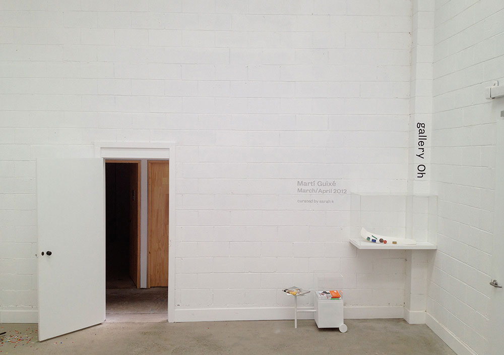
In March 2012 I opened Gallery Oh in Sydney. It’s a micro gallery – a clear perspex box (90cm wide x 60cm high x 40cm deep) mounted to a corner of a room and customised to accommodate a clumsily placed structural post. It unceremoniously inhabits a corner space of stylist Megan Morton’s Studio and School in Roseberry, Sydney, in a vast re-inhabited industrial building also home to a 200-seat organic café/restaurant and a furniture showroom.
The premise of Oh is simple: I invite one work (or more if the work constitutes it) by one international designer, to be shown for a minimum period of two months. This most often runs longer depending on how consumed I am by my other projects. I offer the dimensions and leave it to the designer to create something specifically or to make some existing piece of work in the small space. On the whole, in response, the designers have created works especially for Gallery Oh.
I reasoned at the start that a small gallery should have a small support structure behind it – Megan and Giles Morton are the gallery’s benevolent hosts and backbone. I think they see it as a welcome if unexpected growth of culture occupying a corner of their prime creative real estate.
Blazenka Jurin is a Sydney businesswoman with an interest of her own in design and the way design can influence culture. She responded with enthusiasm to my invitation to be Gallery Oh’s original and sole philanthropist – enabling the gallery to come into being.
In 2014 we are opening an annexe of Gallery Oh – Annexe Oh at Mr Kitly in Melbourne. This retrospective exhibition marks the opening of Annexe Oh and includes all the works that have been shown in the Sydney gallery over the past two years.

Marti Guixé (Spain/Germany)
Business Lunch 2012
Marti Guixé was the first designer I invited to show at Oh – his work is so laden with ideas and humour that it works perfectly exhibited as design/art. He is the philosopher designer of our time, but also designer comic. Marti has been instrumental in the food design movement – I would say he started it (Google him). He was designing food like a problem to be solved back in the ‘90s, with live performance eating rituals and their subsequent documentation.
Marti has always got the good bits down in a book and has a special relationship with Italian publisher Corraini Edizioni. His latest book Transition Menu sets up a fictional Michelin-starred restaurant where his designed food is served as a make-believe dinner – it bears marked similarities to several real Michelin-starred restaurant’s books, the notable Spanish one among them.
The work Marti made for Oh, Business Lunch, is also a fictional meal. Made simply in cardboard and wood, it depicts the food of the future work lunch, reduced to a geometry of nutrition in carefully designed bite-size portions that we can swallow quickly for the more important business at hand.
I had met Marti in Milan in 2010 at the launch of his book Food Designing (Corraini). Originally from Barcelona he now splits his time living between there and Berlin. He spent his formative design years living in Milan in the ‘80s and he talked about this time when the Salone Del Mobile was just he and about eight other designers. It’s amazing to think of that now when it seems like there isn’t anyone in the population who isn’t a designer or married to one. I was in Milan and attending this book launch with Australian distributor of Corraini books Sonya Jeffrey (Books at Manic) and we both asked Marti to sign our copies of the book like schoolgirls. I spent the next few days reading it closely and consequently looking at the world with Marti Guixé eyes, everything coloured by his unique brand of humour. He talks about the necessary and mundane rituals of living in such a way that they are brightened up or re-invented so that we want to do them his way.
There really is no designer to outwit him and his influence is not confined to the food industry. His deconstructed sofa and armchair for Danese, for example, has since had a ripple effect throughout the design world that can be traced in most of the leading contemporary brand’s ranges. The notion of upholstery as a separate entity to the frame, cushions tied to a structure that will seat us comfortably, both practically and visually, was first given form by Marti’s playful Xarxa Sofa in 2009.
Formafantasma (Netherlands/Italy)
Botanica 2012
Formafantasma invite you to come inside their deeply idiosyncratic constructed narrative, shunning traditional forms and materials in favour of their reinvention, and yet giving us a more profound cultural and traditional value in the process.
I was impressed by Autarchy presented in the first year of Ventura Lambrate and commissioned by Rossana Orlandi in Milan. It depicted a world where objects are only made from the simplest available materials – flour is mixed with a setting agent together with some local stone to form a workable durable ceramic-like material and waste from the process of making one object in the collection is used to create another.
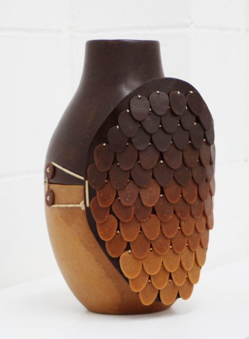
Botanica is another of these worlds. This time the concern is how humans made plastic prior to the petroleum revolution. The use of natural plant and animal resin replaces what we know and the aesthetic takes us back to a less flexible and more natural colour palette of browns and ambers.
I profiled the Botanica works on the supercyclers website at the time and spoke to Formafantasma about their work. Later when I asked Andrea and Simone to exhibit at Gallery Oh they flattered my specific interest with a new Botanica vase made purposefully for the space. It is an especially beautiful and intricate example of their formal language with a contrast of materials over the same surface and an outer layer of scale-like shapes adorning one face, like a shield.
Bertjan Pot (Netherlands)
Masks 2012
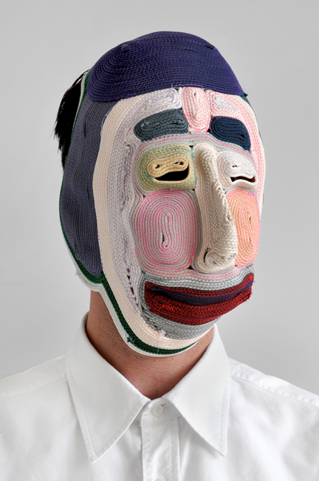
Hands down the most engaging work exhibited during Milan Design Week 2012 for me was the collection of masks by Bertjan Pot at Ventura Lambrate. I took leave of our own supercyclers exhibition across the road from the gallery where they were presented (in an impressive colourful array along the wall at the entry) to experience them more than once.
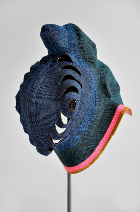
Bertjan Pot is a very amicable, affable person and, like Marti, I think he was intrigued by the prospect of a solo show in such a small space. I am appealing to the very core of what makes a designer tick – offering a problem-solving exercise – and so Bertjan came up with two new masks for the gallery with the size constraints in mind, and with the idea that these masks differ from those in his prior collections because they cannot be mounted on the wall and instead have a custom armature. This makes them suitable outside of the gallery to placement on a sideboard or shelf.
One is a long-faced, pretty-coloured, clownish (heavy-lipped) mask with quite a lot of fine detail used to build up the colours in a painterly manner. The other, he tells me, is inspired loosely by a traditional Papua New Guinean mask.
It’s this modern referencing of the primitive mask, and the act of taking on a persona through dressing up and disguising ourselves, that taps into something very primal and human. Bertjan Pot’s masks immediately call to mind a folk tradition that exists somewhere – he has wittily handled this subject in a contemporary way that allows us to feel like we can share in it and in effect he makes some of that indigenous culture that we long for a little, accessible, ours again. It’s an ongoing series of works that while encompassing design, moves far out into the realm of art and even beyond into the wider culture – making design exactly what it should be – resonant with us.
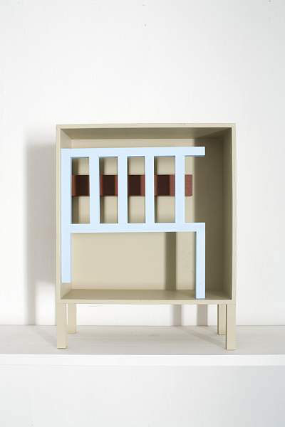
Nathalie Du Pasquier (Italy)
Construction 2010
I knew of Nathalie du Pasquier’s work as part of the Memphis group in the ‘80s when I was studying Architecture at RMIT at that time, although Nathalie and most of the others in the collective were generally overshadowed by Ettore Sottsass’ prolific body of work. Despite this the Powerhouse in Sydney has some good examples of her textile works from this period.
In 2006 when I ran Arp design and book store in Hobart, I stocked Nathalie’s book Quadri A Motore – a beautiful concertinaed picture publication containing her still life paintings and the constructions that she builds and uses as the subject matter. This book is a testament to her mastery of form and colour inspired with confidence by the constructivist and suprematist movements in art and design. The book has remained a sort of bible for me and I have used it as a reference in many projects, so I guess these works have been an influence on my own work.
Sonya and I stumbled across Nathalie’s exhibition Constructions in Milan in 2011 and some of the works from the book were in the show, including the central large-scale piece, a room. Naturally I collected all the printed matter from this exhibition that I could, and this included a hand-stamped contact detail at the back of the Constructions catalogue, which I archived for future reference covetously.
When I invited Nathalie to show at Gallery Oh she offered me a choice of beautiful constructions that would fit the dimension of the space, which had all been part of the Constructions exhibition I had seen in Milan. I chose quite a minimal one that I think neatly describes her compositional skill and when no one purchased it I was secretly glad and happily bought it for the gallery collection.

Eugenia Morpurgo and Juan Montero (Italy/UK) for Open Structures (Belgium)
Don’t Run 2013
Open Structures, the brainchild of Belgian designer and curator Thomas Lommée, is the creation of a simple universal gridded system intended for designers to use to create works that will relate to each other in their scale and also will allow parts to be interchangeable between them.
The system is designed as an open source platform that can be accessed online through the Open Structures, Intrastructures and Material Structures websites. Reciprocally, once an object or component is designed to the grid it can then be uploaded to the Open Structures site for others to use.
I saw this work presented in Milan in 2011 by Belgian Design institute Z33. A number of projects are displayed that have used the grid to create componentry or objects and to create a modular kitchen system. Re-use is encouraged in the form of salvaged parts that have been incorporated into a new object alongside 3D printing and traditional metal, woodworking and plastic injection moulding – nothing is off limits as long as the resulting part is easily readable for its function. It is all done so appealingly – the designer/viewer immediately wants to participate.
The first project used to demonstrate the Open Structures principle is Thomas Lommée and Jesse Howard’s water boiler. This image of a hacked machine for boiling water intended for use in the developing world – using an industrial steel housing with a reused plastic drinking bottle upended with a copper pipe protruding from it as an outlet – is now part of our design psyche. It seeks to demystify traditional perceptions of engineering, deconstructing parts into something manageable and explicable that anyone should be able to get their head around and build.
Lommée and Howard site the ill effects of waste from ‘planned obsolescence’ in product design as inspiration for the Open Structures system – where the lifecycle of an object can be lengthened by every part being understandable and replaceable. Open Structures’ premise of ‘everybody designs for everybody’ is the manifestation of a utopian and socialist idea presented in such a way by it’s Flemish interpreters that it is immediately appealing in both concept and aesthetic.
I searched out Thomas Lommée and once I found him he pitched me a few of the current Open Structures projects as possibilities for Gallery Oh. One of these has just been completed and is a tent / temporary structure project. Although moving into this scale is an exciting development for Open Structures, it wasn’t quite right for the scale of Oh so we decided on the most recent incarnation of Eugenia Morpurgo and Juan Montero’s Don’t Run shoe soles project, with it’s democratic DIY approach to shoe-making. The shoes, whose structural soles are made to the Open Structures grid, are one leather piece and fit together easily with no need for tools or stitching. Also featured in their work is a sandal version, a canvas bag and some of the components of the shoes.

Study O Portable (UK/Japan)
Fuzz 2012
I saw Study O Portable’s clever Platonic ice cube at an exhibition curated by Haptic Thought in London during the Design Festival in 2012. This enigmatic piece of icy geometry is not so much a cube as an icosahedron (representing water) with an octahedron (representing air) shaped void at its centre.
Platonic ice cube belongs to Fuzz, Study O Portable’s series of works that uses the void as a starting point for the form to evolve. They are typically colourful wearable pieces and vessels by design duo Bernadette Deddens and Tetsuo Mukai.
I especially like the way that, as a result of this exploration, the centre of the work is given a clean crisp geometric edge, while the layers of resin build up organically around it until the object itself contains the juxtaposition of a clean mathematical interior and a colourful lumpy exterior.

In addition to the curatorship of Oh, Sarah K is one half of sustainability-spotlighting, waste-reuse design practice supercyclers; the King in Blakebrough & King; and the initiator of The Other Hemisphere, which we are proud to be part of this year as both media partner and co-conspirator on the associated printed matter, PAGES. The Gallery Oh retrospective exhibition at Mr Kitly runs 11-27 July.