Moonbria
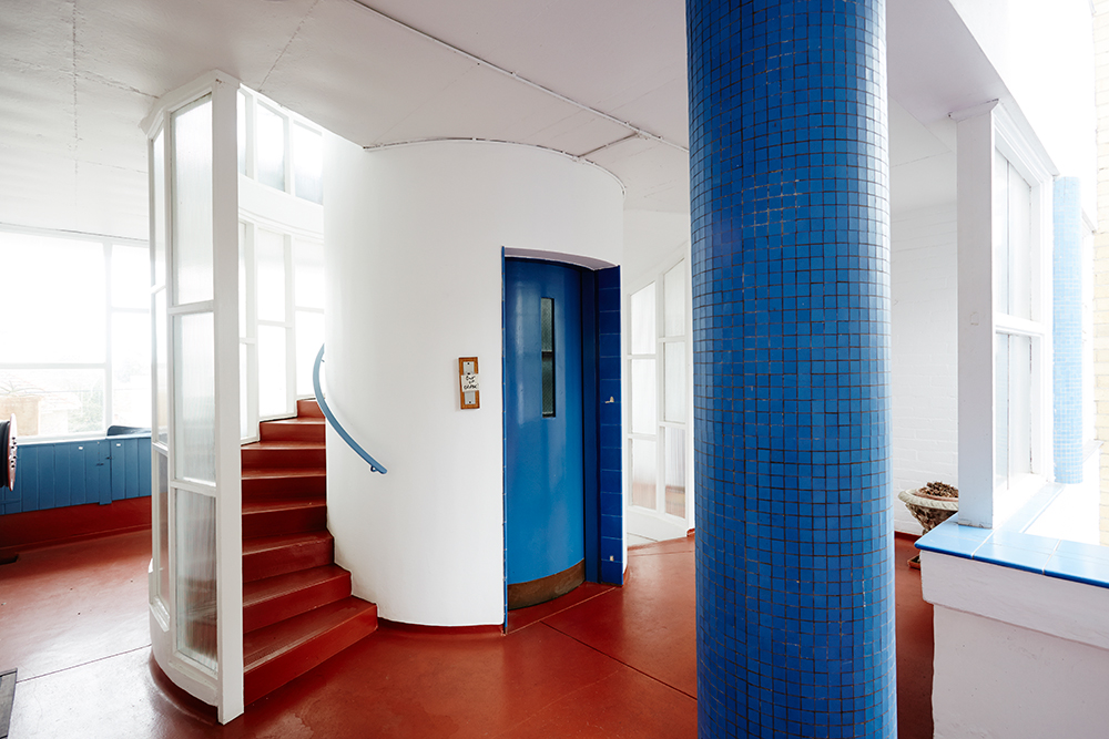
Best known for his later work on the Victorian Arts Centre and National Gallery, it was between 1939 and 1941 architect Roy Grounds finessed his trademark Modernist style on a series of apartment buildings in and around Melbourne’s inner southern suburbs. James Stephens and James Geer explore one of the most iconic, Toorak’s Moonbria, an ode to Grounds’ enduring architectural legacy.
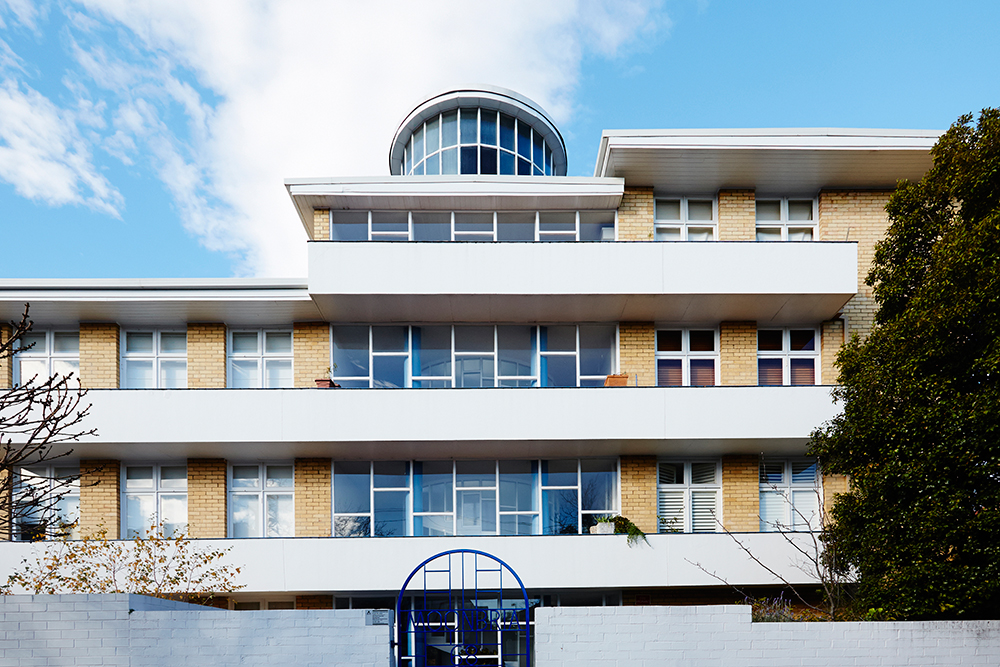
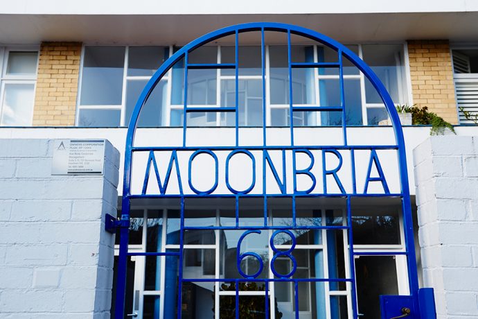
On glimpsing the glass turret between the trees, you know you’ve found it. At street level, ‘Moonbria’ wears its name spelled with the iron framework of its front gate. A facade of glass, yellow brick and white rendered balconies sits close to the street behind a subtly stepped white brick wall, the stepped levels of the three storey high roof line ascending in the other direction. I have come to meet Jim Occleshaw, the owner and resident of a one-bedroom apartment who volunteered to show me and James our photographer through the building and his home.

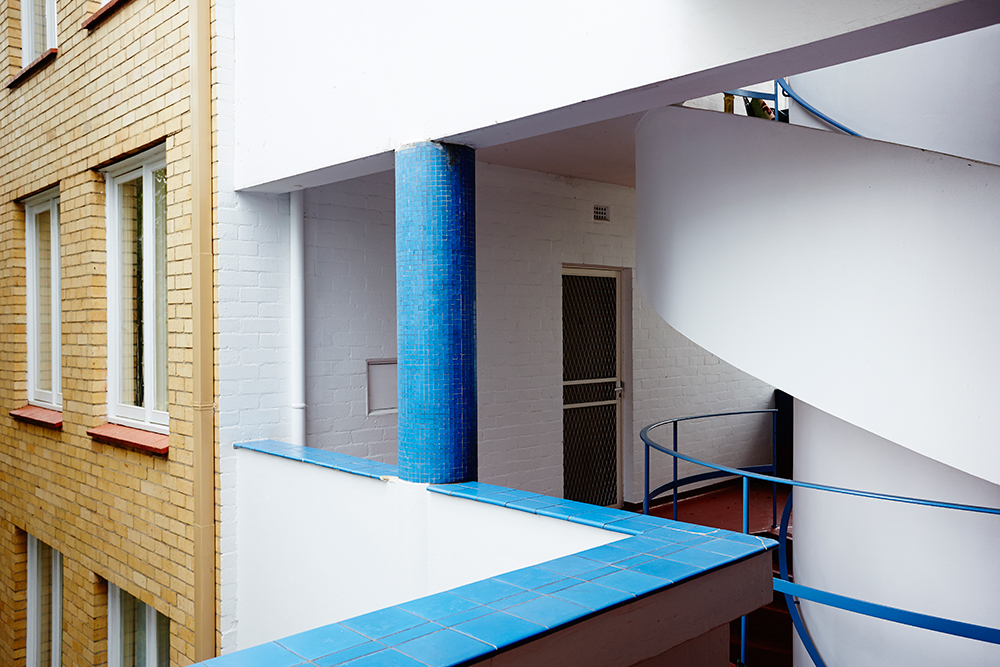
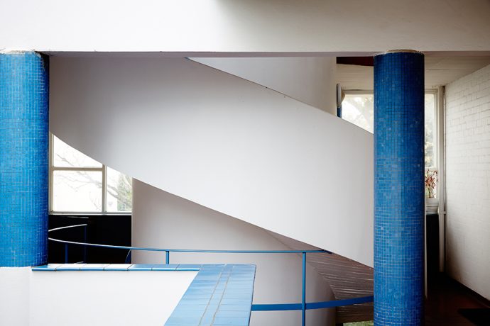
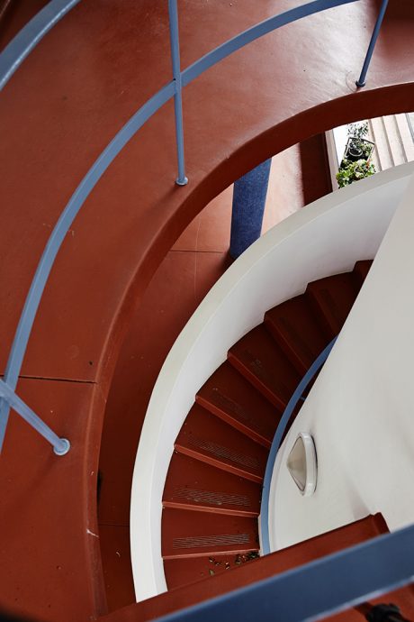
A spiral staircase awaits immediately inside the glazed front door, wrapping around the small cylindrical lift shaft, crowned in glass above the plane of the roof. The overall building forms a ‘C’ shaped plan around a north-facing courtyard, overlooked by broad, walkway balconies that connect the apartments, and linking the front stair and elevator with its mirror double at the rear of the building. There are 21 apartments: One-bedroom apartments make up the building’s two ‘wings’, while the studios make up the building’s spine, with eight garages at ground level facing the side lane. The front wing along the street also has a two-bedroom residence. Moonbria was completed in 1941 shortly after its designer, Sir Roy Grounds, was registered as an architect, and is one of the four of Grounds’ projects in Toorak by which he first made his name.
Jim lives in one of the studios, which is the second he has owned in the building. He is visible far off over the expanse of the balcony, and waves us in.

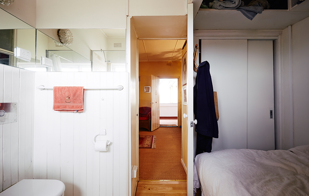
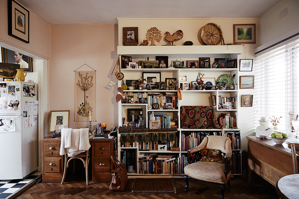
The front door opens from the walkway balcony into the living space. The living space forms the front half of the square apartment. To the right of the door along the front wall two main windows let light in from the balcony, across the right-hand side of the room to the kitchen. The smaller windows of the kitchen and the bathroom let in south light and each gives ample cross-ventilation. To the left of the kitchen, the living room fireplace sits just off-center in the overall plan. Behind it lies the bathroom. Originally, the bathroom had an adjacent dressing room, and the shallow alcove by the window contained a fold-down bed. The fold down bed is now gone, and the dressing room transformed into the bedroom, an enclave closed in enough to feel like the room itself is a four-poster bed. Where the door from the living room to the dressing room used to be now makes the portal from the bedroom into a walk-in wardrobe, the rear of which extends into the living room, and appears like an about-faced piece of furniture.
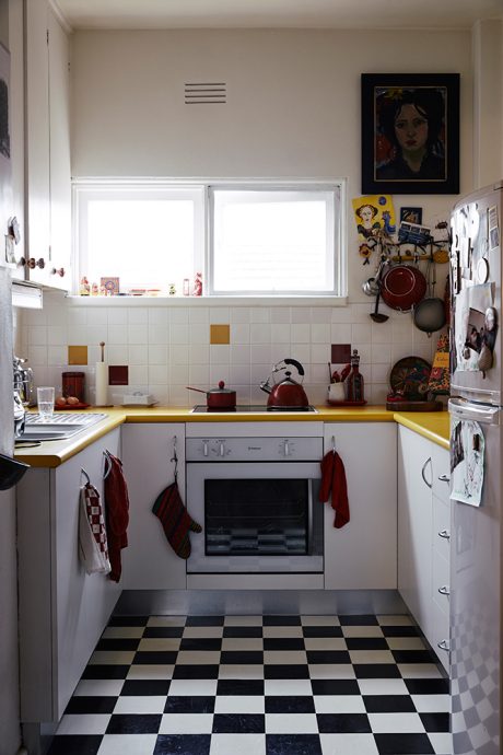
The end of one room finishes as a cul-de-sac inside a larger room, and next to it, the original inset medicine-style cupboard replaced with a new doorway from the living room to the bath and bedrooms. The apartment shows its history in other ways. Tall narrow inset shelves in the kitchen formerly housed a fold-down ironing board. Parquetry is original from the 1940s, and tiles also. Some are cleft where Jim has removed and added benches, “tinkering from time to time” with the apartment’s insides. That this can be “a real task” is evidence of the quality of the construction. Over time, the apartments have been changed by their owners: kitchens have become bedrooms, and dressing rooms kitchenettes. Jim has seen a mix of tenants in his time there. Some personalities, some close, and some invisible. Even away from the building itself, at a pub in Suffolk, England, he met a Swedish architect who knew the building and revealed that he had worked with its designer, Roy Grounds.

Crucially, the apartments are all so livable because each of the rooms has immediate natural light and ventilation. While the circulation spaces are in fact the highpoints and provide the flourishes of the design, it’s the amount of space devoted to useful circulation, centred around the foliage and fresh air of the courtyard, that provides a quality of design that goes beyond a given formal style.


Originally, Jim bought the studio below in the 1980s, sight unseen on a recommendation of a real estate agent friend at the pub. He knew the building, having done a regular paper round past it as a boy. He lived downstairs for six years, using it for city living while having a main residence away from town. He bought the apartment above – again sight unseen – and briefly considered adding a private stairway between the two. While Jim today fulfils the role of the resident handyman, after having let downstairs to his friends he decided to sell it, and plans for a stairway were set aside.

Today the smaller apartments are relatively affordable within the broader market. One factor is that, due to its heritage status, it is not open to a developer to renovate the entire building, so this possibility is not factored into the price of units on sale. What does Moonbria say to today’s multi-residential projects? As more apartments and units are built in inner Melbourne, there is also a dissatisfaction that too many are too small or do not ‘fit’ into their own space, and that this results from capital return displacing other factors in design. Too many rooms without windows or too much space devoted to narrow entry corridors. Moonbria shows an existing example from Melbourne’s own past on how multi-residential projects can be approached, and that the quality of a small residence (37sqm) is in its design, not simply its size.
While a family needs space, setting minimum floor sizes might not help the affordability for one and two occupant dwellings for those happy to live more compactly. Absolute numbers and sizes per project or storey might be less important than a genuine diversity of dwelling types and sizes together. If we do need intervention or new ideas in the market to enhance the reflection of factors other than capital return in multi-residential housing, one thing Moonbria shows us is that we have examples close to hand to help us decide what is important and what we want to achieve.
. 
The ‘Moonbria’ building is tucked away between Malvern and Toorak Roads on Mathoura Road, Toorak. Thanks to Jim Occleshaw for inviting us into his home. All images by James Geer.
